The retro diner chain Perkins Restaurant and Bakery has launched a major rebranding as it aims to stay relevant, but it’s not going overly modern on us. Rather the new name, new logo, restaurant redesign and revamped menu all aim to channel its legacy while reminding customers that it exists. And the results shows that it’s possible to modernise while also putting a an emphasis on tradition.
The new Perkins logo (right) looks both more classic and more modern than the previous design (Image credit: Old and new Perkins logo)
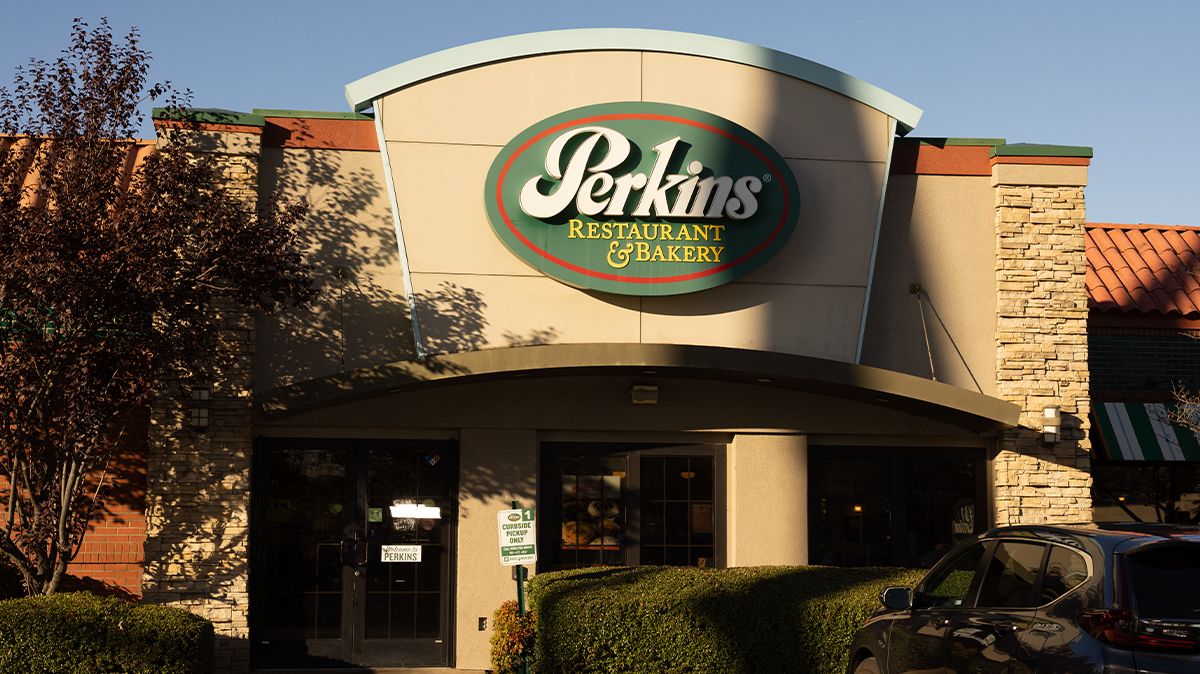
Known for its pies and pancakes, Perkins has been around since 1958 and now has close to 300 restaurants across the US but it’s faced challenges amid rising prices in the wake of the Covid-19 pandemic. The rebranding aims to emphasise American classics of yesterday but delivered in a setting that feels like today.
The name is being changed to the broader- ranging Perkins American Food Co, itself yelling American tradition and comfort food. Meanwhile, the new logo uses a script font in a more muted green. Perhaps less distinctive, but its feels more more classic and more modern than the previous design.
A mockup of a rebranded Perkins restaurant (Image credit: Perkins rebranding mockup on a restaurant)
Restaurants will be revamped to scrap the boring colour scheme chosen in a 2013 makeover and to introduce digital menu boards, modern subway tiles, brighter flooring and new tables, silverware and uniforms. The brand hopes to add some new franchises, which it says will be more affordable to build, and it’s piloting a smaller Perkins Express format for venues like Airports or food courts. The menu will also be updated to include new hamburgers and new ingredients with an emphasis on more than merely breakfast and pies.
“Perkins is an American-born brand where hospitality comes to life for the eclectic tastes of today’s adventurous diners. We are bringing the same soul, with a new attitude,” said Perkins American Food Co president Toni Ronayne,. “Our rebrand is way more than a new logo and descriptor. This is a declaration of our values, our food and our roots, by showing how modern American hospitality comes to life. We’re always stepping forward and evolving, just like the communities we serve.”