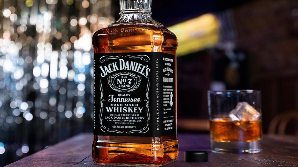
Change in packaging design is fraught with danger. Sometimes a new design is needed to inject some life into a brand that’s losing its edge or to help a product stand out on the shelf amid new competition, but cases like Bahlsen and the unpopular Tropicana rebrand have taught us that change has its risks.
If a new look is too radical, loyal customers may miss their favourite product on the shelf. And even if a redesign is relatively subtle, it can cause another potential problem: doubts about whether the product itself has changed. That’s what’s happening with the new Jack Daniels bottle.
The changes to the Jack Daniels bottle and label are subtle enough that people are only just noticing although the new design has been rolling out for a few months. The shape of the bottle itself has been tweaked, with a longer neck, but it retains its distinctive squared shape, while the label has more storytelling elements.
Has Jack Daniels changed? Bottles have a new shape and flavor is off. from r/whiskey
The new look clearly retains the spirit of tradition associated with the brand, but that’s not enough to stop people suspecting something may be amiss, as discussions on Reddit show. JD has not confirmed any possible change in recipe, but the reaction highlights a constant risk posed by change in design.
Some brands go to great lengths to point out that a product hasn’t changed as a result of a packaging change, plastering on labels with legends like ‘same great taste’ or ‘new look, same recipe’. Some even go as far as to create whole advertising campaigns to clarify the fact. The risk and the expense means a brand needs to be sure any change is truly going to be help its positioning.
For more inspiration, see our roundup of packaging design trends in 2025.
