The best Adobe fonts come free with Adobe Creative Cloud, and they’re an additional selling point of Adobe’s industry-leading software package. Adobe Fonts now comprises more than 30,000 fonts from more than 150 type foundries, offering great versatility for both commercial and personal projects.
Adobe Fonts include the company’s digitisations of many classic typefaces, some of which are up to 400 years old, allowing creatives to use tried and tested hot metal looks in digital pieces. And there are plenty of more modern fonts too – so man that it can be hard to know where to start. To provide some ideas, we’ve picked out some of the best Adobe fonts for different styles based on the choices of our own contributors.
Scroll down to the questions section if you’re not sure how to activate Adobe Fonts or how the licensing works. Don’t yet have Creative Cloud? Then check the prices linked below for the best current deals.
You may like
The best Adobe fonts
01. Early Sans Variable by Character Type
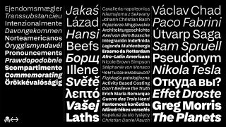
Early Sans was inspired by the metal type Breite Grotesk, adopting its softness but with the forms and proportions of a modern sans. Character Type recommends it as a companion to Late Serif since they’re distantly associated by design but closely related technically, with the same vertical metrics, glyphs and corresponding styles.
Activate Early Sans Variable with Adobe Fonts
02. Input Mono by David Jonathan Ross
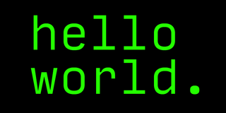
An excellent typeface for code, Input Mono was designed by David Jonathan Ross. Part of the Input family, it takes its inspiration from fonts designed for games consoles but without the technical limitations that constrain the fonts when in these contexts, making it delightfully useable. Ross designed it as a bitmap font originally, and subsequently drew it over the 11 pixel grid. We love the generous spacing and large punctuation of this super-stylish font.
Activate Input Mono via Adobe Fonts
03. Marshmallow by Neil Summerour
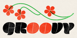
The Marshmallow font family includes Marshmallow Fluff and Marshmallow Script, both of which will add a fun and relaxed feel to your designs. You won’t want to be writing any essays in this font, but it’s ideal for headers or posters. It was created by type designer, lettering artist, calligrapher and designer Neil Summerour.
Activate Marshmallow via Adobe Fonts
04. Noto Serif
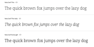
When you just need a simple yet elegant serif, Adobe Fonts has plenty of options, including Noto Serif, which is a Google Font. There are over 60 different weights, too, including bold and italic, and some nice details on descenders.
Activate Noto Serif via Adobe Fonts
05. Operetta by Synthview
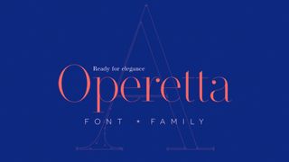
The Renaissance-inspired elegance of Didot and Bodoni has been refreshed for modern applications by the French foundry Synthview via the Operetta font family. Coming in eight weights – from Extralight through to Black – it has gorgeously smooth curves and razor-thin serifs.
Synthview’s Jan Tonellato has sculpted some beautiful swashes for it, there are five optical sizes and for those who love character detail, the lowercase A is marvellously unique. The contrast is so massive at Ultrabold and Black weights, you may never need Mastodon if you opt for Operetta.
Activate Operetta via Adobe Fonts
06. Viktor Script by OH no Type Company
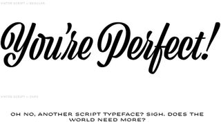
The OH no Type Company is a relatively new foundry mainly specialising in pretty wild display typefaces, playing with reversed contrast, variable widths and so forth. However, its Viktor Script is breath of fresh air when it comes to type with handwritten appeal.
All too often, script fonts get carried away with swooshes and flourishes just like actors trying to bring personality to their roles by adding ham. Viktor Script, on the other hand, is a purposeful script font ideal for succinct messaging with a personal feel, while not overdoing it. Bravo, Oh no. Bravo.
Activate Vicktor Script via Adobe Fonts
07. Tenso by Jos Buivenga
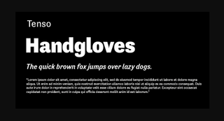
When you just want to create legible text, Tenso is a great option. This sans serif has a higher than normal stroke contrast and has character, while feeling quite classic. It’s ideal for body text, but could also work at bigger sizes. It’s balanced, sharp and there are 10 fonts in the family, created by Jos Buivenga.
Activate Tenso via Adobe Fonts
08. Adobe Caslon by Carol Twombly and William Caslon
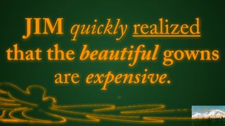
This timeless classic is a favourite in the world of publishing, bringing an authoritative and cultured look and feel to the page. It’s highly legible at all weights and sizes, which is why it can be used for everything from front cover display type through to body copy.
The six Caslon fonts within Adobe Caslon were redrawn in 1990 by Carol Twombly, who modernised it based on samples dating back to around 1725, created by the English gunsmith and typographer William Caslon. He, in turn, was inspired by printers on the Continent, in particular the Dutch. We think Caslon is essential in everybody’s font collection.
Activate Adobe Caslon via Adobe Fonts
09. Alegreya by Juan Pablo del Paral

Within Adobe Fonts there are plenty of typefaces designed for on-screen applications, suitable for everything from UX design to body copy on websites. Often you’ll want a sans serif in these situations, but Alegreya is a font family with robust yet classy serifs that defies convention.
When you’re tired of your Miller or Georgia, this is a screen-friendly and impactful choice. It may surprise you to find an open-source Google Font within Adobe Fonts, but it’s there alongside all the others, with the same licensing conditions. Alegreya was created by Argentinian designer Juan Pablo del Paral of Huerta Tipográfica.
Activate Alegreya via Adobe Fonts
10. Lo-Res by Zuzana Licko
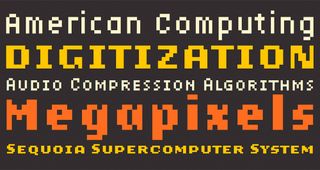
It’s nearly 40 years since the advent of home computers so using a pixel-based typeface seems almost primaeval these days. Lo-Res was created by Emigre’s Zuzana Licko back in 1985, with an update in 2001. It smooths over the coarse sterility of early bitmap fonts, making them seem soft, approachable and perhaps a bit more fun than they really were.
In all, the Lo-Res family includes 25 fonts, and if a project comes up where you can use them, you’ll find they’re a lot of fun. Why not throw in an 8-bit palette while you’re at it? Emigre has shared a 1990 video it created that deconstructs pixel fonts – it’s worth checking out.
Activate Lo-res via Adobe Fonts
11. Merriweather by Eben Sorkin
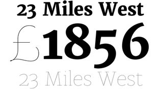
This versatile serif feels modern without labouring the point. Its Light Regular weight is perfect for body copy in magazines or company reports, the italic versions have a gentle elegance to them and UltraBold Regular forms a serious header font for current affairs publications.
When text standards like Times and Garamond are leaving you feeling uninspired, whip up a typographic storm with Merriweather. Like Alegreya, Merriweather is also a Google Font.
Activate Merriweather via Adobe Fonts
12. DIN Condensed by Paratype and Deutsches Institut für Normung
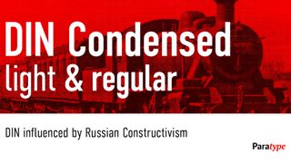
It may seem odd to include something as specific as a condensed sans serif font on a best-of list, but if your job is to create web banners, you’ll know the value of DIN Condensed. It’s superb for fitting copy in confined spaces – more words and the text doesn’t have to feel clipped or abrupt.
Foundry Paratype has digitised DIN and claims that it was influenced by Russian constructivism. That might be the case, but it was designed in Germany in the early 20th century for clear and efficient signage in railway stations and on the roads. Today it’s excellent for directing traffic, so to speak, on the internet.
Activate DIN Condensed via Adobe Fonts
13. Anonymous by Mark Simonson Studio
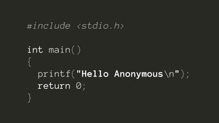
Here’s one for the coders. The Anonymous family includes four fixed-width fonts. Although it was designed with code panels in mind it can be used creatively as well.
It looks great on websites and with its smooth, contemporary feel Anonymous makes a good substitute in situations where you might be tempted to use a typewriter font such as Courier – hence it has bold and italic versions.
Activate Anonymous via Adobe Fonts
14. Abolition by Fort Foundry
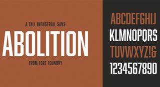
This condensed serif gets lovelier the more you use it. Like DIN Condensed, it’s great for online banners and so forth and with its corners roughly cut at 45-degrees it feels like it means business.
However, if you don’t want to scare the chickens, use the Soft version of the font which brings a little bit of rounding to those corners making it feel a lot more comfortable in gentler settings without losing impact.
Activate Abolition via Adobe Fonts
15. Lust by Positype
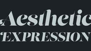
No best-of fonts list is complete without a stunningly luxurious display typeface and Lust lives up to its name by leaving you wanting more. And there is more, too, because its Script and Stencil versions are equally desirable.
It’s not all about the contrast either – the way the lowercase c and r curl back in on themselves is truly alluring. Lust is ideal for work involving high-end brands wanting to emphasise fashion with a sensual touch.
16. Neue Haas Grotesk
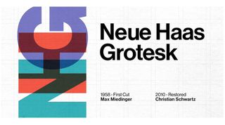
Concluding our list of the best Adobe Fonts is this tribute the original Helvetica. Neue Haas Grotesk was actually the original name of the famous Swiss sans-serif developed by Max Miedinger and Eduard Hoffmann. This font is designer Christian Schwartz’s attempt to recreate it, since Helvetica itself has seen several changes as part of its evolution from pre-digital to digital use. It’s available in both text and display optical sizes with 22 styles in total.
Activate Neue Haas Grotesk at Adobe Fonts
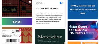
What is Adobe Fonts?
Adobe Fonts is an online service offered as part of Adobe Creative Cloud that provides subscribers with access to a font library via a single licensing agreement. The fonts can be used directly on websites or synced via Adobe Creative Cloud to applications on your computer. The fonts are all free for anyone who subscribes to Creative Cloud or many of Adobe’s individual applications.
How do I activate Adobe Fonts in Creative Cloud?
You can access Adobe Fonts from inside Adobe’s apps or online via the Adobe Fonts site.
Once you find a font you like, you can simply click the slider to activate either individual fonts or entire families. These will become available in all Adobe apps, as long as you’re signed in to Creative Cloud.
When opening a project with fonts that you don’t own, you will be given the option of Resolving Fonts, which syncs any matching fonts from Adobe Fonts. All fonts are included with any Creative Cloud subscription and there are no limits on how many you can use at once. If you need more help, we also have a specific guide to how to add fonts to Photoshop.
Are Adobe Fonts OK for commercial work?
Yes, if you subscribe to Creative Cloud you automatically have a licence to use Adobe Fonts for both personal and commercial work (see the question below regarding the use of Adobe Fonts by clients).
Does my client need a licence for Adobe Fonts?
A question that often comes up regarding font licensing with Adobe Fonts is whether the designer’s licence to use the fonts via their Creative Cloud subscription also covers their customers’ subsequent use of the finished design assets, or if the client needs a separate licence.
If you create graphics or documents that have rasterized or properly embedded font data, for example PDF, JPEG, or PNG, the client does not need any additional licence to use the finished assets. Things change if the clients needs to be able to edit the designs. This would require them to have the font installed on their own machines, which would require them to have their own licence, be it via Creative Cloud subscription or a desktop license purchase.
Note that if the fonts will be used on a website, you cannot use your own Creative Cloud subscription to host web fonts for clients. For this use, the client will need their own Creative Cloud subscription. You can learn more on the Adobe Fonts licensing page. Also see our guide to font licensing for designers.
What happens to Adobe Fonts if you cancel a Creative Cloud subscription?
Adobe Fonts are a part of your cloud subscription via Creative Cloud. Unless you purchased the individual fonts outright, any Adobe fonts will disappear from your machine if you cancel your Creative Cloud subscription. Even if you still have the files, you will lose the licence for commercial usage.
What’s the history of Adobe Fonts?
Adobe Fonts was previously called Typekit, which was created in 2009 by Small Batch. Typekit was bought by Adobe in October 2011 and changed its name to Adobe Fonts in October 2018.
Is Adobe Fonts worth it?
Paying for an Adobe subscription may not be worth it for the fonts alone as there are other sources of fonts out there, including free options like Google Fonts (also see our pick the best free fonts in general). However, Adobe Creative Cloud has many other selling points and contains many industry-standard programs (see our Adobe software list).
If you’re a professional graphic designer, it is likely that you will want to use Adobe products (see our pick of the best graphic design software), in which case it makes sense to take advantage of Adobe Fonts when there are appropriate fonts for your work.
You may want to avoid using Adobe Fonts if you know that you’re going to cancel your Creative Cloud subscription in the near future.
See below for the best current Creative Cloud deals, or check our page on Creative Cloud discounts.
