Publisher GIMP.org
Developer The GIMP Team
Price Free and Open Source Software (FOSS)
New features New version, 3.0 featuring new Non-Destructive Editing (NDE) tools, incremental UI improvements, plugin updates and additions.
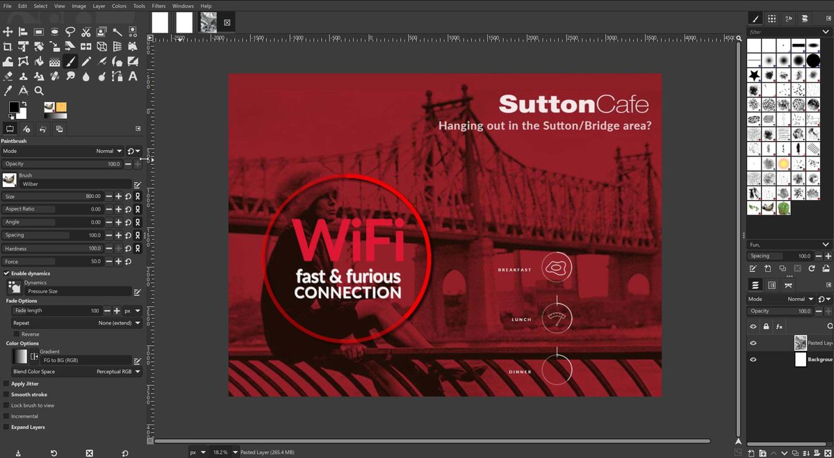
If you don’t already know, GIMP is an open-source digital image manipulation application that runs on virtually all platforms. And while it has existed since the 1990s, it never became the household name that it should have. This is because, as many parents have been told about their children, it has long been an “under achiever”.
Case in point: The GIMP team has just released version 3.0. To be more clear, they just released its “Release Candidate”, which is essentially a late beta. This is some 8 months later than was originally promised at the start of this year. The reason: Some of the developers caught colds. Yes, seriously.
Far worse is that as v3.0 is being birthed, it is now exactly 20 years since the release of their previous 2.0 version. I literally can not think of another application that has taken that long between releases. Granted, there have been numerous interim releases in between. Some that could have easily been dubbed 3.0, so some may reasonably argue “what’s in a name?” But as we make our way through this new version, we need to ask, should this have been the first full integer release in 20 years? And will it bother the frontrunners among the best photo-editing software offerings?
GIMP 3.0 review: what’s new?
While there was much work done “under the hood”, let’s focus on the things that users can actually see.
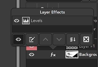
For example, one of the most asked for features/workflows arrives in this release with additional updates. Non-Destructive Editing (NDE) snuck into a recent previous release, and is now being further refined in v3. This is of course a very important addition, and allows attributes like Levels and other modifications to be applied, and later either removed or adjusted at will.
You will see a small “Fx” icon next to the layer in the Layer Pallet. When clicked it brings up options to turn the effect on/off, modify or delete. A “Merge filter” toggle will flattens the layer effects.
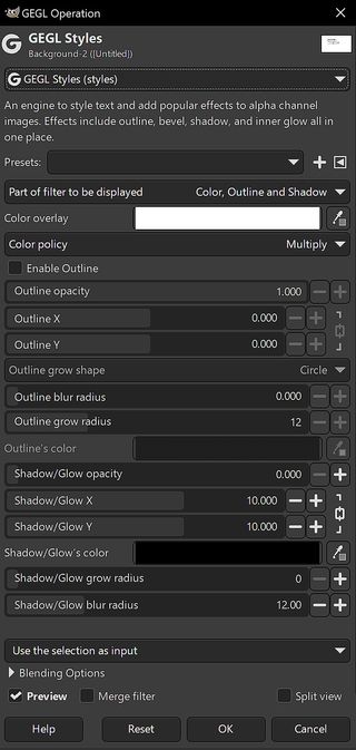
Plugins are a cornerstone for getting the effects that we want. So a number of plugins were updated and tweaked for v3. The GEGL and babl filter systems in GIMP have seen a number of updates since their last releases in February.
New plugins to GEGL include “GEGL Styles”, which offers a wide range of new and needed effects. Such as a simple non-destructive stroke function that should have existed years earlier. In addition, Inner Glow and Bevels have been added. The extensive range of included filters and plugins are very impressive.
It has best been said in online GIMP forums that “Gimp needs a Blender 2.8 moment”
As you slog through the program, you will likely feel impressed by the amount of settings and tweaks that GIMP makes available to the user, often more than you would find in Photoshop. At the same time, you may feel these options are overwhelming. Largely, this is the fault of the UI. More on this soon.
Another new addition is GIMP’s version of smart guides and snapping. Allowing us to intelligently drag and place objects while they snap to the next most logical location. For example, to align with other page elements.
Still missing from GIMP
While nice, there is still a lot missing that should not be missing from an almost 30-year-old image editing tool. For example, though we finally have some non-destructive tools, we still await something comparable to PS “Smart Objects”. We are told that was intended for v3, but is now expected in v3.2, to be released who knows when.
Rarely discussed but painfully missing, is the addition of any GPU acceleration. Photoshop has been using our GPU’s OpenCL power for a long time. Neither GIMP nor Krita do this, so we often get a few seconds of wait time after performing even mildly weighty functions. The same action on PS would be done in real-time. The only solution I know of is getting a faster processor.
GIMP still doesn’t have full support for CMYK colour. However it has added a few abilities to make that less of an issue. CMYK is used far less today, but that is neither cause nor excuse for GIMP’s continued lack of support for such a basic need. Fortunately, traditional printers have become quite adept at accepting and using RGB files.
And as to be expected, there is no AI in GIMP. (Check out Krita for such options.)
Continuing interface issues
Poor interface design is an issue shared by many open-source applications. An issue we are often told that comes from too many programmers and not enough designers working on a project. But in truth, the GIMP team has often said they simply prefer to do it the way they like.
The result of which means they have never truly caught on with the creative community. It has best been said in online GIMP forums that “Gimp needs a Blender 2.8 moment”. Referring to when Blender finally agreed to adopt more industry standard interface design, resulting in its popularity exploding.
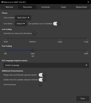
Despite continuing promises of an improved interface, GIMP 3.0 is still much of the same. With slightly cleaner icons, and better adaptation on 4k monitors (finally).
But I still have many interface quibbles. Starting small, I feel that the ruler is far too much in ones face. I could find no way to either dim it or change its color, or size. If it annoys you also, the only option is to turn them off completely. But if you do that the canvas visually runs off to the left-hand toolbar area without any demarcation of boundaries. Odd.
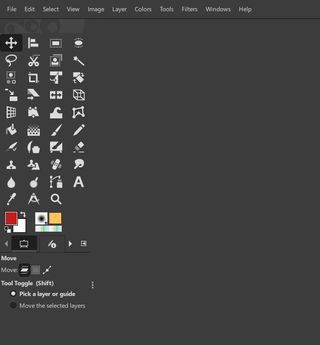
Most of us have long complained about the way GIMP stacks its tools. These complaints are based on both aesthetics and a poor use of valuable screen space. The new version has made no obvious attempt to improve this, or allow reasonable user modification.
Learning GIMP tends to make it feel like a challenge game, where every damned thing has to be learned, down to every keyboard command. Want to select the BRUSH tool, just hit the “B” key, like in both PS and Krita, right? Nope. How about “C” for the CROP tool, also like in PS and Krita? Again no.
By comparison, the Krita team clearly better understands how important UI is, and they’ve taken steps to make it easier for people to use their program. And to make that leap from Photoshop. Smart.
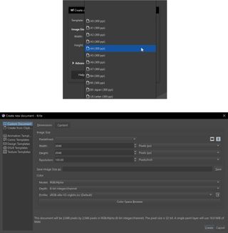
Another area of basic refinement where GIMP is miles behind everyone else in the market is in starting a New Project. Photoshop, Krita and others make it fast and easy to create a new project file either based on what is currently in the clipboard, or easily choose an appropriate template. GIMP’s new project dialogue does neither of these things. They do offer template options, but they appear in one long drop-down menu, which makes it much harder to choose. As opposed to all others that segment the templates into obvious categories like Print, Web, Photo, etc.
Finally, another unforced error comes our way when we go to save an image. “Save As…” in all other image programs offers the full range of format options from within the dialogue box. GIMP only offers saving in its own XCF format. To save in any other format one needs to go to “Export…” Why, I don’t know. But then you need to find another popup menu to select the format option. And that popup opens DOWNWARD, going beyond the confines of the dialogue, and even off my monitor screen!
Has GIMP finally arrived?
After years of us waiting and quietly cheering the GIMP team on, has version 3.0 brought this application in line with others in the market? Sadly, no.
While projects like Blender and WordPress have set the bar for open-source tools, the GIMP team appear to still not have learned that part of software development, even for free software, must include reasonable ease of use, and reliable update schedules. Or your market will go elsewhere. As many have to Krita.
But while a painfully long time in the coming, version 3 is now here. It is not everything I wanted it to be. Nor is it everything that it actually needed to be after 20 years. But it’s here now, and it isn’t bad. Yes, I realize “Isn’t bad” is no great compliment.
However, here are the pluses: Everything is fixable. They say the missing functionality is “on its way”. Great, so deliver it sooner rather than later. And listen to your user base when they tell you – repeatedly – that the UI sucks. Because it does.
Despite all that I’ve said, once one gets up the needlessly steep learning curve, we have the basis of a solid product. Especially if they take this opportunity to move forward more reliably. If they don’t, I’ll just feel like I was duped yet again.
Who’s it for?
If you are on Linux the only options are Krita or GIMP. So you should download them both. Another alternative is the online Photopea. It has a lovely interface but some obvious limitations of being in the cloud.
User on Mac and Windows clearly have a few additional options, but not as many as we would expect to have in 2025.
If you are a fast learner or not as entrenched in the “Photoshop Way” of doing things, then give GIMP a whirl. Or if you need some tools or capabilities that Krita doesn’t have and GIMP does, much better typographic capabilities for example, then again GIMP is there for the taking.
(NOTE: I reached out to the GIMP team for this article, and never heard back.)
