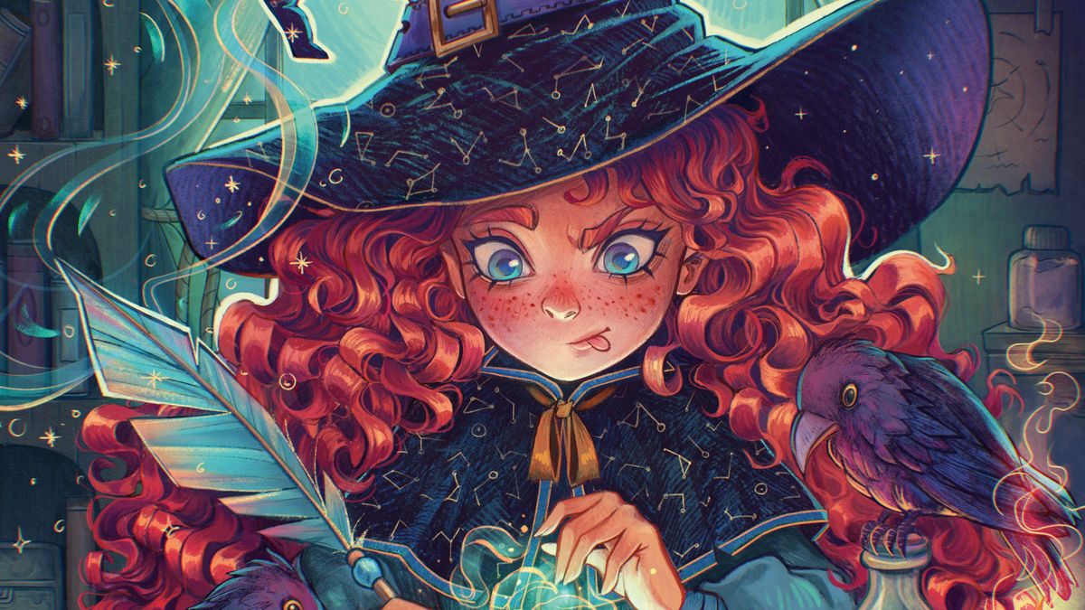
Magic has always sparked imagination. Since it doesn’t exist in our world, there are countless ways to portray it through art. Will it be the blinding light from a wizard’s wand? The shimmering mist from a witch’s spell? Or the shadowy tendrils of a dark warlock? There are no rules, so we can let our creativity run wild.
I’ve had a soft spot for witches since childhood, which is why I decided to create an illustration on my favourite theme for this tutorial. It depicts a young witch learning a new spell, accompanied by her feathered friends. I want to focus on highlighting the magical elements so the illustration bursts with life.
I’ll show you some useful features found in Procreate and walk you through my process for finishing a new illustration
Daria Widermanska
For some time now, I’ve been creating all my artwork in Procreate, which is not only convenient and simple, but also gives me full control over what I draw. It’s one of the best drawing apps on iPad. In this tutorial, I’ll share various tips that might make your work easier or help you get acquainted with the software for the first time.
We’ll talk about composition, finding inspiration, choosing colours, building atmosphere, and different rendering techniques. I’ll show you some useful features found in Procreate and walk you through my process for finishing a new illustration. I’m really curious to see how my workflow compares to yours. If you want to learn more, there are 20 Procreate tutorials on the site to read and watch. Also, read Creative Bloq’s guide to the best iPad for Procreate.
Daria is a professional artist specialising in character illustration, with many years of experience in game development, and working with various authors and publishers.
01. Finding inspiration and creating thumbnails
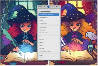
My initial idea was to create a drawing of a young witch in the midst of her studies. After some research, I figured out which magical items would be essential in her room. You should start by sketching a quick thumbnail and testing different colour options. To make it easier to adjust the colours later, create each one on a separate layer, which allows you to use the ‘Hue, Saturation, Brightness’ option in Adjustments.
02. Making a rough sketch of your image
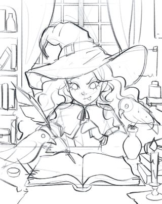
I chose a classic triangular composition where the pointed hat and flowing curls perfectly guide the viewer’s gaze towards the centre, where the spell will appear. To draw the window and the book, I used Procreate’s Symmetry tool, turning on Drawing Guide under Actions > Canvas and then selecting Symmetry in the edit options. It’s important the layer you’re drawing on has the Drawing Assist option enabled.
03. Drawing the line-art
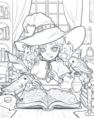
Lower the Opacity of the sketch to 10-20% and then draw detailed line-art over it. While it’s enough to just refine the previous sketch, I prefer to redraw it from scratch. Initially, create each element on a separate layer so it’s easier to move or resize elements later. Make the outer lines of larger objects thicker to improve the image’s readability, while the background lines are the thinnest.
04. Separating the foreground from the background
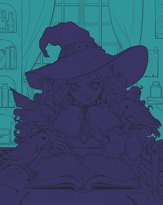
Flatten all the sketch layers, done by simply pinching them with your fingers, and then create new layers underneath for the colours. Two will suffice for now: one for the foreground and one for the background. A handy method for filling a large area with colour in Procreate is to first outline it with a hard brush (just avoid leaving gaps) and then drag the selected colour into the centre.
05. Beginning to lay down the image’s base colours
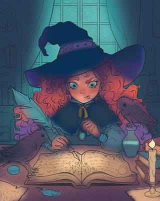
Add an empty layer above the witch and set it to Clipping Mask. This allows us to colour without going outside her shape. Use an airbrush to apply the base colours from the thumbnail. Don’t worry about going outside the lines, as the soft airbrush effect makes the image look more organic. Use the same method to colour the line-art and also make sure you get rid of the black lines.
06. Creating the illumination and atmosphere
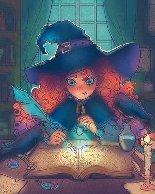
Continue airbrushing on additional Clipping Masks to add lighting effects such as reflected light and rim light. The Overlay mode is helpful for enriching the colour palette, even with shades that might not seem to fit at first glance. Gently colour the background; I used a greenish moonlight to enhance the magical atmosphere. Finally, test the colour of the spell in Add mode.
07. Start rendering with the face
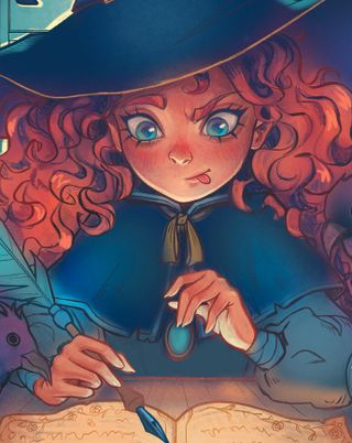
I always begin the rendering process with the face because it’s the most crucial element in my character illustrations. I mainly use one brush, the same one that I used for sketching earlier, to add details to the shapes I’ve already coloured. First, work on the layers beneath the line-art, and then finish with those above it. This process gives you maximum control over the drawing.
08. Adding a traditional feeling
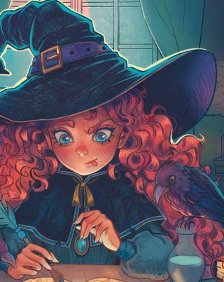
I enjoy using Procreate because it allows me to easily achieve effects that resemble traditional media. I used the default 6B Pencil brush to create a traditional-style texture on the character’s hat and cloak, as well as the birds. Additionally, I added sharp rim lighting to the hat and animals to maintain the form of the objects, despite the flatness of the texture.
09. Painting the hair
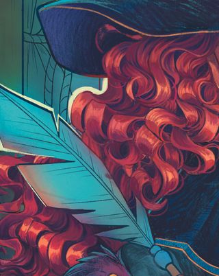
I love curly hair. When painting curls, it’s important to remember that hair is divided into sections, and each section is a distinct part of the whole, has its own highlights, and casts its own shadow. At the same time, the curls overlap each other and are never perfectly even. I noticed the hair of my witch had too much contrast, so I toned it down using a layer in Darken mode.
10. Detailing the foreground
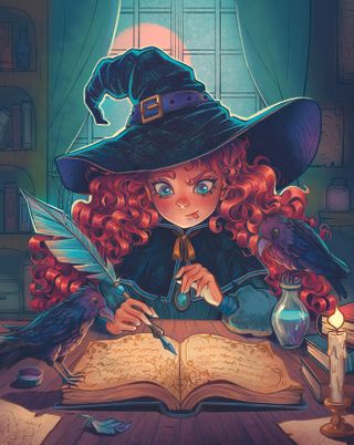
Render the other objects in the foreground in a similar way, keeping in mind that the light source is in the centre. Paint the elements closer to the edges darker. I coloured all the magical objects, except for the book, in similar shades of turquoise and pink to maintain consistency. At this stage you can freely move between the different elements and treat the entire foreground as a whole.
11. Giving the background some love
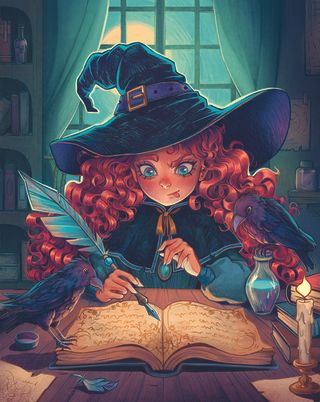
When painting the background, work on the layers underneath the character. Try to use muted colours while keeping some variety. In this illustration, the background is only supposed to enhance the scene and create an atmosphere, so it shouldn’t be too prominent. Use the Multiply mode on the layer to naturally darken the edges, and the Overlay mode to highlight the subtle moonlight.
12. Bringing in magical details

Before adding some magical elements to the image, take your time to enjoy drawing the details. I decorated the hat and cloak with constellations, added freckles to the character’s face, and enhanced textures in other areas with extra lines. With the constellations drawn, I created a mask on the layer and gently masked out some sections with the airbrush and black colour to make the texture more natural.
13. Building up the atmosphere
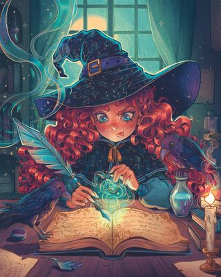
To create the magical effect and the candlelight, use the Add or Color Dodge modes. You can make abstract shapes and erase them inside with the airbrush eraser to make them transparent. After that, gently blur the spell above the book using the Gaussian Blur tool found in Adjustments. Next, draw some intricate swirls and embellish them with magical dots, stars or little circles. Magic!
14. Wrapping up with post-processing
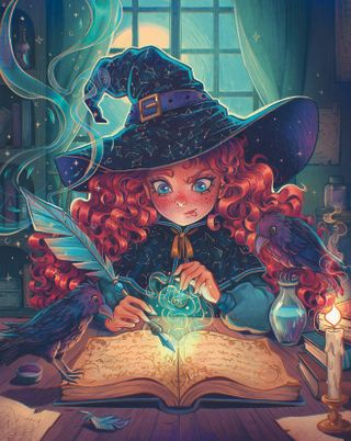
After finishing the illustration, copy it into a separate file and flatten all the layers by grouping them and choosing Flatten, then gently increase the contrast using Curves, found under Adjustments. Finally, apply a slight Chromatic Aberration effect, at no more than 3%, and add grain with Noise set to Multi.
Get more Procreate tutorials in ImagineFX
This content originally appeared in ImagineFX magazine, the world’s leading digital art and fantasy art magazine. ImagineFX is on sale in the UK, Europe, United States, Canada, Australia and more. Limited numbers of ImagineFX print editions are available for delivery from our online store (the shipping costs are included in all prices)
Alternatively, you can access us instantly through our digital options:
• Apple app (for iPad or iPhone)
• Pocket mags (multi-platform app, great for Android users)
• Zinio (multi-platform app for desktop or smartphone)
