The Pentawards has released its annual report unveiling the top packaging design trends set to take over 2025. With cultural shifts, changing consumer habits and an increased focus on environmentalism leading to a constantly evolving industry, this upcoming year of design innovation is set to include a diverse range of aesthetics, from psychedelia to Art Deco.
Using insight from this year’s Pentawards competition, the report reflects over 2000 entries from more than 60 countries, giving a unique projection of the industry’s hottest packaging design trends. Below is just a selection of the trends set to take over 2025 – to read the full report download it here.
Designing with impact
‘Designing with impact’ is all about “design that goes beyond convention to communicate meaning”. Subverting design norms to communicate meaning and encourage mindful purchasing via “visual cues or storytelling, material choices and design details”, this trend encourages a movement towards sustainability and inclusivity.
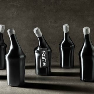
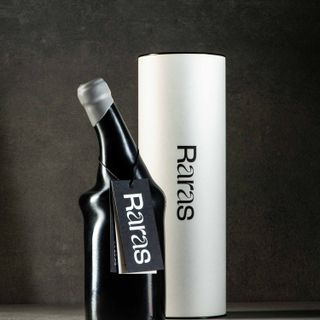
A prime example is Raras, a limited-edition wine that “puts the research of rare diseases on the table.” The atypical shape of the bottles, alongside the changing typography and label messaging work in tandem to encourage important and candid conversations around health.
“When packaging design defies convention, it’s already creating a layer of impact for the consumer, making it stand out beyond its market. When you pair that with meaningful storytelling and beautiful details, you’re onto a winning design” says Chloe Scanlan, marketing manager at Pentawards.
Art Deco revival
Gatsby-style Art Deco packaging design is back with a bang – think striking geometric shapes, opulent colours and plenty of glamour. With a particular focus on the drinks sector, this classy aesthetic revives the retro luxury of the ’20s design trend with a modern twist, bringing a contemporary flair to the well-loved design era.
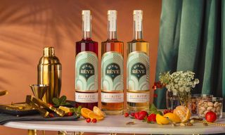
Apéritifs brand Rue de Rêve takes cues from the Art Deco era with its arched 1920s architecture-inspired design created by Makers & Allies. Capturing the intersection of the brand’s French inspiration and Californian heritage, the tactile golden embellishments of the design make for a luxe experience that “transports drinkers to a Golden State”.
Simple shapes meet stand-out shades
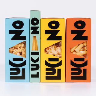
Embracing bold visuals, this trend uses simple geometric shapes paired with bright primary colours to create a striking visual appeal. The playfulness of this combination makes for visually arresting packaging across a variety of products, making it an adaptable trend with a distinct contemporary quality.
Created by Dispenser Studio, Pasta Luciano’s packaging is a prime example of how bold design can create a standout shelf appeal. Embracing the graphic nature of large geometric shapes, the contrast of the packaging’s bright colours mirrors the liveliness of the brand’s creator, Luciano Monosilio, bringing a unique personality to the branding.
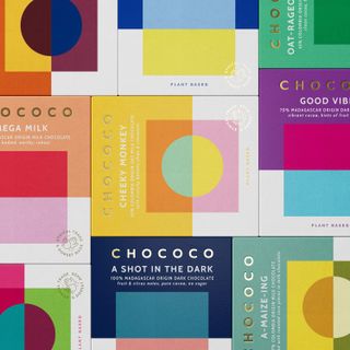
“A packaging design system should always be on brand rather than on trend,” says Neha Tulsian, founder and creative director NH1Design. “When it aligns with the brand’s personality, bold shapes, typography, and primary colours in a saturated market create an instant visual impact. This trend highlights simplicity’s primal appeal, with strong geometric forms and vivid hues communicating confidence, playfulness, and modernity in one glance.”
Inspired by psychedelia
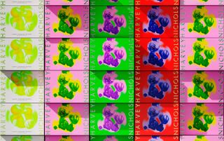
Taking inspiration from the ’60s nods to psychedelic design are increasingly appearing, using kaleidoscopic patterns and intense colours to transport consumers into new dimensions. Despite its retro origins, psychedelia-inspired design has a distinctly contemporary feel thanks to its unrestrained use of bold colour and striking patterns.
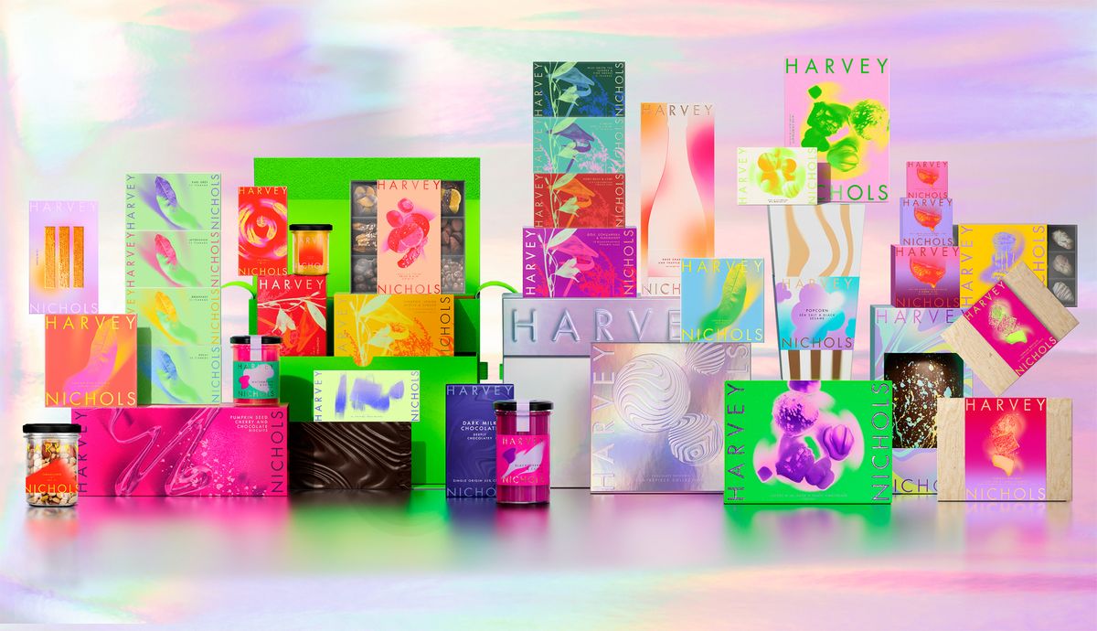
Embracing this aesthetic, Design Bridge and Partners introduced a vivid palette in its redesigned Pleasurama food packaging for Harvey Nichols. Maintaining the brand’s heritage of luxury, the new branding appeals to a new generation of customers with its daring and commanding design.
Cultural connections
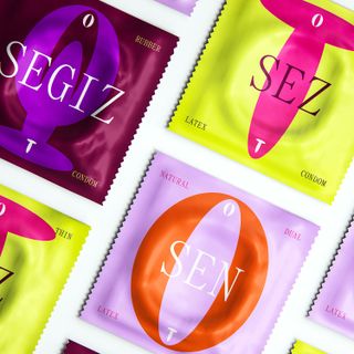
With a focus on heritage and history, ‘cultural connections’ create a sense of identity for brands while addressing an “understanding of cultural nuances in different target markets”. Connecting with audiences in a uniquely authentic way, this trend spotlights culture and heritage as an educational tool and a platform for thoughtful conversation.
Uncovering social taboos, OT is a condom brand “aiming to tackle the issue around the absence of comprehensive sex education, gender inequality, and a culture of shame in Kazakhstan”. With the ‘O’ and ‘T’ representing man and woman side by side, the packaging redefines sexual culture, promoting equality by visualising harmonious and healthy relations between the genders.
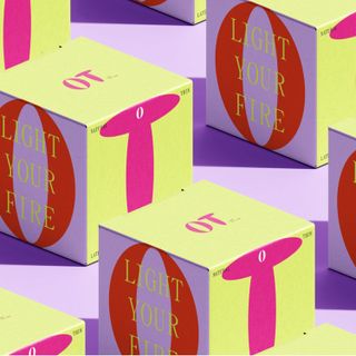
“It is evident that packaging, as a powerful means of communication, can help convey cultural and social issues,” says Alberto Cienfuegos, partner and creative director at Lavinia & Cienfuegos. “Telling us stories about a product’s origin, raising awareness about the importance of protecting the environment, or speaking to us openly about traditionally taboo topics, such as sexual matters, are just a few examples.”
For more 2025 predictions, check out Canva’s design trends for 2025. If you’re after more design inspiration take a look at the graphic design trends to watch in 2025.
