As AI reshapes creative workflows, designers are experiencing pressure from two contradictory forces. As a result, the graphic design landscape is experiencing a fascinating dichotomy as we approach 2025.
One of the biggest graphic design trends of 2024 has been the rise of AI. But as this emerging tech continues to revolutionise creative workflows, there’s been a growing countermovement celebrating human imperfection and authentic expression. And this tension between digital precision and organic creativity is giving rise to some of the most interesting design trends we’ve seen in years.
To learn how these emerging trends are shaping the future of visual communication, we spoke with leading designers and creative directors. We share their thoughts below, as well as their musings on the trends to avoid. Meanwhile, to see how these trends fit into the overall culture of the 2020s, also read our guides to the rebrands of the decade and the type of the decade.
2025 graphic design trends
01. AI-enhanced creative exploration

Every day, it seems, AI tools are becoming increasingly sophisticated, allowing designers to explore concepts more deeply and efficiently. And not everyone sees this as a bad thing.
“AI-powered design is set to revolutionise the graphic design landscape,” predicts Graeme Green, digital designer at Cheil UK. “Tools like Adobe‘s Generative Fill have become essential in my creative process, enabling deeper exploration of concepts. Some are adopting generative AI in their personal projects, such as Rodney Leonardo’s Neon Concept Campaign, a design concept for Nike. This trend signifies a shift toward creativity, allowing designers like myself to unleash their full potential as we move into 2025 and beyond.”
David Alexander, creative director at The Frameworks, agrees. “Generative AI will be transformative for graphic design in 2025, allowing designers to push visual exploration into new and unexpected places,” he believes.
“I’m already seeing designers experiment with futuristic imagery, surreal photography and an AI-generated illustrations,” he adds. “Combining these with AI-driven video platforms such as Sora and Hailuo AI, which can also animate static visuals, gives creatives an even greater depth to their toolbox and will revolutionise visual storytelling.”
02. The rise of ‘ugly minimalism’
Every action causes an equal and opposite reaction. And so in direct response to AI-generated perfection, designers are embracing intentional imperfections and raw aesthetics. In some ways this approach harks back to previous eras, but with a contemporary twist.
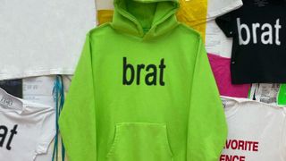
“Much like the punk age of design, and even the Dadaist collage designs of the ’60s, we’re starting to see a resurgence of intentional human imperfections in design,” says Jodie Valery, designer at Wonder. “The disruptive ‘ugly minimalism’ aesthetic is the design world’s response to the takeover of AI, clearly visible in the jarring type and vibrant green of the Brat album cover and the Brat Girl summer trend.
“In 2024 we leaned into AI and the amazing things we can do with this technology, but 2025 could be the year we actually rebel against it and return to creativity in its purest messy and human-centric form.”
Steve Campion, co-founder of Good Noise, tells a similar story when he talks about the trend for ‘undesign’. “Work that feels loose and not over designed can work really well in some sectors,” he explains. “It’s strangely refreshing, it feels very human and it’s full of charm.
“Being an agency that does a lot of work with hospitality brands, and therefore spends a lot of time in restaurants, I’ve come across a number of businesses that have adopted this approach,” he adds. “It really works well when a business knows their audience and knows what will appeal to them. This essentially makes the undesigned, well, designed.”
03. Handcrafted and analogue
Another aspect of the backlash against AI is how many designers are leaning away from the digital and towards the earthy and analogue. As Ell Jeffrey, senior designer at Waste Creative explains: “We’re seeing designers, brands and illustrators turn back to the physical. Organic lettering, physical textures, zines, playful colours and hand-crafted elements that soothe as an antithesis to the current gloss and gleam.
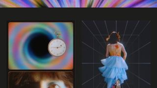
“Scrapbooking, hand drawn doodles, and the considered use and balance of these with type are leaning into what machines can’t simply create in a genuine manner,” he adds. “A good example is They That Do‘s work for record label Pressure Systems.
Hoang Truong, senior designer at Hook, agrees. “As new generations enter the industry, they’ll bring with them the desire to shift the norm. We’ll lean back towards the organic, embracing the imperfect and real human connection, as the pendulum swings back in the other direction.”
And so does Becca Jones, designer at ilk Agency. “In retaliation to AI-generated work flooding the industry, I think the next big trend will be a return to craftsmanship,” she predicts. “Truly human-made and mastered, tactile, detail-galore design. In the age when almost any Tom, Dick and Harry has the tools to create hundreds of social tiles, logos and even adverts in a matter of minutes, clients are left wanting something unique and individual to them.
“Amsterdam Museum Night by From Form, a texture-rich campaign inspired by flipbook style, makes a perfect example of authentic, human design that really appeals in a tech saturated market,” she adds. “In the year to come, we’ll hopefully be seeing loads more bespoke typography, grainy textures and raw materials.”
04. Quirky and joyful

Branding is all about giving a company, product or service a sense of personality. But how do you achieve that through design? Katy Hopkins, executive creative director at Iris, points to a growing appreciation for designs that incorporate multiple layers and tactile elements, creating rich visual experiences.
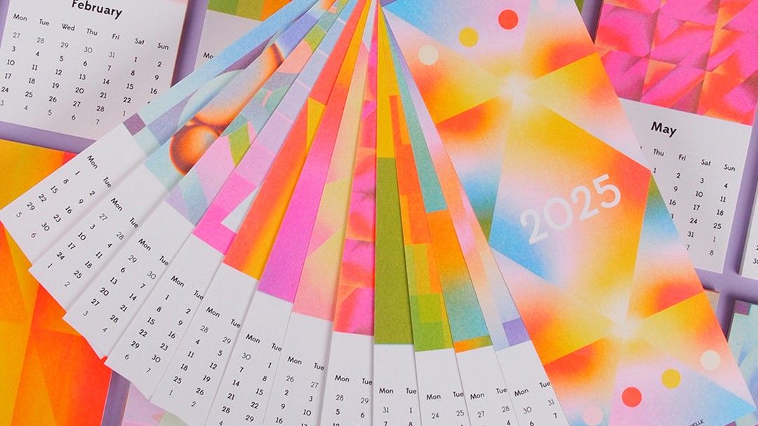
“I predict more design and illustration that delights in textures and imperfections, full of quirk, joy and playfulness,” she says. “In 2025, collage, hand-drawn and textured designs will bring a personal humanising touch, as a great contrast to the polished and well made, everyone loves a little bit of wonk. Examples include Studio Superkolor’s Riso Wall Calendar 2025, Aurelia Beatrice’s branding for Sip For Us and Didier Mazellier’s typographic posters.”
Lucas Luz, art director at &Walsh, adds that: “More brands are focusing on infusing personality not only through typography and graphic elements but also through their animations and motion behaviours. This approach adds depth and dynamism to something that was static for years. An example of this can be see in our work for yoghurt brand Coconut Cult. We included animations that brought the illustration system to life and made the brand more playful.”
05. The algorithmic-artisanal paradox
Which tendency will win in the competing trends towards AI and the analogue? Optimistically, Teemu Suviala, global chief creative officer at Landor, sees it as less of a zero-sum game, and more an opportunity to carve out a third way.
“While artificial intelligence empowers designers with unprecedented creative capabilities, it simultaneously elevates the value of the handcrafted and imperfect,” he explains. “The ease with which AI can generate polished visuals will fuel a countertrend embracing raw aesthetics, handcrafted details, and visible flaws as hallmarks of genuine human expression.”
In short, he predicts that: “A new DIY aesthetic, enabled by hacking and subverting generative AI tools, will emerge to reflect broader societal anxieties and a distrust of institutions, potentially giving rise to entirely new art and design movements that challenge algorithmic perfection.”
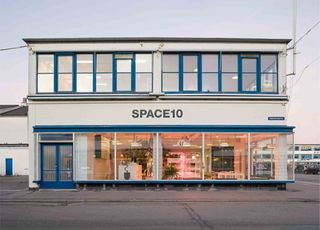
He shares a couple of examples. “Ikea and its innovation lab Space10 projects created 19 inspired desired to reimagine future living spaces, incorporating handcrafted, sustainable materials to ground the futuristic visions in real-world usability and warmth. And Gucci Vault combined digital innovation with vintage craftsmanship, reinterpreting archival pieces alongside futuristic virtual experiences blending the imperfect charm of retro designs with AI-enhanced digital storytelling, challenging traditional ideas of luxury.”
06. Unfiltered reality
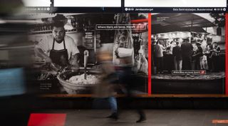
Gavin Finney, creative director at Maverick Media, reckons that 2025 could be a turning point in terms of how the digital world drives us towards images of the ‘perfect life’.
“For more than a decade now, we’ve existed under a disingenuous pact,” he argues. “Life is hard and messy. But we, as individuals and brands, have almost all presented an image – especially on social media – that it’s easy, ordered and perfect. 2025 though, could be the year that brands start to collectively carve out alternative work which turns its back on the overtly curated in favour of the more authentic and relatable.
“Pairing the right client with this raw, deliberately imperfect look – through, for example, collage-style design, or reportage-style film and photography – can capture genuine moments of life, trigger memories and transport viewers to a happy place. Uncommon’s recent campaign for Coca-Cola in Norway is a great example. Instead of the usual glossy vibrancy, they worked with street photographer Frederik Trovatten to capture real snapshots of life in black and white. Even the brand’s inclusion feels authentic, natural and unforced.”
07. Futuristic metallics

In many ways, AI is makes us feel like we’re living in the future. And so it’s not surprising that many of our experts are seeing fascination with future-forward design elements, particularly in typography and colour choices.
“Gen Z and Millennials are driving a heavy metal aesthetic right now,” observes Abigail Baldwin. “This will continue into 2025 with the announcement of Future Dusk as the colour of the year by trend forecasters WGSN and Coloro. The colour is a deep, moody shade of blue with hints of purple and grey. Elsewhere, Dazed Magazine’s Beauty category uses the metal aesthetic for their logo, plus &Walsh are also using the effect for their branding. So I’m expecting in 2025 to see more cool silver tones, bold chrome combined with melty metallic typography.”
08. Bold minimalism
Here’s a trend we’ve been hearing this from a lot of agency folk over the last few months. Moving beyond the extremes of maximalism and traditional minimalism, designers are finding a middle ground.
“Maximalism has touched every aspect of design over the last few years, from The Public Theatre’s bold typographic posters to Burberry’s intricate new logo,” says Andy Harris, joint head of design at M&C Saatchi UK. “Striking colours, patterns and whimsical eclectic design is everywhere. Replacing minimalism’s pared back styling, where less was more, the current ethos has very much been ‘more is more’. But after this sensory overload, what’s next?”
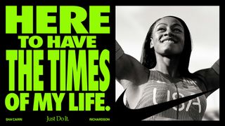
Andy’s prediction is that: “in 2025, we’ll see the next phase of this journey, Bold Minimalism, starting to take over. Simplicity and clarity combined with impactful typography and strong colour palettes; this is minimalism on acid.”
We’re already seeing brands embracing this, he adds. “Burger King’s rebrand at the start of the year is an excellent example, showing how a distinctive pairing of typography and colour in a stripped-back, graphic brand-world can cut through in the marketplace. In August, Nike’s Winning isn’t for everyone launched. Eye-catching, impactful and concise, this campaign cemented Bold Minimalism as one to watch for 2025.”
09. Human-centric design

As technology becomes more prevalent, there’s a growing emphasis on creating designs that forge genuine emotional connections with audiences. As Lucy Harmer, creative director at Bond & Coyne, observes: “Lo-fi, less-polished storytelling techniques, including elements like pop culture references, memes and intentional imperfections, are gaining traction, especially with Gen Z audiences who value genuine connection over perfection.”
She believes this trend stems largely from the way Gen Z consume social media. “They create content in a much less curated way than how Instagram was 10 years ago,” she points out. “And now brands need to catch up with that in order to convey an authentic message.”
Examples of brands doing it right? “Universities are increasingly employing student-led content creators: CCCU and RCA have great organic content,” she notes. “And we’ve seen that forums like Reddit are often some of the most useful places that universities can place their content. In terms of more commercial brands, this Snapchat campaign basically tells that exact story of the shift from perfect to authentic.”
10. Meaningful design
Here’s a trend that we’ve been hearing a lot about over the last 12 months. Brands are increasingly seeking a sense of social purpose. And so, as Lucy puts it: “Mission-driven, holistic design is taking centre stage, as brands aim to create experiences that resonate with audience values and elevate everyday life.”
She explains that meaningful design is not just about aesthetics but about emotional depth and genuine human connection. “It moves it on from lip-service ‘purpose’ and responds to increasing demands from consumers to see businesses ‘walk the walk’ and not merely ‘talk the talk’.”
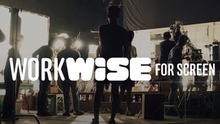
“For example, we worked on a project recently with the British Film Institute called WorkWise for Screen, to create a platform where all kinds of people in the screen sector could learn and be heard. It has been so well received throughout the industry; there was obviously a very strong need.”
Similarly, we’ve been reporting for years on the design industry’s efforts to put sustainability at the heart of their process. But it does seem that recently, a lot more meat is going on those bones. In short, environmental consciousness is moving beyond mere aesthetic choices to influence the entire design process and execution.
Rob Ellingham, experiential creative director at Cheil UK, believes that, “As sustainability becomes an ever-more important consideration, designers will incorporate natural elements like earthy tones, biodegradable materials, and plant-based textures.
“This trend extends beyond visuals and will influence packaging design, print media, and even digital design with an emphasis on reducing digital waste; for example, optimising file sizes,” he adds. “And physical design products, such as packaging and print materials, will increasingly reflect eco-conscious choices with recycled paper, eco-friendly ink, and sustainable design methods.”
Trends to avoid
So far, we’ve focused on trends that our experts approved of. But that doesn’t mean everything that’s happening in the world of design is universally approved of. So to provide a bit of balance, we’ll end with thoughts on trends to avoid, courtesy of Simon Manchipp, co-founder of SomeOne.
01. Colour – pointless graduations
Simon describes this as “The AI language of choice; add a pointless yet mechanically perfect but soulless graduation from green to purple.
“It looks a bit fluffy; it’s conceptually very fluffy,” he explains. “Avoid and instead use colour strategically. Be strong with composition. Where everyone uses dark blue, resist the temptation to follow. And don’t just use red instead.”
02. Typography: Another dull sans serif
“Almost every sector has been savaged by the introduction of bleak and bland sans serif,” argues Simon. “The fashion industry will an age to recover from the wholesale rejection of serifs. Don’t join in.”
Instead, he urges you to: “Add character with your characters. Yes, young people can read serifs. And old people can read them too, even on a screen. And no. They are not too complicated, they actually aid readability. If you need to use a sans for balance, make it one that adds ownability, not strips it away.”
03. Iconography: Craftless creativity
Simplification is usually a good thing when it comes to rebrands. But if that’s all that you do, you’re doing your client a disservice. As Simon puts it: “If you have a visually arresting, meticulously illustrated and ownable symbol in your branding, expect it to be miserably abstracted to a pointless blob, terribly auto-traced (Burberry), or simply thrown in the bin (Jaguar). A travesty. Instead get closer to the history, and make it useful for the brand.”
04. Themes: the obvious
“Too many brands are falling for the utterly obvious,” says Simon. “Just because Apple now uses an Apple symbol does not mean your startup brand called Fire needs to show flames. Brands that are not hyper established and very very rich need more in their bank than the utterly predictable. Be lateral. Stretch audiences imagination. Challenge the norms to stand out, be counted and win.”
To explore some of the best graphic design out there, see the winners of the 2024 Brand Impact Awards.
