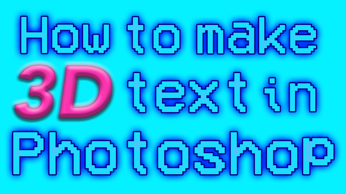
Likely you’ve just come to us after being unable to find the 3D extrusion tool in Photoshop. As of October 2024, Adobe has removed the 3D panel from Photoshop, presumably to encourage us to use Adobe Substance 3D for the editing of 3D files. Substance 3D might be up there with the best 3D modelling software, but that does not help us with creating 3D-effect typography in PS.
This puts us as designers in a tricky situation, as we now need to come up with a new, manual way of making text appear 3D. So you’ll be pleased to know that we can create something just as good as the direct 3D effect in Photoshop. Firstly we’ll show you how to make your text appear 3D using the Effect Controls panel, before finishing it off with some extra tips on exploring Photoshop’s intricate tool options to tailor your 3D typography to your design.
For more on new developments in Photoshop, see our Photoshop review.
01. Create your text layer
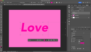
In a fresh Photoshop document, create a new layer. You can do this by pressing cmd, shift and N, and then pressing ‘enter’. Then click on the text tool – the ‘T’ icon in the left-hand side toolbar, drag the mouse across the screen to create a text box and type in your text.
02. Choose your font

A geometric, sans serif font such as Avenir, Bebas or Helvetica is best when first trying this method. If you’re more experienced with using Photoshop, a cursive font will also work. In this example, we’ve gone with Avenir in ‘black oblique’. You can select your font in the box at the top of the screen in the right-hand corner.
03. Create the text’s initial background
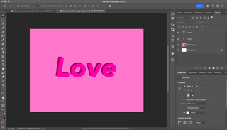
To start adding some depth, you’ll need to duplicate your text. You can do this by selecting your text layer, pressing cmd and C, and then pressing cmd and V. This will come up as an identical layer. You’ll then need to change the colour of the duplicate text to a much darker shade. This shouldn’t be quite black, but it should be close. Then, in the ‘layers’ panel, you’ll need to drag your duplicate text layer underneath the original layer.
To finish off, use cmd and T on your keyboard to transform the layer. This will allow you to move it around. You should move it so that it is convincingly behind your original layer as a shadow would be. You can adjust the angle and distance from the original text depending on how thick you want the final result to look and which direction you want the depth to be in. Press enter when you have finished placing it.
04. Copy the background text’s hex code
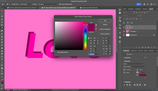
Double click on the second text layer, and then click on the colour ‘fill’ button to bring up the ‘colour picker’ window. This will tell you the exact hex code of the darker colour you have chosen. Select this hex code and press cmd and C to copy it. We will be needing this same colour in a moment.
05. Prep your pen tool
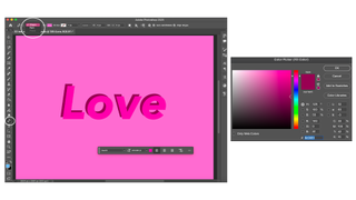
We now need to prep our pen tool. Firstly, select the Pen tool by clicking on the pen icon in the far left tool bar. After clicking on the Pen tool you’ll see a menu appear in the top left-hand corner that when clicked on allows you to choose between the options Shape and Path. Make sure Shape is selected. Then in the colour ‘fill’ button next to it, double click and paste the hex code you copied into the hex code box.
06. Use the pen tool to fill in the gaps
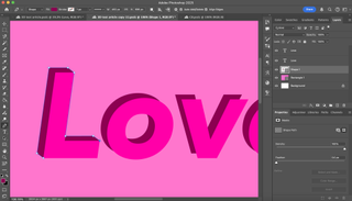
Press cmd, shift and N and then press enter to create a new layer. In the ‘layer’ panel, drag the new layer below the other two text layers.
With the Pen tool, each click creates a new point of a new shape. In your new layer, start by clicking on all the unjoined corners of the first letter to join the two text layers together. This makes it appear as though the text is made out of three-dimensional blocks.
At this point, geometric fonts are easier to work with, but if you are more experienced with Photoshop then you can work with a cursive font. To do this you will need to curve the pen tool’s lines when making round corners. You can do this by holding down ctrl when clicking on a new point.
07. Repeat for each letter
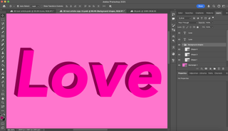
Repeat the same method for each letter, creating a new layer for each one. Once you are done, hold down shift and click on all your shape layers. This will select all of them. Click on the Options button in the right-hand corner of the layers panel. This is the icon formed of three small horizontal lines. Here you will see a drop-down menu. From here, select the option, Create new group from layers. Name the group ‘background shapes’ and press enter. All your shapes are now contained in a group that can be hidden or collapsed to make your layers more organised. They can be hidden or collapsed by clicking on the small arrow in the left-hand corner of the layer group.
08. Add an embossment effect
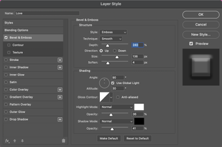
Now we need to return to our original text layer. Double clicking on this layer will bring up the Effect Controls panel, which allows you to add and adjust effects on that specific layer. Select Bevel & Emboss and set the adjustments to those below.
Style: Emboss
Technique: Smooth
Depth: 240%
Direction: Up
Size: 136 px
Soften: 4 px
Angle: 90°
Use global light: Ticked
Angle: 30°
Anti-aliased: Unticked
Highlight mode: Normal
Opacity: 36%
Shadow mode: Normal
Opacity: 41%
The adjustment options will appear in this same order.
09. Add an inner shadow
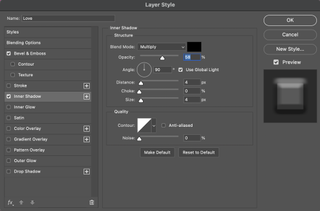
Add an inner shadow to your text layer as well. This will help to create the illusion of internal texture and tone in your text. Set the specifications to those below.
Blend mode: Multiply
Opacity: 58%
Angle: 90°
Distance: 4 px
Choke: 0%
Size: 4 px
Anti-aliased: Unticked
Noise: 0%
The adjustment options will appear in this same order.
10. Add an inner glow
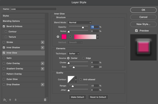
Add an inner glow effect as well. Create a colour darker than the text’s main colour but brighter than the background text. This will give your text an internal shine that makes its edges appear rounder. Click on the colour fill in the Inner Glow panel and paste the hex code of your darker colour into the hex code box. Set the rest of the specifications to those below.
Blend mode: Normal
Opacity: 73%
Noise: 0%
Technique: Softer
Source: Centre
Choke: 0%
Size: 51 px
Anti-aliased: Unticked
Range: 22%
Jitter: 0%
The adjustment options will appear in this same order.
11. Add the Satin effect
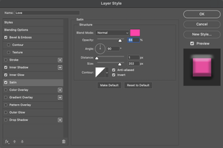
Select the Satin effect. Keep the blend mode as Normal and keep the colour as it already is. Set the rest of the specifications to those below.
Opacity: 84%
Angle: 90%
Distance: 1 px
Size: 202 px
Anti-aliased: Ticked
Invert: Ticked
12. Add a gradient overlay
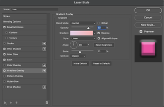
Now you will need to add a gradient overlay, but it is important to choose the right gradient. It usually works best to pick a colour within the colour family of your text, but on the opposite tonal side. As the text in our example is dark pink, we have chosen a light pink gradient to complement it. The gradient overlay will be subtle but will help create variation that makes your 3D effect convincing. Set the rest of the specifications to those below.
Blend mode: Normal
Opacity: 77%
Reverse: Ticked
Align with layer: Ticked
Style: Linear
Angle: 90°
Scale: 71%
Method: Classic
13. Add an outer glow
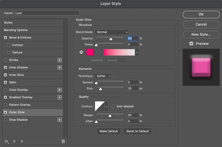
For your penultimate effect, you can add an outer glow. This is optional depending on the tone of the typography you are creating, but it can help to make it stand out if the text is against a darker background. You’ll need to make the outer glow a darker tone of your text colour, which you can do in the colour fill box in the Outer Glow adjustments panel. Set the rest of the specifications to those below.
Blend mode: Normal
Opacity: 53%
Noise: 0%
Technique: Softer
Spread: 0%
Size: 25 px
Anti-aliased: Unticked
Range: 50%
Jitter: 0%
14. Finally, add a drop shadow
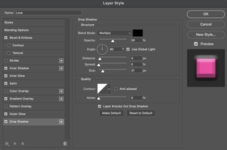
For the final touch, add a drop shadow. Keep the colour of the drop shadow black, and set the opacity to 50%. Play around with the Distance and Range to find out what works best for the tone of your typography. Once you’re done, click Ok or press Enter.
15. Explore and adjust
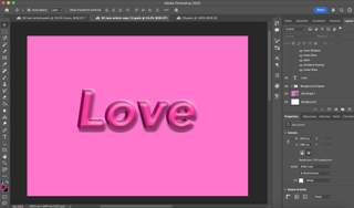
You’ve now created your 3D text! Now that you’ve got to grips with some of the effect options available to you in Photoshop, have a play around in the Effect Controls panel and explore more options for your typography. As artists, all our best creations are made from exploring unfamiliar territories, so explore the effects we’ve touched on in this article that you might not be as familiar with and adjust some of the specifications until you create something unique.
Now that we’ve just given you the tools to create 3D text, it’s your job to play around with it until you get something completely yours that works best for your design.
For more on typography, see our typography of the decade series.
