The Kansas City Chiefs logo has change a lot over the years, even by the usual American football standards. The team was founded back in 1959, and the logo is instantly recognisable, even many who don’t follow the NFL too closely.
That’s partly because of the Chiefs’ tight end Travis Kelce due to his relationship with superstar singer Taylor Swift. As a result, the team’s current logo is being seen more frequently. But what was the original chiefs logo? Let’s take a look back in time and find out.
For more American football logo inspiration, see our pick of the best NFL logos of all time. You might also want to see our guide to the best logo designers if you’re looking to create a logo of your own.
The first Kansas City Chiefs logo: 1960-1962

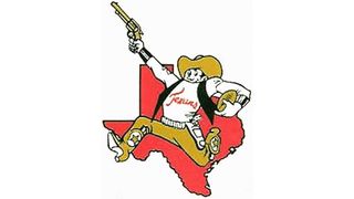
What was the original Chiefs logo? It was a gun-toting cowboy with a red map of Texas in the background. The first Kansas City Chiefs logo was designed by cartoonist Bob Taylor back in 1960, a year after businessman Lamar Hunt founded the team. Wait, but is that the wrong state? Nope, at the time, the team was based in Dallas and was called the Dallas Texans.
The characterful and highly detailed Texas cowboy is wearing a hat, cowboy boots and a T-shirt that says ‘Texans’ on it. He’s also carrying a pigskin football in his left hand. Originally, Hunt wanted the team’s colour scheme to be orange and Columbia blue, but he ultimately went for gold and red after the owner of the Houston Oilers picked orange and Columbia Blue first.
It was a fitting logo for the team before they relocated and changed their name, with the map of Texas and the cowboy making it clear where the team was based and the red and gold colour scheme symbolising strength and success.
The loincloth Kansas City Chiefs logo: 1963-1971

In 1963, the Dallas Texans relocated to Kansas City, Missouri. Hunt thought about keeping the team’s name, but Jack Steadman, who was the team’s general manager at the time, persuaded him to change it. They settled on the Kansas City Chiefs, in honour of Harold Roe Bartle, mayor of Kansas, who was also known as The Chief.
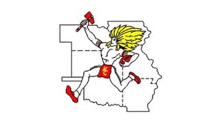
Taylor designed the team’s new logo, too, although he kept some of the compositional concept of the first design, replacing the individual elements. The cowboy was swapped out for a Native American man, who is running with a tomahawk rather than a gun. Likewise, the red map of Texas in the background was swapped for a white map of Missouri and some of its nearby states.
The loincloth has the letters ‘K’ and ‘C’, and the man is holding a pigskin football like the gunslinger in the first logo. The colour red still plays a part in this logo, although it’s a more vibrant red than in the previous iteration. The team still use the same red six decades on.
However, it’s a logo that hasn’t aged well, particularly in an era when teams like the Washington Redskins have changed their names due to accusations of racism against Native Americans.
The stripped back Kansas City Chiefs logo: 1972-present

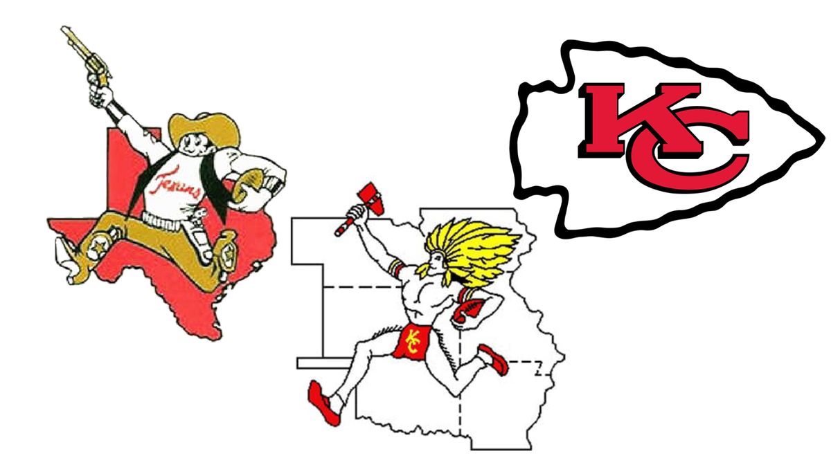
In 1972, a huge logo redesign was undertaken, completely transforming the team’s main symbol. The Native American man disappeared and state outline was replaced with a much more simple, stripped back logo design, although it retained a slightly comic-book look thanks to the hand-drawn look of the outline around the arrowhead.
Hunt reportedly designed the logo on a napkin on a road trip back to Kansas City. He took inspiration from the logo of the San Francisco 49ers, and the interlocking ‘S’ and ‘F’, which sit inside an oval. But rather than an oval, the ‘K’ and ‘C’ of Kansas City sit inside an arrowhead – the team play at Arrowhead Stadium, and have done so since 1972. This is the last aspect of Native American imagery that remains in the current logo.
The sans-serif font Hunt used was original, with his hand-drawn letters still used in the logo today. There’s almost a 3D effect due to the bold black outlines around the red lettering.
The logo was first used on the team’s helmets during games, before it was promoted to the overall emblem used by the team. It differs from the team’s previous two logos, but the minimalist design works well – it does what it needs to do, and over the last 50 years it’s become very recognisable. Sometimes, less really is more.
For more sporting logo histories, see our Miami Dolphins logo history, the history of the Philadelphia Eagles logo and the NBA logo history. You might also want to see the story of the 2025 Super Bowl logo.
