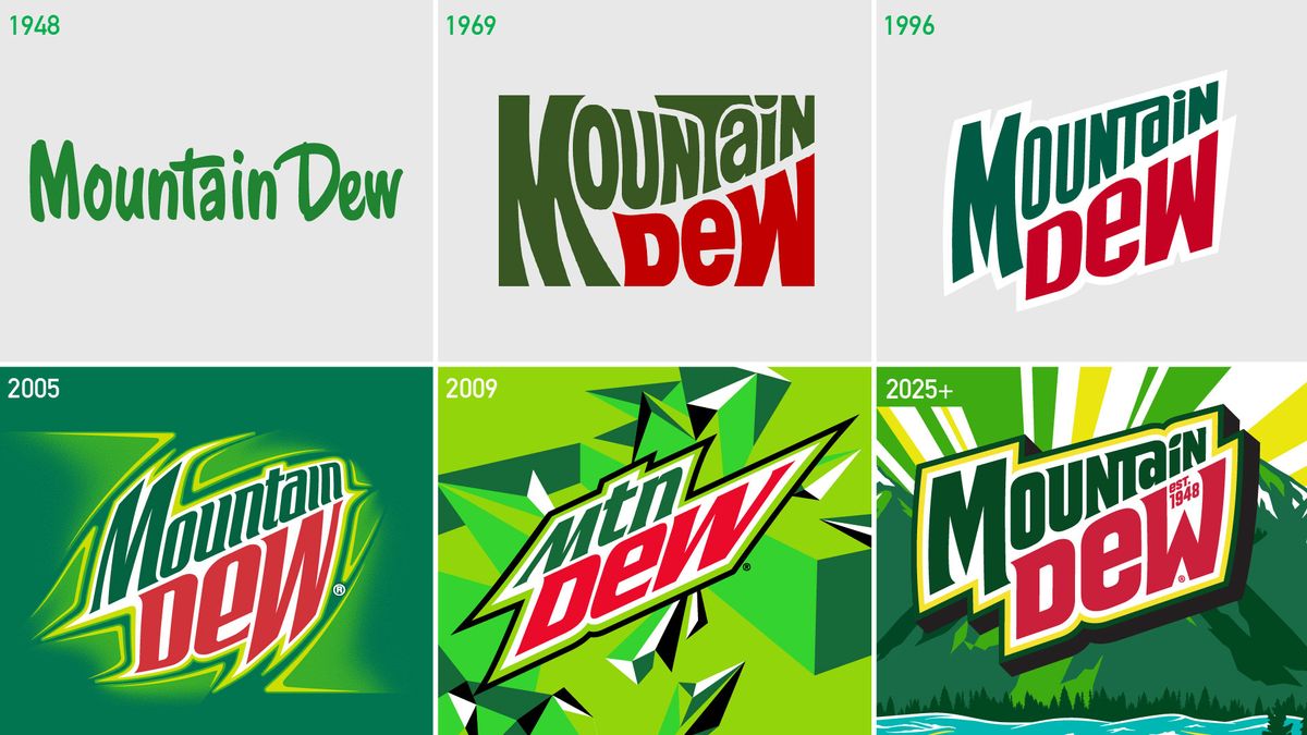
While flat design and sans serif wordmarks have dominated previous years, we’re officially in the era of the retro logo. Brands left, right and centre have been taking a leaf out of their own history books when designing ‘new’ logos, unveiling designs clearly based on their heritage branding. And the latest to adopt the trend is Mountain Dew.
Going back to its roots, the soft drink brand has not only introduced a nostalgia-tinged rebrand, but also a return to its original name. Previously stylised as ‘Mtn’, the full ‘mountain’ is back – as are the basics of a logo design from 1996. (Looking for design inspiration? Check out the best logos of all time.)
(Image credit: Mountain Dew)
“Born in the mountains, the distinctive citrus flavour of Mountain Dew propelled the brand to become a global cultural phenomenon, giving us a rich history to lean into as we reimagine the next 75 years of the brand,” shares VP of marketing at Mountain Dew, JP Bittencourt. “Mountain Dew is reclaiming the mountain with a new logo and visual identity that is synonymous with adventure, celebrating the great outdoors and embracing the “DO THE DEW” spirit.”
(Image credit: Mountain Dew)
“With this new visual identity, Mountain Dew is reclaiming its legacy with a timeless look designed to elevate both the physical and digital spaces the brand adventures in,” adds SVP and chief design officer at PepsiCo, Mauro Porcini. “We’re excited for fans to see the new Mountain Dew, which includes an updated logo that embodies the brand’s origins, a sunny refreshed colour palette, and graphic outdoor landscapes unique to the Mountain Dew flavours.”
And it seems the return of the mountain is already going down a storm online.
Pepsi’s officially putting the “Mountain” back in Mountain Dew with a rebrand next yearNature is healing pic.twitter.com/xFExIa99GYOctober 9, 2024
Good, I never liked the MTN nonsense https://t.co/4wZGFbVpX2October 10, 2024
(Image credit: Mountain Dew)
From Burger King to Burberry, plenty of brands have brought back old brand assets in recent years. And Mountain Dew isn’t even the only PepsiCo brand to do the same – one of the most notable of the bunch is Pepsi’s own retro revival.