Publisher Amazon Games
Developer Amazon Orange County
Release 15 October
Formats PC, PS5 Xbox Series X/S
Amazon Games’ New World: Aeternum is a unique pitch; the online RPG offers a fantasy world inspired by history’s greatest civilisations and most iconic cultures, with remnants of the Roman Empire rubbing alongside architecture and biomes inspired by Japan, Roman and Medieval Europe, as well as the jungles and bustling ports of the Caribbean.
We went behind the scenes on the original release of New World for PC back in 2021, now Amazon is releasing its massively multiplayer online RPG for PS5 and Xbox, with an huge update for PC, in the form of New World: Aeternum, which sees the previous release merge with the new, resulting in an extensive visual overhaul and the creation of new, original designs.
Below art director Charles Bradbury and associate art director Rosie Strzalkowski from Amazon Games Orange County explain the work that has gone into creating New World: Aeternum’s environments, and how the game’s unique blend of influences has resulted in something truly original.
What were the main artistic and historical inspirations for the environments?
Rosie Strzalkowski: For the most part, the cultural themes and biomes in Aeternum were primarily influenced by real world cultures and regions. This gives us a foundation to tell the story we aim to tell, but our goal is not historical accuracy, so we don’t hold on too literally. The most important aspect for us is to create a sensory experience for players that goes beyond what their eyes see on the monitor to engage their emotions.
We also strive to remain consistent to our art style, reinterpreting and transforming the inspiration to fit the Aeternum aesthetic. This method gives us a rich tapestry drawn from the real world for both the art style and the lore while remaining distinctly its own.
The Legion theme, for example, draws inspiration from the Roman Empire, especially its constructions in the Middle East, such as the temples found in Baalbek and Jerash.
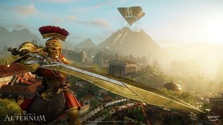
In another location within Brimstone, we were inspired by Egyptian architecture, with the prominent pyramid visible as a visual landmark across the entire region to let players know where they are at all times. We felt there was a risk of the enormous desert space getting repetitive so we created different and memorable desert biomes and themes within the desert to keep players engaged and situated.
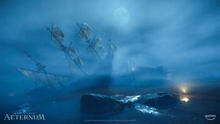
We also want to make sure that new regions feel distinctly different from existing ones. Ideally a player should know which region they are in by looking around at the environment. Regions within the map have their own distinct colour combinations, lighting, temperature, shape language and framing. For example Brimstone Sands is hot, bright and wide open, while The Cursed Mists portion of Cutlass Keys is cool and atmospheric.
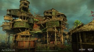
The lore and narrative, as well as the gameplay, also significantly influences the art throughout Aeternum. The Cursed Mists area, for example, is a PVP area that tells the story of lawless pirates who are hunting hidden treasure and guarding it at all costs. This backdrop is reflected in the architecture, which is ramshackle and haphazard, hastily built for defensiveness, with many concealed spaces for hiding.
Because the Citadel within Cutlass is perched on the cliffs, its architecture drew inspiration from real world coastal cliff settlements like Oia in Greece. This design not only influences the aesthetic, but in very practical ways it also provides more vantage points and hiding places for a better PVP experience.
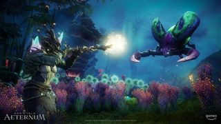
Elysian Wilds presented a different narrative than the rest of the game. The concept revolves around the organic takeover of the existing environment by the biome itself. To begin visualising this theme we began with keywords such as “Otherworldly” and “Sea creatures.” The shape language draws inspiration from Miyazaki’s Nausicaä of the Valley of the Wind, but is reinterpreted to align with the Aeternum aesthetic.
What was the workflow or process for creating the environments?
Rosie Strzalkowski: The workflow for creating environments begins with a series of meetings to establish game play goals that prioritise player enjoyment, while still considering the team’s capabilities and time constraints. Once we reach a consensus, designers start identifying high-level ideas to shape gameplay, such as what gimmicks will be used, the intended flow through the region and how players will interact with the space.
During this phase, the narrative and lore team comes up with a story and the specific beats that they want to hit. Meanwhile the art team establishes high-level ideas for visual inspiration and begin gathering reference and assembling reference boards that capture the essential aesthetics for the look and feel. These boards visualise the vibe of the area for the whole team. We then create concepts that establish mood, shapes, light and colour, etc. as well as the key architecture pieces.
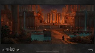
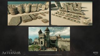
Once the conceptual phase is complete, the modelling team can dive into creating the new 3D assets. They collaborate closely with the world builders to make sure they create every necessary modular piece at the right metrics for players to interact with.
As the Modelling team is wrapping up building the assets, the ‘Worldbuilders’ begin composing points of interest (POIs) into engaging play experiences. They compose these spaces to enhance player exploration and interaction, along with a sense of awe, all while keeping the space performant for various platforms.
Throughout this process, play testing becomes a big priority. The team conducts testing at various stages to gather the feedback they need to iterate and tune the play experience.
What makes a good game environment?
Charles Bradbury: This one is tough to answer briefly, every game is different with unique gameplay and goals that vary wildly. Speaking in very broad terms, a good game environment is any space that offers a unique or meaningful experience for players through the gameplay or story that the space offers to the player.
Even within New World: Aeternum that could be very different, depending on which area of the world the environment is in and the goals or intent for that particular space. We do have guiding art pillars as high level touch stones for the art overall, to ensure we’re putting focus on the right things to enhance the player’s experience and make sure the game world all fits consistently across all areas.
We pursue bold and dramatic visuals, while trying to maintain a believable and grounded world
Art director, Charles Bradbury
Diving into some details, we try to build spaces that offer players a sense of exploration and discovery, reinforcing the vast supernatural world of our setting on Aeternum. We seek to show evidence of the craftsmanship in all our non-nature assets – showing within the lore who built a thing and why, across the various historical cultures and various NPC factions.
We pursue bold and dramatic visuals, while trying to maintain a believable and grounded world. We want to ensure the space enhances the game play and is in harmony with it in every aspect.
Lastly we seek to ensure everything tells a story: from small simple stories like a knife and half-eaten bit of cheese discarded in an abandoned farmhouse, to large scale stories of the cataclysmic forces of corruption breaking the land of an entire zone apart. There are thousands of other narratives woven in between reinforcing the various quests and narrative themes throughout the game. If nothing else we hope every space big or small offers something visually to the player to discover, and take in a kernel of the wider story of the game world overall.
As a game environment artist what key things do you consider before you’ve even put pen to paper (tablet?)?
Rosie Strzalkowski: We focus on several key aspects. First we have to establish the theme, the biomes and where on the map the new space will be placed and how all of this aligns with the story we are aiming to tell and how it will inspire a sense of adventure and fun for players. For example the New Cutlass area is a full PvP and PVE region where players engage in combat with each other and the AI. We think about how the players will use the environment to their advantage, both taking cover and challenging them with wide open spaces.
We identify the key words that capture the theme and distill it into simple concepts that we can wrap our heads around. New Cutlass Keys Citadel for example – the key words are “Ramshackle”, “Lawless” and “Patchworked Shanties Teetering on Rocky Cliffs”. With these guiding sentences in mind we gather visual references that inspire the design. These could be anything from literal patchwork quilts, to deteriorating fishing nets, and the stacked architecture of the Caribbean and Greece.
We put together the images that embody those words with their forms, lights, colours, mood, atmosphere etc and we call these “ref boards”. Each section of the ref board embodies one of the foundational visual goals, from atmosphere to colour palettes, biomes and shapes that resonate with the theme.
At times developers have to be magicians, using the technology to trick the eyes and capture the desired feeling we want without being overly literal or obvious
Associate art director, Rosie Strzalkowski
On the other side of things we consider how the theme can impact performance. Creating awe-inspiring environments while maintaining optimal performance is a big challenge. For instance, if those vertically stacked shanty towns are dense with polygons and unique materials all casting shadows, combined with long lines of sight, they could negatively affect the frame rate. At times developers have to be magicians, using the technology to trick the eyes and capture the desired feeling we want without being overly literal or obvious. It’s sometimes a delicate balance.
Additionally, we examine how the theme will impact gameplay. For example, if there are a lot of vertically stacked shanties, we think about how players will access those vertical spaces. Will that be fun to play in? Will it enhance the PVP experience?
Which environment in Aeternum has taken the longest to get right, or which aspect has been the most debated?
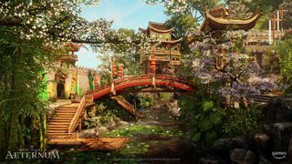
Rosie Strzalkowski: One of the environments in Aeternum that was very challenging to get right was the Ebonscale Reach style, inspired by Chinese architecture. After exploring our initial European Tudor style, we really wanted to create something distinct and unique, reflecting the diverse cultures in Aeternum’s lore. Our goal was to celebrate and include these source cultures without falling into stereotypes, all while ensuring consistency with the overall aesthetic of Aeternum.
This proved to be quite a challenge, particularly for those of us who aren’t deeply familiar with the architectural norms and cultural styles of those countries. We did a lot of research and sought feedback from various team members, including our geopolitical team. Navigating this complex cultural landscape required collaboration and respect to achieve a well-rounded representation, making this aspect one of the most debated and time-consuming in the development process.
How does lore and story influence an environment’s design?
Rosie Strzalkowski: For players to feel an immersion in the game, it’s important that the story and the environment are aligned in simple, intuitive ways. That means that the Lore and Art teams need to be closely aligned.
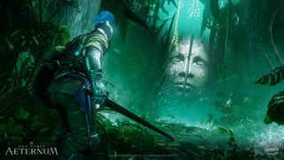
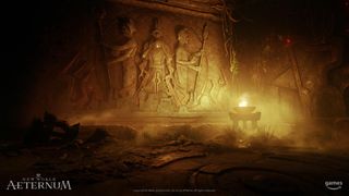
On Aeternum we start washed up on the shores with the idea that this is Paradise Lost, the realm of all mythology. It’s Eden, it’s Atlantis, it’s Shangri-La, and you can see this in the mystery and majesty across the world. The player has their own time period, but for each region and culture the art team needed to drill into foundational areas of lore to ask questions and make suggestions based on what we think will look good visually and be most achievable. For example, we knew we wanted to create ruins for players to explore, but we also had to define who built them, what building materials and tools they used. Who are these Skeletal Warriors that still guard the ruins?
They obviously didn’t build them because the ruins are too massive. Answering these questions and fostering an ongoing dialogue about each section of the world is something we’re always working on. This allows the artists to add flourishes and lore secrets that hint at what purpose the ruins once served, and it allows narrative designers the opportunity to develop a story that flows naturally in the world as the player travels.
What game engine do you use, and does it have any clever features or tools that make your life easier?
Rosie Strzalkowski: We use a proprietary in house engine called the Azoth Engine. This engine provides advanced features like real time dynamic global illumination, eye adaptation, HDR lighting, screen space ambient occlusion, as well as many other features that all contribute to Aeternum’s immersive quality and visual appeal as an AAA game.
Our Worldbuilders leverage the Azoth Editor to quickly build and test Points of Interest (POIs) as they work. This process is crucial for ensuring the POIs are both fun and cinematic, while maintaining good performance.
The Worldbuilders are a unique type of environment game artist/level designer hybrid that excel in level layout, composition, player flow and visual storytelling elements.
One of the greatest things about the Azoth Editor is that the Tech team is part of the Aeternum team, allowing Worldbuilders to work directly with programmers to get the features and tools they need. When we needed to focus on optimization, they gave us tools to visualize which areas to focus on. When we needed changes or additions to the tools, they are right with us to adapt tools to our workflows and collaborate on solutions.
What role does lighting and VFX play in bringing an environment to life?
Rosie Strzalkowski: VFX is probably best described as the candles on the cake of environment development. The effect is rarely the center of attention, but adds an atmosphere and a polish to the environments, without which players would say, “I can’t put my finger on it, but something just doesn’t feel right.”
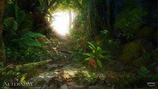
Without VFX environments can fall flat, and feel stale and lifeless. VFX add movement such as dust and leaves, flickering lights, smoke, insects, weather, gurgling brooks, raging waterfalls, and much of the moving or shiny polish that can breathe life into a beautifully crafted but immobile environment. A beautiful environment can exist without VFX, but when complemented by VFX, a beautiful world becomes stunning.
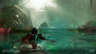
Lighting, and the resulting shadows, involve elements that evoke mood, create the illusion of depth on the flat monitor, and hint to players what they need to do. Lighting will absolutely make or break the visual quality of an environment. Without it, players would not be able to even see the three dimensional shapes, and everything would be flat like a cartoon, or just look very confusing.
Lights also affect the colours of an environment which in turn affects the feelings that players have while they are within it. Orange and yellow tones can create a feeling of excitement and adventure, Reds can create a feeling of danger, while green can evoke feelings of renewal, and hope, and Blue colors can make a space feel cold and melancholy.
Because lights and shadows are expensive to render, Worldbuilders always have to be careful to place them well and use them with purpose.
How does collaboration work at the studio?
Charles Bradbury: Collaboration is critical to just about everything we create. Like most artistic endeavours, each environment is a team effort with many many parts, without any of which it would not be quite as impactful or successful as it is.
We are constantly building on and adding to the foundation of what we’ve already created. We have a lot of development process we use, breaking down our various efforts into steps and tasks that artists, designers, engineers etc all undertake. Tools like the art or game pillars help to guide us in where to focus and ensure what we build aligns with the overall vision for the project.
Our team is also very open discussion focused in how we plan and decide what we work on. Like any team we have a hierarchy with leaders and vision holders, however we believe good ideas can come from anywhere and quite a number of visual easter eggs that players remember, or features players love, came up through collaborative discussion and “ah-ah” moments along the way.
Has designing for New World changed over the years since launch?
Charles Bradbury: Over the course of the project, through our initial PC launch and soon releasing New World: Aeternum, we’ve definitely learned a lot. On the art side, we’ve been able to receive a massive amount of feedback.
We can look at data about what things have resonated with players as well as how players act in game; where they spent time or struggled. We’ve also found that players themselves are very diverse and what one group of players gravitates towards may be different than another group. It’s been eye opening in some cases, things we expected or didn’t anticipate. Our tools and processes also have evolved quite a bit over the course of the project.
One area where we’ve learned a lot is in how we define and build our spaces. Early on we started very broad, as we had lots of ideas about the game world overall and all the various landmarks and areas the player might go.
We laid out the overall world map very early, in very loose brush strokes. We planned out a lot of our early art sets, but the game itself was still evolving, so there was a lot of guesswork about what we’d need to make and how to go about it. We created a ton of great assets, but it was like a giant box of Legos with lots of cool pieces, and it took us a while to figure out how best to put it all together.
As we built new areas of the world and started to focus more on the specific mood, biomes and cultures we wanted to create, we got more efficient at knowing the kinds of sets we’d need ahead of time, and could focus our time more where it mattered and where players would notice. As artists we tend to fixate on every detail, wanting to make sure it all looks the highest quality, but some things players just don’t notice or won’t spend time looking at, so we’re better putting more of our energy where it will matter to players.
We also improved how we can tell stories in our game world, learning ways we can set up the environment to present and reinforce the story that we want to tell. With New World: Aeternum, we took the opportunity to completely redo our introduction to the game. We treated this as a chance to make an environment that would encapsulate and hint at many of the wider themes, both visual and storytelling, that the wider game had to offer later. From the narrative and visual side, we also wanted to start the game off with more of a bang and dramatic introduction.
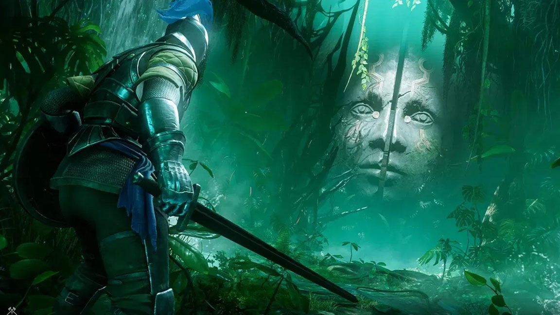
We also took this release as a chance to raise our visual bar across the game, with many little polish touches all over, as well as further optimising the experience for consoles without sacrificing visually – which forced us to make a lot of behind the scenes changes to how things are set up and built. The dramatic flaming ship crash and lush jungle ruins in the new intro level is just an early taste of all the various spaces and visuals that Aeternum invites players to explore.
Visit the New World Aeternum news site to keep up to date on Amazon Games’ new release. If you’ve been inspired by the team’s work and want to create yourself, read our guide to the best digital art software and best drawing tablets.
