From big impactful slabs to childlike Y2K icons, the 2000s was a decade that welcomed desktop publishing and DIY documents. The availability of font design software along with an increase in type design-specific courses were helping guide new designers in the world of both printed and digital words, which in turn led to a greater array of independent foundries popping up in subsequent years.
As type designer Jeremy Tankard, says: “Typography, which had become the dull part of many graphic courses, was now ubercool… [These courses allowed designers to become] attentive to the nuances of type and also allow those with greater potential to look deeper at visual language, ask questions, pose questions, and push for more.
Explore more iconic typography through our best typography of the 2010s article, and the rest of our typography by decade coverage.
01. Gotham
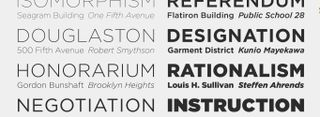
A leader in the type world for the 2000s, as picked by multiple designers we spoke with, was Gotham, designed by Tobias Frere-Jones with Jesse Ragan and released through Hoefler&Co.
“Gotham quickly became a staple for its geometric yet friendly appearance when published in 2000,” says Abigail Baldwin, director at design agency Buttercrumble. “It was originally commissioned by GQ magazine, as the editors wanted a sans-serif with a geometric structure that conveyed a modern, masculine, and fresh look for their publication. GQ sought a font that would provide a combination of novelty and established credibility, giving the magazine a trustworthy and contemporary voice, according to Hoefler (type designer).”
Jessica Strelioff of Goodside Studio also picked the typeface as an icon of the decade. “Gotham really became popularised in 2008 when it became the brand typeface for Barack Obama’s presidential campaign. And for good reason: it’s a workhorse typeface, yet friendly and approachable, rooted in tradition yet modern.”
Gotham was also a top choice for Laney Lynn, senior designer at Team: “During this decade, we started to see visual trends move away from the eclectic, blob-y skeuomorphism that y2k is so well known for. The new dominating trend was a flat, minimal reinvigoration of early 20th century Americana. As such, Gotham, a geometric sans serif became the workhorse of the decade. It was inspired by architectural lettering from mid-century New York City, and captures the innocuous but authoritative nature of signage and engraved lettering. It is easily one of the most influential and widespread contemporary typefaces.
Summing up nicely with “When in doubt – Gotham”, Adam G, co-founder and creative director of LA-based design studio TRÜF, believes Gotham is here for the long-haul. “If the 90s were about grunge and ripping things up in a creative, dynamic way a la David Carson, the 00s were kind of a return to minimalism, cleanliness and order. If we had to sum up type design in the 2000s with one font it would be this one. A geometric sans-serif that is so widely used that there really isn’t anything in global pop culture that it hasn’t been a part of. Of course, there’s backlash to designers using it now just as there was backlash to the ubiquity of Helvetica but we don’t care. We love it. We’ll use it forever.”
02. Comic Sans
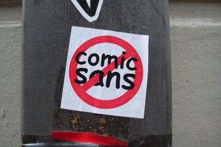
Next up, a classic Marmite font. But, love it or hate, Comic Sans is certainly an icon of the era. Although it was originally released in 1994, Terrance Weinzierl, creative type director at Monotype, selected it for this list given that it was “peaking from the desktop publishing wave”, he says.
The playful font, designed by Vincent Connare and released by Microsoft, was inspired by comic book type and aimed at younger users. As it crept onto all manner of documents, from homemade flyers to rudimentary websites, it became a point of derision – and, 30 years later, it’s still met with strong opinions.
“The Y2K aesthetic [was a] micro art movement,” Terrance continues. “Computers were having a huge influence on design and people were leaning into the optimism of new technology, a ‘truth to materials’ if you will. Many things were slathered with digital effects and textures, pointing to maximalism at times, reflecting the explosive nature of the maturing global internet.”
Terence also describes the “hangover of grungy and chopped up serif type styles from the late 1990s”, along with “geometric typefaces during the era, especially CD covers for pop and dance music”, he says. “The TV show Charmed, for example, is a time capsule of fashion, type and digital effects … I distinctly remember a lot of geometric typefaces during the era too. See Alice Deejay’s chunky pixel logo, to pin-point it. Stalwart typefaces like ITC Avant Garde Gothic or FB Agency were still enjoying popularity, while Europol by Ray Larabie of Typodermic used in the 2006 Torino Olympics is exemplary of the time. Sci-fi, and the often tagged ‘techno’ typefaces depicted in it, were big.”
03. Retina
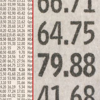
“Retina, designed by Tobias Frere-Jones for The Wall Street Journal’s stock listings, stands out as a defining typeface of the early 2000s,” says Derek Koch, associate design director at brand strategy and design studio Team. “Its key feature was its ink traps – tiny gaps in the letterforms that prevented ink from bleeding and blurring. What began as a functional necessity evolved into a stylistic hallmark, influencing a wave of typefaces in recent years that embrace exaggerated ink traps as a design trend.”
The typeface was first designed for high-density print in order to save WSJ paper (and millions of dollars). The paper commissioned Jonathan Hoefler and Tobias Frere-Jones’s firm Frere-Jones Type in 1999, and Retina was launched the following year. WSJ condensed its page sizes again in 2007, leading to Hoefler & Frere-Jones creating the new typeface Exchange.
04. Impact
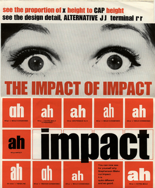
“Fonts in design during the 2000s still had a lot of remnants of the 1990’s aesthetic, such as Curls or the Idiosynoptium font used on titles including Resident Evil. However, I think there was also an increased focus on a cleaner futuristic aesthetic with fonts like Impact,” says Johnny Kotzé, founder of Studio Gummi. With its thick strokes, and compressed spacing it was intended for display design, and therefore not originally released with italics or bold.
“Impact has been used on everything from Call of Duty to ‘I Can Has Cheezburger?’ cat memes. Originally designed in 1965 by Geoffrey Lee, it became part of the Windows 98 package. This all probably helped it become a popular typeface from that era. I love grotesque style fonts and have even created some of my own like Dbl Dagger.”
05. Basic Commercial
“Basic Commercial, as the name suggests, played an important role in the conception of simple, functional, and well-executed ideas,” says Diego Limberti, chief design officer at Soko. The minimal, highly legible typeface was said to have been inspired by the hot metal type era, when the typesetting method for print involved words cast in molten lead, using Linotype and Ludlow machines.
“This digital typeface family was created by [the foundry] Linotype, and is based on the design of [H Berthold A G’s] Akzidenz Grotesk, a font from around 1900. For me, this font is a portrait of good design from the 2000s, where the trends of digital technologies spread across a wide variety of styles and customisations that were not always appropriate and often crossed the line between what was good and what was merely experimental.”
06. LL Akkurat Arabic
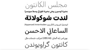
For her choice of the decade, Dina Benbrahim, Moroccan multi-disciplinary creative and founder and director of experimental design programme Hello Departures, has selected LL Akkurat Arabic, distributed by the Swiss Lineto foundry.
“It is a great companion of Laurenz Brunner’s iconic Akkurat,” she says. “[Type designer and historian] Titus Nemeth used the Naskh script to provide a visual interpretation, and, in my opinion, what’s brilliant about it is that it successfully showcases the diversity of the Arabic letterforms in terms of size and proportions.”
Of the typeface, Titus says, “I wanted to avoid an exceedingly modular approach that is prevalent in Arabic low contrast typefaces. Instead, I sought to develop a visual language that makes the Arabic version as usable for continuous text as its Latin companion. To achieve this, Akkurat Arabic draws on the Naskh style, the standard form of Arabic writing for reading. Akkurat Arabic is thus highly rationalised, but its repertoire of shapes, its proportions, and its architecture remain connected to the form of Arabic that is most suitable for text typography.”
07. Freight
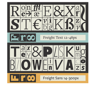
“Designed in 2005 by Joshua Darden, Freight is a typeface that has always caught my attention,” Eleni Beveratou, creative director of typeface design studio, Dalton Maag Ltd. “I remember being introduced to this typeface early in my type design career and my mind was blown by the concept of a superfamily – I was impressed by the fact that a typeface could combine 120 fonts in many weights and styles.”
Freight was inspired by 18th-century Dutch typeface and consists of five distinct families: text, sans, micro, display and big. “The attention to the detail in the letters in each size is reminiscent of the tradition of punchcutting, where different cuts were crafted based on the size they were intended to work at,” Eleni continues. “I love the angularity of the micro style in both the uprights and italics. The exaggerated features in this style ensure they remain visible even in limited space. It’s almost as if a parallel has been drawn between typefaces for small sizes and the exaggerated facial features puppets used so an audience can perceive them from afar. They look extremely elegant and full of character from a distance, but on closer inspection, you realise that this elegance was a trick of the eye.”
08. Change
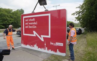
“Berlin is a city of constant change. The name of the city’s previous corporate typeface, Change, designed by Alessio Leonardi, was therefore a perfect fit,” says Ivo Gabrowitsch, founder of Fontwerk, of the font, which was used widely across the city as part of the ‘Be Berlin’ campaign and beyond. “The humanist design – generally popular in the 2000s – also represented the self-image of the capital after the reunification of the two German states. After two consecutive dictatorships that ruled from within the city, Berlin now sees itself as a cosmopolitan, progressive city with a heart, though anything but streamlined.”
“Berliners are self-confident, interested and unique, as far as the diverse lifestyles can be summed up in a few words. All this is represented by Change, with its strong horizontal emphasis, curved diagonals in selected letters, broken stems in the italics as well as the contrasting interplay of angular and round elements. This makes the font look human, lively and unconventional, but not perfect – just like the city,” Ivo continues. As a Berliner himself, Ivo says he was able to identify with the typeface and felt “proud of the courage of the decision-makers to allow ‘rough edges’”. Since the 2020s, the German capital has used Berlin Type, created by HvD Fonts.
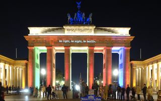
See this type in action in the best rebrands by decade series, and you can use any of these brilliant free fonts to kick start your own projects.
