Accessibility is a pillar of great design – it shouldn’t be an afterthought, whether you’re making a poster, a video, a magazine or a website. When you use a clear, legible typeface, you make it much easier for people to understand and engage with your content.
This doesn’t mean your type choices stop being clever or interesting; nor does it mean you have to spend a lot of money to follow the rules, because there are loads of free sans serif fonts and free fonts for designers that happen to be accessible. You’ve probably used a few of them in projects without realising.
To save you trawling the internet (and getting sidetracked by browsing free web fonts), we’ve gathered the best fonts for accessibility, both free and paid.
What are accessible fonts?

Usually, sans serif fonts tend to be more accessible than those with serifs, but there are exceptions, as our shortlist shows. And, just to confuse you, some fonts specially designed for people with dyslexia haven’t had great feedback from the dyslexic community; meanwhile, fonts like Tiresias, designed with the RNIB, may work well for visual impairments, but too many of its letterforms are mirrored (a problem we’ll explain below), causing problems for dyslexic readers.
“Our findings to date show that no one font works for everyone,” says Rick Treitman, Entrepreneur-in-Residence at Adobe’s Readability Initiative, part of the Readability Consortium. “We process information better when we’re able to read fonts that work best for each of us.”
So what generally makes a font accessible? Here are some key aspects:
- Empty· Distinct characters that don’t mirror each other – it should be easy to tell the difference between each character, particularly no mirroring between letters like ‘b’ and ‘d’ and ‘p’ and ‘q’; people with conditions like dyslexia can see these as interchangeable if they’re too similar. Make them different by varying tails and spurs.
- Variation between ‘impostors’, such as capital ‘I’, lowercase ‘l’ and number 1 – many fonts make these near-identical, which can frustrate readers. Imagine constantly typing a password or username wrong because those glyphs look the same.
- More open counterspace – letters with counters, such as ‘a’, ‘e’ and ‘s’, or numbers like 3 and 6, should have a wide gap between the counter and the rest of the form. Think of it like showing an open door rather than a slightly ajar door. This makes them harder to confuse.
- Decent x-height – a greater difference between the baseline of the text and the mean (average) height of lowercase letters. User-friendly designers aim for a very precise x-height of 68-69%. Basically, avoid squashed or low letterforms. list
01. Atkinson Hyperlegible

Download Atkinson Hyperlegible for free or find on Google Fonts
America’s Braille Institute developed a free typeface for vision-impaired people. It’s named after the Institute’s founder.
Jessica Oddi, a disabled designer, also recommends it: “I’m a big fan of Atkinson Hyperlegible. It has so much information on their website about the thoughtful design and unique characters.”
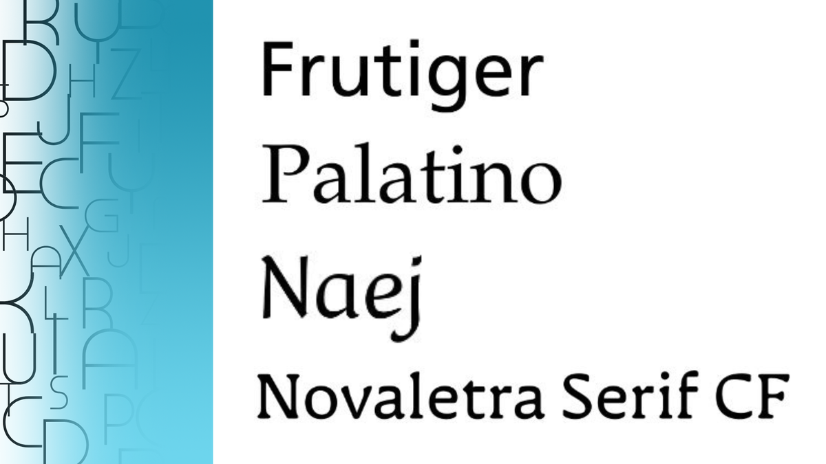
02. Frutiger®

Download Frutiger® at MyFonts from £18
Adrian Frutiger’s classic typeface, published by Linotype, began as a practical font for signs in Charles de Gaulle Airport. Frutiger® was later expanded and completed to work for projects much smaller than airport signage or displays: think book covers and bank notes. It’s also used by the NHS (mainly Bold or Roman).
03. Georgia Regular

Download Georgia at MyFonts from £25
“For older readers, slight serifs such as Georgia produce better reading results,” says Rick Treitman, from Adobe’s Readability Initiative.
Georgia, a Microsoft staple, is a rounded and reliable serif choice with horizontal top serifs that are easier to spot on a large scale or a high-resolution screen. Legibility comes through with choices like higher ascenders (those taller lower-case letters, like ‘l’ and ‘d’) than capitals.
04. Inconstant Regular

Download Inconstant Regular for free
Here’s a project by Daniel Brokstad for Dyslexia Scotland, giving an alternative to the much-hated (but super legible) Comic Sans. There are lots of accessible variability elements you can tweak to make it your own (like variable ascenders and descenders), two stylistic sets, plus the very individual letterforms really stand out, leaning at different angles. Great for posters, tshirts and more.
05. Lexend Deca

Use Lexend Deca for free on Google Fonts or download as open-source
The APA Style Guide says Lexend Deca, part of the variable Lexend font family, is ‘DRD-friendly’ – suitable for people with developmental reading disorders. Inspired by Quicksand, this was designed by an educational therapist, Dr Bonnie Shaver-Troup, working with Google to improve readability. In 2021, it expanded to become Readex, which includes Arabic scripts.
06. Mooli Regular

Use Mooli for free on Google Fonts
Think of Mooli as the whiteboard writing of your favourite schoolteacher, upgraded by woodcarver and type designer Vernon Adams. It’s clear, crisp and friendly, with quirks to separate commonly mixed-up letters. The upwards sweep of the eye for ‘e’ (using a diagonal stroke) is a nice touch. This font would suit family-friendly marketing, like toy packaging or modern museum leaflets.
07. Museo Slab 300

Download Museo Slab at MyFonts from £7, or find on Adobe Fonts
A great slab serif font for titles and headlines, recommended by SiteImprove, Museo Slab was designed by Jos Buivenga at exljbris. There are six different weights in the font family, but stick to the lightest three (100, 300, 500) with counters and apertures open enough for easy reading. It would fit menus, exhibition guides and annual reports.
08. Naej Std Regular

Download Naej at MyFonts from £39.99
A nice humanist font choice for children’s books (its original purpose), with large counters and elegant descenders. Blondina Elms Pastel, its designer, is also a calligrapher. Naej’s Renaissance feel would also suit history-themed events, wedding invitations, or the current fairycore trend: think craft fairs and art workshops.
09. Novaletra Serif CF Regular

Download Novaletra Serif CF at MyFonts from £27
Connary Fagen Type Design developed this as a complete type family, with seven varying weights and Italic versions. There’s an overall nostalgic feel, with rounded terminals, and barely curved shoulders on ‘m’ and ‘n’. Novaletra Serif adapts to many different languages, including Cyrillic, and defines itself in editorial work at any size.
10. P22 Underground

Download at MyFonts from £4 or find P22 Underground on Adobe Fonts
You’ll definitely recognise this digital adaptation of Johnston, the iconic type family used for across the London Underground. Graphic designer Mike Bell uses P22 Underground to make Tube-inspired maps, saying: “it’s the only font I’ve used across all my designs.” It’s not just for Tube enthusiasts, also gracing book covers and business cards.
11. Palatino

Buy Palatino at MyFonts from £47.99
This was designed for Linotype in 1948-50 by the late Hermann Zapf, who also made Dingbats and Optima. Palatino was named after a 16th-century calligrapher. It’s popular for typesetting books, being clear and smart. A modernised version, Palatino Nova, was created by Zapf and Akira Kobayashi.
12 and 13. Sincopa Nina and Sincopa Ella

Download Sincopa Nina and Ella from Adobe Fonts
Sincopa is a three-font family, each named after iconic singers: Billie Holliday, Nina Simone and Ella Fitzgerald. Nina and the bolder Ella are a joy to use, creating movement and ‘offbeat rhythms’, according to designer Fer Cozzi. Try them in music promotions, but save Ella for occasional emphasis.
14. Spencer Light

Download Spencer at MyFonts from £22.95
The Spencer type family was designed at The Northern Block by Sofie Beier, known for her typography books. She named it after Herbert Spencer, a teacher who specialised in legibility at the Royal College of Art. Organic and interesting, the family has 10 variants, including gently slanted italics. It would fit high-end fashion and homeware marketing.
15. Thorngumbald

Buy Thorngumbald at MyFonts from £23
“My approach to accessibility was reducing similarity, symmetry and repetition across characters, giving each glyph its unique identity,” says designer Thom Milson, of Fettle Foundry.
“For example, the lowercase ‘i’ has an upper serif and the lowercase ‘n’ has a sloped upper stem, not the normal flat left edge. Reading is easier at both a distance and small text sizes.”
Clean and minimalist, Thorngumbald would suit magazines or packaging.
16. Verdana

Download Verdana on MyFonts from £29
A stone-cold classic recommended by disability charity Scope, Verdana was developed by Matthew Carter at Microsoft for screen displays. It continues to be used today, even as a default font on Hotmail, and newbie Verdana Pro is also available for Windows 10. However, some letterforms could do with more originality.
Now that you’ve got a sense of accessible type options and the best fonts to try, don’t wait to use them in your next project. The last word goes to Thom Milson, of Fettle Foundry, who sums up why accessible type is so important:
“I believe it’s entirely possible to create something that is both accessible and full of character. In fact, I don’t see how a design can be considered successful if it intentionally excludes people… we have a responsibility to guide our clients towards more informed decisions.”