Typography a powerful tool for communication, and kinetic typography adds another layer to that. Animated typography can really stop the viewer in their tracks. It can engage and delight, and it can tell sometimes quite complex stories.
Typography animations are used in commercial campaigns as well as personal projects, from music videos to homages to a famous lines from movies and explorations of the typography itself. We’ve picked some of favourite examples to provide some inspiration, from music videos to movie tributes and more.
Feeling inspired? Create your own kinetic typography using our pick of free fonts and After Effects tutorials will help you on your way. You’ll find more much type inspiration in all of our typography week coverage.
01. North by Northwest kinetic typography
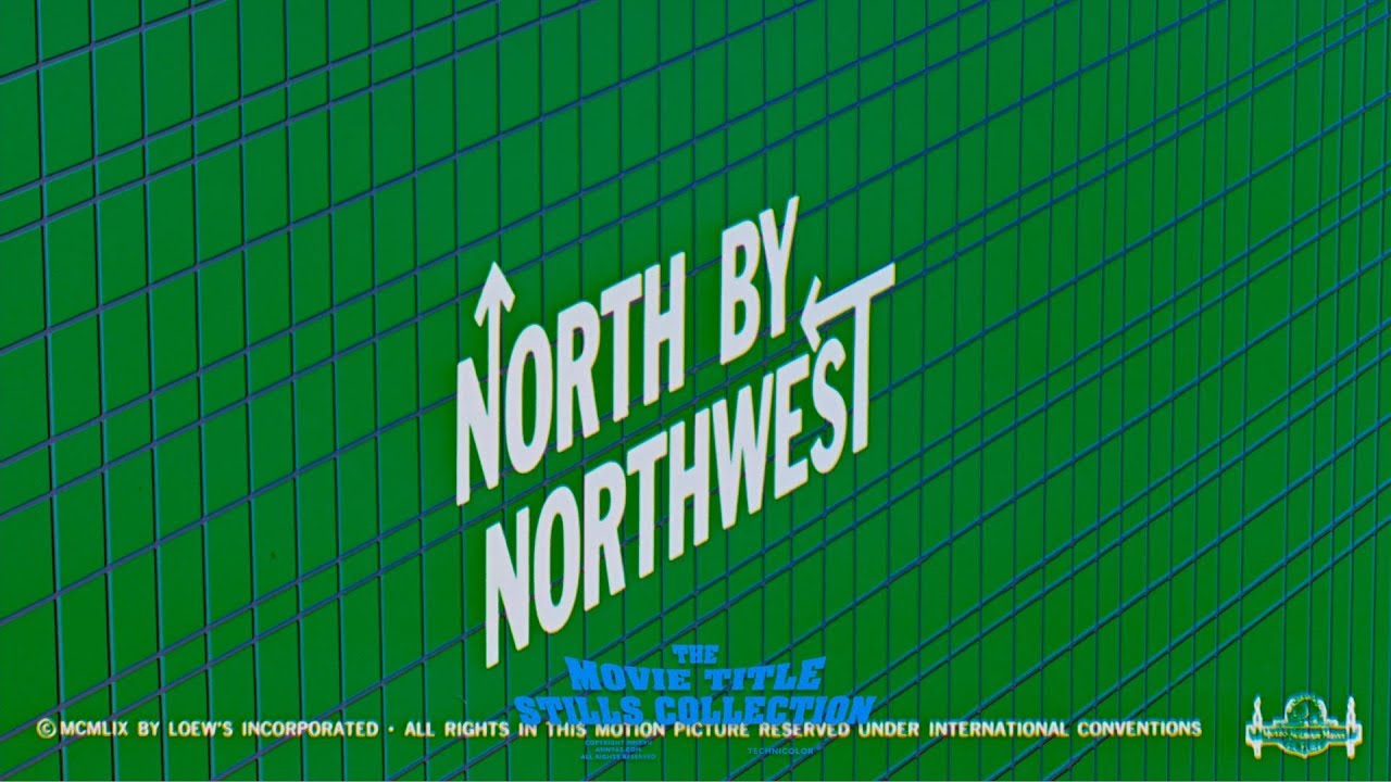
Let’s start where it all began. Kinetic typography isn’t something new; it’s been around for decades. Alfred Hitchcock’s North by Northwest (1959) is often credited as being the first feature film to make extensive use of kinetic typography in its opening titles, and Saul Bass’s work had a major influence on making kinetic typography part of movies – it became a way of keeping viewers’ attentions.
02. The Office
Moving on to how kinetic typography is being developed by contemporary creatives, this piece by motion graphics artist, Stepdraw riffs on a classic moment from The Office (the US version). Including bears, beets and Battlestar Galactica, the timing is spot on as is the personality the sketchy typography lends to the audio.
03. Rick and Morty
The kinetic typography in this video was created by animator/director Gary Motion. Based on TV show Rick and Morty, it’s a total contrast to the above example. It again adds visuals to a classic comedy TV moment, but is flashy and fast-moving. It’s a super slick piece that has some great detail like the diagonally-sliding text, and the varied use of style and colour.
04. McDonalds Drive Thru kinetic type ad
This kinetic type ad from McDonald’s was made during the COVID-19 pandemic to show that it was still taking Drive Thru orders. As in many of the best McDonald’s ads the company made effective use of its corporate colors to evoke immediate associations with the brand. This is kinetic typography at its most simple and effective.
05. The Light in the Dark
Animated and directed by Eli Guillou, this animated typographic piece aims to encourage anyone who feels that they’re lost in the darkness, and to help them find the light in the dark and to move forward.
06. By Your Side
Created by Paulo Manso, a graphic and motion designer from Brazil, this lyric video for Jacob Sartorius’ By Your Side has a lively hand-drawn look to it, with a vivid palette and energetic visual flourishes that are sure to catch the eye.
07. Gill Sans
Gill Sans, created by eccentric typographer and animal lover Eric Gill, is a classic and reliable font that can be found in most designers’ type collections. But how much do you know about it? This motion work by Matthieu Dufour and Carl Soper will set you straight, assuming you speak French.
08. Tina Touli‘s Shifting Symphonies
A post shared by Tina Touli (@tinatouli)
A photo posted by on
No roundup of the best kinetic typography would be complete without mention of Tina Touli, and we could have included any number of her striking dynamic pieces. Shifting Symphonies is series of kinetic typography artworks on the theme of transition created for the main stage projections at the Videocittà festival in Rome. We love how she creates harmony through combinations of hard and soft forms. The piece above was inspired by DNA, but it also conjures up ideas of fluffy marshmallows, giving it a dreamy surreal feel.
09. Coconut Woman
This lively animation by Motion Surfing uses coconut-shaped type timed with the rhythm of the song to to convey personality and energy.
10. From Paper to Screen
This masterpiece was, unbelievably, a graduation project by graphic designer Thibault de Fournas. The animation shows the evolution of typography from paper to screen in serious style. The first half of the video deals with the basic rules of typesetting, before moving on to the use of typography in cinema, with impressive effects running throughout – the tribute to Saul Bass (whose work we mentioned at the start) being our favourite.
11. Language
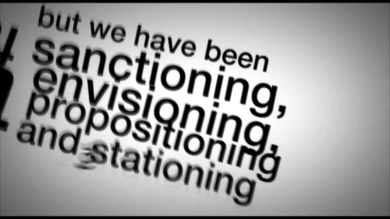
Designer Matthew Rogers is the man behind this kinetic typography animation of the words of British writer and actor Stephen Fry. A fan of this particular essay on language, Rogers decided to make it his first kinetic typography project using a combination of After Effects, Flash and Illustrator.
12. The 10 Commandments
In just under two minutes, this kinetic typography animation reveals the 10 Commandments. The man behind the piece is designer Vit Ryznar, who completed the project using After Effects.
13. Shine a Light
Let’s be frank, this J-pop tune by DJ Takuma featuring Angella Guistini is pretty forgettable, and we imagine the lyrics were sugary nonsense even before they got translated from Japanese. But the vibrant typographic video by Bait makes everything better.
14. Childline: First Step
Ad agency YCN Studio collaborated with LA-based production company Buck on this powerful animation, which encourages children to talk about and report sexual abuse.
The video promotes the services of UK-based, confidential, free, 24-hour counselling service for children, Childline. Following a conversation between child and advisor, the four-minute animation uses kinetic typography and abstract art to get its message across. It’s by no means an easy issue, and we think YCN Studio and Buck have done a sterling job at covering it in a powerful yet sensitive way.
15. Breaking Bad
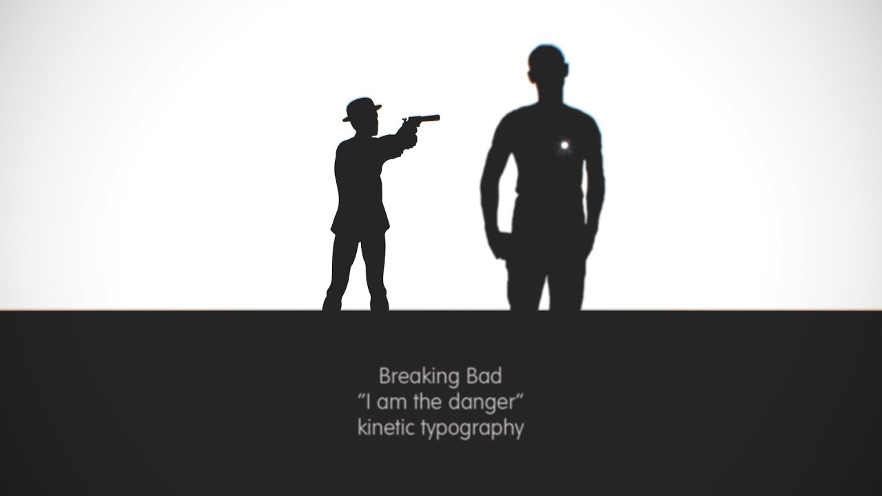
American TV show Breaking Bad has won multiple awards since it first aired back in 2008. Which is hardly surprising when it includes brilliant monologues like ‘I am the danger’, in which school teacher-turned-criminal Walter White convinces his wife that he’s a dangerous man, capable of striking fear into hardened criminals.
Graphic designer, illustrator and animator Paul Cooper decided to pay homage to the infamous scene using kinetic typography. He visualises the intense scene through a series of black and white illustrations and text, all cleverly timed to each character’s lines.
16. The Hush Sound – Lions Roar
Part of a two man team, designer Mig Reyes worked on this typographical motion graphic piece to The Hush Sound’s Lions Roar song. Heavily inspired by motion graphics studio MK12, the duo used After Effects to time the song’s lyrics to the brilliant typography and graphics.
17. Procrastination
This trailer for David McRaney‘s international bestselling book You are Not So Smart uses cleverly animated typography to sum up its contents. Animated, designed and produced by Plus3 productions, the perfectly timed animation is all about procrastination, and it’ll have you nodding in agreement and smiling all the way through.
18. The Edge
Hunter S Thompson has influenced a generation of film-makers, writers and designers. This homage to the author by Piotr Kabat combines an array of design disciplines to showcase some of his finest words.
19. Apocalypse Rhyme
This is an amazing piece of work considering it was all done by one person. Oliver Harrison wrote the poem, composed the music and organised it all into a splendid animated whole for Channel 4’s Random Acts, and his reward was the Best Motion Graphics prize in the British Animation Awards 2014.
20. Bob
Oliver Smith is a 3D animator and compositor who can turn his hand at many aspects of the moving image. Inspired by ‘Weird Al’ Yankovic’s Bob Dylan parody, Bob, the song features Yankovic’s signature style and comical lyrics. Although the amusing tune is the main influence for the video, it’s Oliver’s stunning array of graphic titles and typography that really stand out.
21. Anonymous
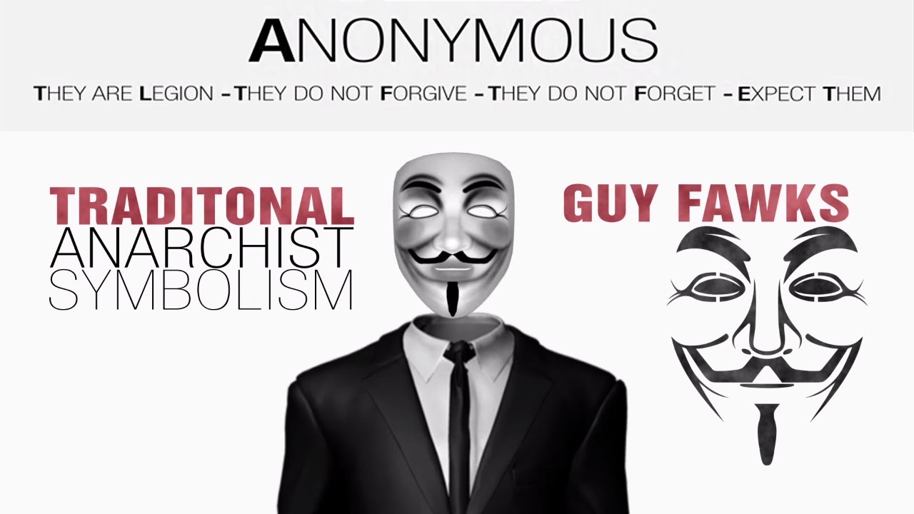
This super-cool infographic kinetic typography animation tells the story of how online hactivist group Anonymous came together in 2003 and subsequently went on to stage various protest actions. The short animation, which uses 3D effects, electronics and text to convey the message, was created by multimedia designer Savva Tsekmas.
22. Shop Vac
Artist Jarrett Heather made this kinetic typography music video for Jonathan Coulton‘s Shop Vac. The humorous animation took Heather somewhere between 500 and 1000 hours to complete. At just under three-and-a-half-minutes long, the brilliant video features a number of different fonts, all perfectly suited to the story each tells.
23. Rolling Stones – Doom and Gloom
Celebrating their 50th anniversary with a series of gigs back in 2012, the old-time rock ‘n’ rollers released an accompanying new track that was pretty darned good. For the music video, Trunk Animation designed this great splatter style animation, which is reminiscent of Ralph Steadman‘s typographic artistry.
24. Karloff
Another piece from graphic designer Thibault de Fournas, who has combined modern typefaces Bodoni and Didot in this beautiful animated video exploring how two extremes could be combined into a coherent whole. Stylistically, the video is centred around a series of expanding and disappearing hairlines, with cuts complementing editorial typographic layouts.
25. Mad as Hell
Peter Finch’s iconic ‘I’m mad as hell and I’m not going to take this any more’ speech from Network is still relevant 40 years on, and while it doesn’t necessarily need any extra weight lending to it, this kinetic typography treatment by Aaron Leming makes a pretty good job of it.
26. Alphabet
This alphabet in motion video is sublimely smooth. Former graffiti artist turned motion graphic artist Pavel Pavlov morphs simple but beautiful lines and graphics together to form a unique design for each letter of the alphabet.
27. Conan O’Brien
Working from one solid artboard, this entertaining kinetic typography video recreates the dialogue on the final episode of NBC’s The Tonight Show presented by Conan O’Brien. The camera pans between nicely set type, ending with a shot of the entire piece. The combination of eclectic typography and modern 3D letterforms achieved in Cinema 4D provides a contrast between old and new.
28. Make it better
Colour and morphing typography are wonderfully combined in this video. Creator Climent Canal and animator Sebastián Baptista‘s beautiful video brings an inspiring message to vivid life.
29. ALQUIMIA Animated Type
Pavel Paratov has constructed a mesmerising piece of golden kinetic typography here. The letterforms reshuffle to the electro beat by Satoshi Yoshitake, integrating abstract shapes into the mix.
30. Back to the Future
If you’re anything like us, you’ll already be a huge fan of Back to the Future. So, what could be better than kinetic typography of this priceless conversation between Marty McFly and his mother? It’s the work of Canadian graphic designer Melanie Burgess.
31. Alphagames
This inventive animation quickly became one of the most popular kinetic typography videos on Vimeo when it was released. It was created by freelance editor and animator Evan Seitz, who has worked on commercials for Coca-Cola and the American Cancer Society – one of which went on to win a Telly Award at the 32nd Annual Convention.
32. Fight Club
There’s plenty of Fight Club kinetic typography hovering around the World Wide Web, but this particular offering from Adrian Moran is a belter. The visual FX, motion graphics and 3D artist has created this animation to accompany Brad Pitt’s infamous Fight Club rule listing. We love the colours too.
33. Hello Hola Hallo Bonjour Ciao Ola
This adorable kinetic typography animation was made by Spanish graphic and motion designer Daniel Moreno Cordero. Daniel created his animation using After Effects, Illustrator and some Photoshop, alongside a typeface entitled Granaina Limpia.
34. Ira Glass on Storytelling
The producer and host of This American Life, Ira Glass, discusses what makes up the building blocks of a great story in this animation, made over three days by David Shiyang Liu using Illustrator and After Effects.
35. The Breast Cancer Alphabet
A post shared by Het Borstkanker Alfabet (@borstkankeralfabet)
A photo posted by on
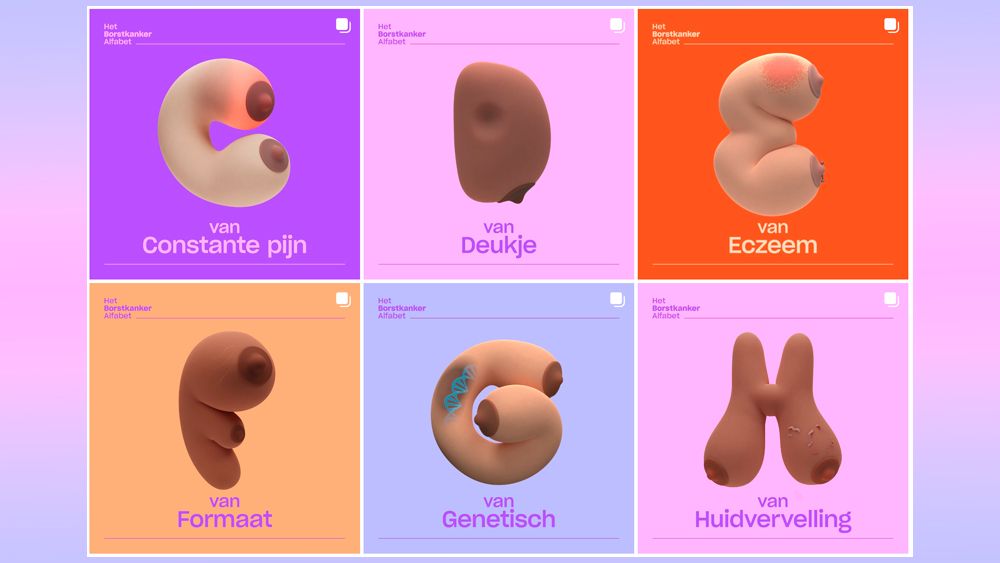
The Breast Cancer Alphabet was conceived by Amsterdam-based agency TBWANeboko for the Breast Care Foundation and Alexander Monro Hospital to coincide with Breast Cancer Awareness month in the Netherlands. As could be expected, the forms are visually arresting, especially in the animated typography, but they’re also educational, since they each represent potential symptoms of breast cancer, showing that there’s much more to checking than looking for lumps alone.
36. RocknRolla
Created by Siddharth Raj, this kinetic typography animation takes a speech from Guy Ritchie’s British action thriller movie RocknRolla and brings it to life. We love how Raj has incorporated various font shapes and sizes to fit perfectly between each other.
37. Pulp Fiction
Gangster movie speeches are cropping up a lot in this list – it seems like they’re the perfect accompaniment for great kinetic typography. This Pulp Fiction number was created by Norwegian motion designer Christian Gjerde. Watch for the particularly clever ‘car’ moment at the end of the video.
38. Fusion Design
This animation combines motion graphics with kinetic typography to a faultless execution. There’s not much information on this one by Dusan Tatalovic but we love the way he has managed to almost personify the typography throughout the musical accompaniment.
39. 29 Ways to Stay Creative
Created by Japanese motion graphic design studio TO-FU, this video is by far one of the most popular kinetic typography animations out there. It’s easy to see why with its inventive graphics and helpful content.
40. Kid President peptalk
Motion designer Taylor English is the artist behind this fun, animated typography project, which she created for her time-based typography class while studying at the Savannah College of Art and Design. The video is a visual representation of one of nine-year-old Robby Novak (aka Kid President)’s motivational speeches.
41. The Alphabet (in typefaces)
Designer and animator Alessandro Novelli captures his love for typography and animation in this 60-second Alphabet video. The gorgeous animation spells letters A through to Z, with a different font featured for each. The dancing letterforms are accompanied by Si Tu N’étais Pas Là by Fréhel, a track used in the movie Amelie.
42. Husbands: Dream
This music video for Husbands’ single Dream sees the lyrics light up as they’re sung. To make it, French design duo Cauboyz created individual boxes with each word placed on the front using laser-cut and hand-cut stickers. Wires were then attached to each box, complete with a handy switch to press once the word came up.
43. Coldplay: Atlas
Featured on the Hunger Games: Catching Fire soundtrack, this video for Coldplay’s single Atlas was created by New York-based agency Blind Pig in collaboration with creative agency Hugo & Marie. The team effort has executed one of the best uses of kinetic typography we’ve come across in a while.
Directed by Mario Hugo, the illustrations are largely based around the celestial sky map and myth by Micah Lidberg. Animation creative directors Ric Comline and Jonny Bursnell ensured that the video would be a seamless animation sequence, with both agencies providing gorgeous inspiration.
44. The Dead Words

The Dead Words project was begun by Karen To Nakada in 2010 as a way to express her love of both words and type. The graphic designer, illustrator and letterer is driven to promote and commemorate no-longer-used words before they are forgotten forever.
The project has generated much interest in the design community with well over 100 contributions to the project and counting, including everything from handcrafted to kinetic typography. Here is just one of the beautiful submissions, with many more to see on the website.
For more type inspiration, see our guide to how to choose the right typeface. We also have articles on perfect font pairings and the difference between font vs typeface.
