From the 1920s to the 2020s, we choose iconic fonts that reflect each decade and ask the experts why they worked. Whether or not design trends fit neatly into the confines of a decade, we all have an idea of how certain eras looked – and typeface is one element that evokes a certain retro aesthetic. Imagine ’70s psychedilia, or 1920s art deco to understand how powerful that can be.
From ancient cave paintings to aeroplane livery, typefaces have been helping us communicate for thousands of years. We won’t be going as far back as 20,000 B.C. as we delve into the history of these vital elements of graphic design, but it’s important to look at how typefaces and fonts have evolved.
Evolution came about through technology, culture, and branding preferences, with a variety of styles invented and licensed for use. We have chosen a font for each decade from the 1920s up to now, with a look at how it reflects each decade, and where you may have seen it used.
Typeface is a big part of everyday life for our experts, so they have weighed in with their thoughts on our decade-by-decade font journey as well. You might see some of these trends reflected in our free fonts list, and certainly in our best logos by decade content.
1920s: Futura
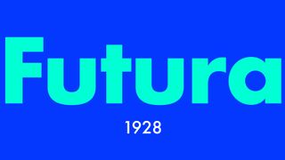
Seen as modern, readable and ahead of its time, Futura was released in 1927 by designer Paul Renner. Although classed as a sans-serif typeface its form is geometric, in contrast to previous sign painting and condensed lettering models in this category. First used for the New Frankfurt housing project in Germany, and found fame as the font used on the plaque left on the moon by Apollo 11 in 1969. Its popularity in print and digital has seen it used as a header and body font for brands such as Crayola and HP and in movies such as V for Vendetta.
Ana: “Futura embodies the 1920’s obsession with progress and modernity. It draws heavily from the Bauhaus movement, echoing its principles of form, function, and simplicity, while maintaining character. Futura looks to the past, with its capitals directly inspired by Roman capitals, to create a vision of the future. You can find it on your Kindle or brands like Dolce & Gabbana, FedEx, Red Bull, Volkswagen, Absolut Vodka, Gillette, Swissair, and Nike.”
Ana Rudolph is a graphic designer at Dawn Creative whose work is influenced by typography and urban environments. Previously at Daybreak Studio and Bow & Arrow, her client list has included Redrock, Flex Finance, and Netherlands-based Effenaar.
1930s: Times New Roman
Serif typefaces are known for the small lines or strokes attached to the ends of letters, with Times New Roman one of the most famous, and still widely used in this style family. Times New Roman first appeared in newsprint, after being commissioned for The Times in 1931. Designed by Stanley Morrison, an advisor to Monotype, and in-house lettering artist Victor Lardent, it quickly became popular for use on various typesetting machines. They designed a font with authority and a subtle decorative touch that has been part of the Microsoft font library for years.
Times New Roman has an old-fashioned feel, is the right kind of style for academic work, and works well in smaller point sizes.
Lucy: “Although I don’t typically use Times New Roman in my designs, there’s no denying its place as a classic serif font. It really defined the formal look of the 20th century with its readability and professional appearance, making it a go-to choice for academic and formal print media to convey a sense of tradition and authority.”
1940s: Brush Script

Handwritten style fonts were used in logo design, signage, postcards and posters from brands such as Ford, Campbells Soup, and Coca-Cola. Brush Script came in an era where handwriting and calligraphy were incredibly popular, and businesses saw the opportunity to commission typefaces that reflected this approachable and friendly style. Brush Script was designed by Robert E. Smith in 1942 and was popular in advertising throughout the ’40s and ’50s, and later thanks to its nostalgic post-WWII feel.
Brandon – “The (type)face that launched a thousand scripts! This typeface is undeniably iconic. It’s pretty much the go-to default typeface for Sadie Hawkins dances and homemade thank-you cards. I wasn’t around when this typeface was designed, but I’m glad we now have a huge variety of script typefaces to choose from, all inspired by Brush Script!”
1950s: Helvetica
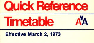
Swiss designers Max Miedinger and Eduard Hoffmann could not have anticipated the global success story their font became, but 1957 saw the introduction of what is now one of the world’s most commonly used fonts. Helvetica was part of the International Typographic Style and was designed to be neutral and highly versatile. With clarity, even in smaller sizes it was a popular choice for architects for their drawings and project descriptions, big corporations, mass media, and helped establish unified visuals and branding strategies.
Ana: “Helvetica is literally everywhere you look. It’s one of the most used sans-serif typefaces. It became a symbol of modernist design after WW2. Its clean and versatile appearance became the face of corporate culture and has since been commandeered by hipster graphic designers. Helvetica is used by giants like IBM, American Airlines, and transport systems across the globe.”
1960s: Univers

Univers was one of three typefaces designed in 1957, and while it may not have reached the popularity levels of Helvetica, it entered the 1960s as one of the largest font families of its time. Univers was considered innovative on release due to its range of weights and widths. Designer Adrian Fruitiger accomplished consistency across a variety of applications, in print and digital formats. IBM, Monotype, and Linotype all licensed this font.
Lucy: “Univers’ clean, modern design from the 1950s really makes it stand out as a groundbreaking sans-serif. The way brands like Swiss International Air Lines and eBay have used it shows just how well it captures those Swiss design principles.”
Lucy Sunderland is a graphic designer and illustrator with a portfolio including logos, website assets, event branding, and outdoor signage.
1970s – Octopuss
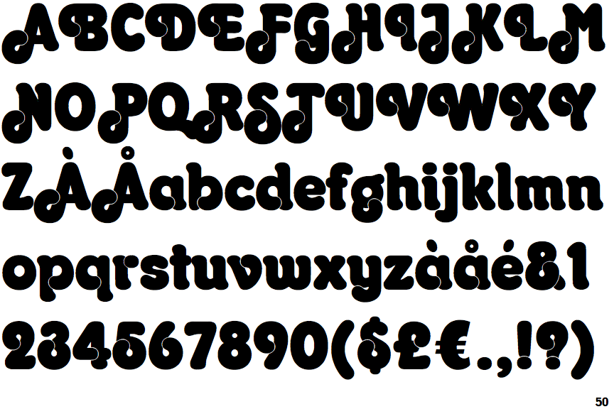
The ’70s was a time for groundbreaking trends in music and fashion. Bell-bottomed, trousers, DISCO music, freedom, and fun, with the typefaces of the decade reflecting that. Octopuss, now trademarked by Monotype ITC was designed in 1970 by Colin Brignall, a designer known for several popular ’70s fonts. Brignall designed a fun and funky font, designed for larger point sizes, headings and headlines. It’s a font that brought energy and impact to many albums cover art, posters and advertising.
Brandon – “This typeface in the wrong hands can be absolutely diabolical. The default kerning (in the modernly available font) is atrocious, and using it in all caps should be felony. However, with a bit of TLC, Octopuss can lend the perfect bubbly groove to a design.”
1980s – ITC Avant Garde Gothic
This geometric sans-serif font has been on more of a design journey than most. It’s based on a logo font seen in Avant Garde Magazine and started life as a logo concept and headline font. It then morphed into a fully-fledged typeface with typesetting for headlines and text copy, digital text copy versions and five different weights in total. The 1980s saw a cultural shift toward the bold and geometric, innovation and change, and ITC Avant Garde Gothic became the ideal fit for these trends. The font was widely used in media, branding, and advertising, including by Macy’s (the store’s logo was in the extra-light style until 2019) and alt-rock band Travis.
Brandon – “I don’t care that it’s overused, this font is fab! Futura’s cooler older sister who moved to NYC to smoke cigarettes and work at Vogue. It looks great in every weight in the family, upper and lower case, tightly and widely tracked. Although designed in 1970, this font immediately reads as the ’80s and can read campy or elegant easily.”
1990s: Arial
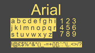
Arial is a font that needs no introduction if you are a Windows or Google Doc user. First created by Monotype for IBM, who commissioned a font for their first big laser xerographic printers, it’s been part of the MS Windows family since version 3.1. It’s a sans-serif font known for its simple, clear design, and unlike its inspiration Helvetica, has been more widely accessible on digital platforms.
Lucy: “Arial is known for its practicality, simplicity and legibility. Originally created to replace Helvetica and work better on screens, it’s still a solid choice for corporate and digital branding thanks to its neutrality and effectiveness.”
Here’s more on what happened to fonts when brands went digital.
2000’s – Ringbearer

If you look at cultural references for the 2000s onwards, magical, and fantasy movies and their typefaces come high on the list. The attention to detail in these films is at a high level and unsurprisingly has inspired many fonts, including this one, Ringbearer.
Ringbearer is a readable, bold, and elegant representation of the runes seen in the Lord of the Rings Trilogy. It’s a typeface that goes along with attention to detail and helps set the mood for whatever product it is used on, whether that is a book, movie title or logo. Created by Pete Klassen in 2002 it may not be the only font inspired by the Middle-Earth but it is perhaps one of the most iconic.
Ana: “Ringbearer draws inspiration from the font used in The Lord of the Rings movies, standing in stark contrast to Helvetica. Instead of embracing clean lines and order, Ringbearer returns to an ornate, natural, and handcrafted aesthetic. It starts a movement back towards something more elaborate and natural.”
Brandon Kennedy, Senior Design Director at L.A. and New York brand studio Sibling Rivalry, who has worked with the likes of NBC, Ford, and tech, entertainment and lifestyle brands.
2010s: Roboto
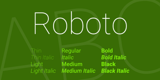
Roboto perfectly illustrates the need for a company, like Google which commissioned it for use in-house, to adapt to changing technology. Their previous typeface Droid did not display well, and they needed a font that would look good on a range of larger screens (phones and tablets). Christian Robertson, a display font specialist designed Roboto as a system font for Google in 2011, and it was later applied across other platforms such as Google Play Store and YouTube.
Brandon – “Google’s default system typeface. It might just have a bit too much personality with its narrow width to be used as a system typeface. It reads rigid and serious, which kind of strips it of humanity. If it’s being used intentionally to add a tech-forward flair without going full monospace, I guess it’s fine! Couldn’t be me.”
2020’s – Bebas Neue
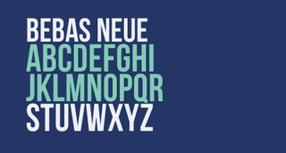
Bebas Neue sits in the middle of a Sans-Serif sandwich that features the original Bebas, and Bebas Neue Pro (a paid-for commercial font). This revised font was designed by Ryoichi Tsunekawa for the Dharma Type Foundry in 2010 and launched as a free-to-use font.
Designers love the fact this typeface works in headlines, titles, and body text, so can grab attention wherever it’s needed. High-profile usage includes the movie poster for La La Land and branding materials for Nars Cosmetics and North Face.
Ana: “It has a bold strength that cuts through the noise of today’s overstimulating world. Its popularity reflects the shift toward an era of information overload, where its boldness naturally commands attention. Bebas Neue has gained widespread recognition, most notably seen in the Netflix logo.”
Some of these fonts are used in the best rebrands by decade, be sure to check them out.
