When creating a brand identity, some would say the most important job is to make sure the design is totally unique in order to be memorable and carve out a niche. With this in mind, any associated typeface would ideally be custom – created specifically to deliver a bespoke look.
Surprisingly, many brands actually choose to use the same fonts for their wordmarks, relying on styling and context to create their own distinct aesthetic. Of course, it is unusual for competitors in the same space to adopt the same logo font (though it does happen, especially in the case of one well-known typeface – keep reading for more on that), but many brands across different industries utilise identical and even well-known fonts as part of their identities.
Here are four commonly-used fonts and the brands that use them for their wordmark. Had you noticed?
This week is Typography Week on Creative Bloq, be sure to head over to our dedicated page.
01. Helvetica
(Image credit: Toyota)
Helvetica has been used by many prominent brands. In fact, it was once the go-to commercial font because it was considered to ooze professionalism, trustworthiness and corporate approachability. It’s a sans-serif that is super-clear and clean, with a friendly, rounded appeal – and it pairs well with other fonts thanks to being fairly neutral in appearance (find out more about font paring here).
(Image credit: Getty Images)
Thanks to the amount of widths and depths it comes in, it’s remarkably versatile when you spot it across different brands – it does manage to look quite unique in its various applications. For example, the Toyota wordmark is remarkably different from the Harley Davidson aesthetic (we think Harley Davidson is an outlier in this market – the messaging of this brand is something quite different from the above description).
Other brands using Helvetica are American Apparel, Nestlé, Luthansa, Kappa, Fendi, Energizer, Panasonic and Jeep among others.
02. Didot
(Image credit: Zara)
The fashion font of choice, this typeface is used on magazines and brands globally to signify high-end luxury. The small serifs, thick and thin elements and circular lines are now reminiscent of expense and quality. Not particularly versatile, but maybe that’s the point, you can see Didot in action at Vogue, Harper’s Bazaar, Giorgio Armani, Boss, Guess and, less expensively, Zara (though that Zara logo did cause some controversy).
(Image credit: Condé Nast)
It’s most often used in black on a white background, with the monochrome adding to the simple elegance associated with luxury brands.
03. Futura
(Image credit: Gillette)
A real mix of brands have channelled Futura – there’s no clear pattern here, unlike with the two fonts that came first on this list. A geometric sans-serif, its universal appeal comes from the modern aesthetic, that’s also fairly neutral and the way it works across print and digital. We would never have expected to see some of these brands in the same list.
(Image credit: Franklyfluent)
Big names include Domino’s Pizza, Nike, Louis Vuitton, Gillette and Red Bull. This is another example of a font that manages to look completely different across applications, with the design context and weights chosen impacting the overall aesthetic hugely.
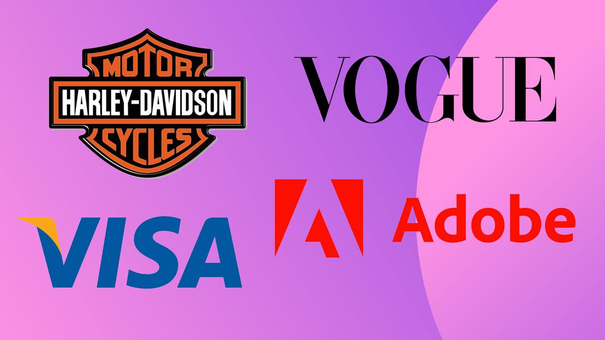
04. Myriad
(Image credit: Adobe)
Some huge names have utilised Myriad – a humanist sans-serif that is super-adaptable thanks to its range of weights and widths.
(Image credit: Visa)
Its versatility is notable from the applications across brands that share a space – would you imagine that Apple and Adobe would be happy to share a typeface, for example? Well that’s exactly what Myriad delivers, with Apple having used this typeface for its corporate font from 2002 to 2017 while Adobe uses it for its logo. There’s also Volkswagen, Rolls-Royce, Walmart, LinkedIn and Visa that have used the typeface for their wordmarks and logos.
You can see some of these fonts in action on our best logos roundup.