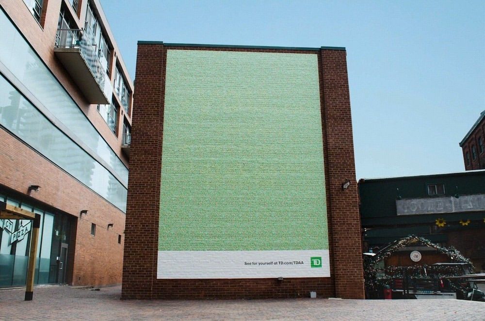
Billboard advertising needs to be different and original to get attention. Erecting what appears to be an enormous plain canvas certainly generates intrigue, but what’s the message? Well, it turns out that a specific target audience will see more in this ad than others.
To onlookers with standard color vision, the billboard looks like a bit like a magic eye picture made up of green dots. But no matter how long they look at it, the hidden message won’t appear because it’s only visible to people with colour blindness.
A closer inspection reveals that the poster also contains red dots, and these are the key to the hidden message that’s only visible to people with color vision deficiency, a decreased ability to see colour or differences in colour. “If you can see this, it’s because we see you,” the message reads.
The clever ad was commissioned by the Toronto-Dominion Bank (TD Bank) and developed by Ogilvy Canada. It promotes the TD Accessibility Adapter, a free Google Chrome extension that allows users to customise their web browser with a range of enhancements to improve accessibility, including reading guides, larger fonts that are more friendly for people with dyslexia and various color modes, including monochrome, dark mode and low saturation. Initially developed for the bank’s own use internally, it’s now available to everyone.
Ogilvy says that one in six people have a visual impairment or neurodivergence and that only 3% of the internet is accessible for them. The tool aims to make a difference to that.
For more advertising inspiration, see our pick of the best adverts of all time and the controversial Nike Olympics advert.
