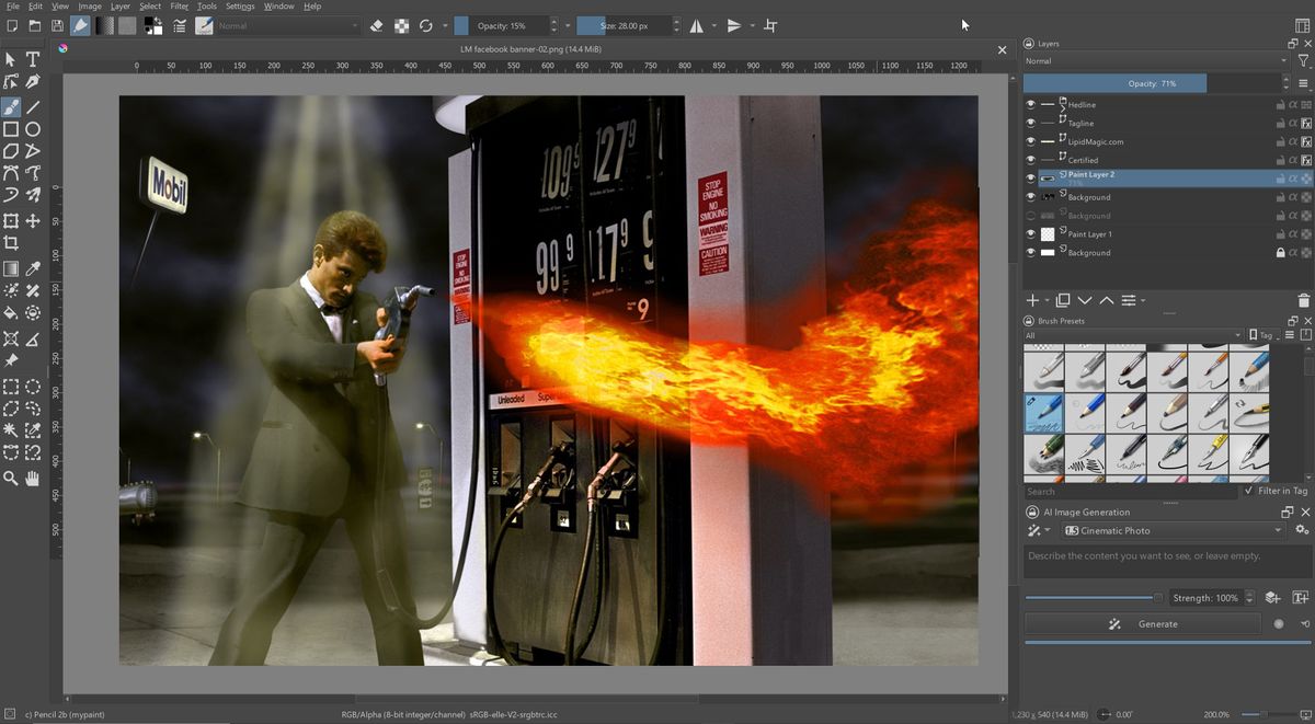
It can be argued that Adobe’s Photoshop was the world’s gateway to digital art. At almost 35 years old, it’s not only loved, but also globally integrated into all of our design and production workflows. Krita, meanwhile, may have been named ‘digital art’s best kept secret’ in our best digital art software guide, but it certainly hasn’t got the same mass user base (yet).
As wonderful as Photoshop is (see our full Photoshop review here), its “core” functionality – the parts professionals rely on most – hasn’t changed that much in at least 20 years. For example, Layers were added in 1994, the Healing tools in 2002, and Smart Objects way back in 2005. 3D tools were added and removed. AI was just added. But many tools over the years have been “narrow use”, at best.
So alternatives, both commercial and free, have had a long time to catch up – and the open source project, Krita is becoming increasingly popular. Its popularity likely stems from it’s robust Coral Painter-style tools that naturally appeal to artists. And its interface and features that allow PS users to instantly feel at home, and productive.
I’ve been a dedicated Photoshop user for years, and am in the process of switching over. Here’s how I think they compare.
Design: Photoshop vs Krita
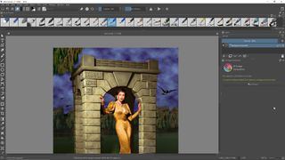
If you sat down to a computer with Krita already open, one might think Adobe’s Creative Cloud had updated PS with a new look. Because the Krita team has mostly kept the interface we love from PS. The classic Adobe interface with TOOLS along the left, and the pallets – like Tool Options, Layers, Brushes and AI, all along the right.
If Krita’s UI is a bit “horsey” looking on your monitor, try going to SETTINGS: Configure Krita… > General > Window Tab, and Uncheck “Enable HiDPI support”, then press OK and restart Krita. The results should be smaller icons and text that better match the more modern PS interface.
As expected, there are things that are better in one program than the other. The good news is that neither Krita nor PS is bombastic about the way it allows us to work. Each offers user customization. Arguably, with Krita offering a good deal more.
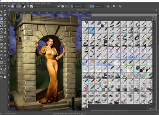
One of the biggest and most obvious UI difference from PS is the treatment Krita gives to its Brush tools. Where the default PS keeps brushes under a tab and their icons “diagrammatical”, Krita puts them front and center, and with icons that are instantly descriptive. Much like Coral’s Painter, this is a clear nod to the artists and illustrators who rely on brushes more than other tools.
But while the interfaces are otherwise similar, there are clear workflow differences. For example, what first seemed weird was my inability to find the SHARPEN and BLUR tools. Rather than implementing tools, Krita has dedicated Brushes for these functions, found in the BRUSHES pallet.
With a similar mindset that differs from those at Adobe, you will find no Eraser tool in Krita. Instead you will find faster Eraser Toggle switch sitting just above the canvas. So whatever brush you have currently selected becomes the eraser tool.
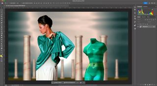
Likewise, the Layer Pallet is quite similar to PS. But with enough differences that you may need to skim those pages in the manual.
Different, yes. But not any better or worse. And nothing that prevented my feeling comfortable with its interface.
Features: Photoshop vs. Krita
When it comes to a feature-by-feature match up, it’s actually a much tighter fight than many would expect. Let’s hit the major ones:
Tools On the Left: While Krita’s tools are not an exact copy of PS, they are similar enough that most creatives can jump in and start to work. One slightly confusing ergonomic is that while Krita is more pixel based than it is Bezier, all the outline tools are clustered to the top of the toolbar, and needlessly scattered.
Color Modes: All of the major color modes are supported in both apps. Grayscale, RGB, CMYK, LAB, at 8, 16 and 32-bit per channel.
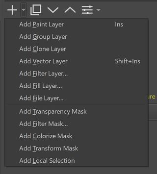
Layers Pallet: While its UI is a bit less elegant, Krita’s Layer options are quite robust. It offers 12 different layer types, like a Clone layer, File layer (similar to a Smart Object), Filter layer. It not only offers 15 layer Transform options, but then an additional 13 customizable transforms in addition. And a host of Properties controls that include items like “Split Alpha”, and Conversion tools.
Distortion Effects (not filters): We have waited decades for Adobe to add more robust distortion controls. Krita’s are better, with cage options, unlimited grid divisions, etc.
Printing. No excuses, this one is just odd: As hard as this is to believe, Krita doesn’t print. Though in our web-based world, it took me quite a while to even realize this! The workaround is to soft-proof in Krita, then export to a printing app of some kind. Reasonable, if one does not do a lot of heavy printing. In a related note: Krita doesn’t support PDF exports, the preferred format for commercial printers. PS takes the win here, by forfeiture.
Wacom and Tablet Support: If you have ever pulled your hair out trying to get a Wacom connected, recognized, and properly set up in PS, then you will appreciate how easy it is with Krita. On Windows the correct tablet driver needed to be found and installed. But after that, Krita rocked and was super easy. On Linux, well, not even a driver was needed. Plug the Wacom in and Krita was a pressure sensitive beast in two-seconds flat. So seamless, it was unreal. Krita wins.
Typography: One area Krita falls down is typography. Not that it can’t do it, but that it forces the user into a separate floating window. Functional yes, but clearly inferior to PS’ on-canvas integration of type and art. This makes graphic design with typography more tedious in Krita. And while letter tracking works, its kerning ability is in question. Adobe clearly get the win here.
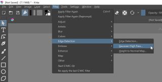
Plugin Filters: Krita rocks 9 Filter categories, containing over 50 native internal filters. It also supports a limited number of PS plugins. That’s already a lot. But Krita also supports the G’MIC framework that adds over 500 additional plugins (only supported on Windows and Linux). Krita edges out the win here.
Levels: Both programs have the standard fair of editing tools. And both act in much the same way. However unlike Krita, PS’ tools work interactively. Drag a slider and see the results in real time. Krita requires the click-down on the slider be let go, before it will update the screen. Nothing terrible, but less interactive and slower. Photoshop gets the nod here.
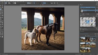
Artificial Intelligence (AI): You say you can’t walk away from Adobe’s cool new AI tools? No worries, as Krita has its own Stable Diffusion (and other AI models) plugin as well. With options to run these LLMs via a web-based service, or by installing the rendering server locally and running the process on your GPU. Quality and speed TBD, but the flexibility of Krita’s AI, its ability to choose the engine and render locally, clearly give the win to Krita.
3D Seamless Textures: Do you ever use PS to prepare textures for 3d/game work? Then you know how important creating seamless textures can be, and how kludgy it is with PS’ “Offset” filter. But in Krita just click the “Wrap around mode” button, located above the canvas, and start dragging interactively. Krita wins here as well.
Performance: Photoshop vs Krita
Even with comparable tool sets, there can be a whole lot of differences that give our challenger a win or a loss on overall performance.
Speed / Responsiveness: We have to say that the minor win here goes to PS. But that it is a win made from micro benefits, not large ones. For example, simply booting Krita takes longer than one might expect. As does the processing of many filters and functions. This implies that there is room for more optimization within Krita’s code, if anyone ever gets to it. More ram and a faster GPU may be enough to help Krita keep pace.
There are “programmatic” issues that slow it down as well. For example, the lag in the Levels function mentioned earlier. Again, not major. But if you are the type to get road rage waiting at a traffic light, this may be worth considering.
The User: Lest we forget, the slowest element of any workflow is usually the user. Just how efficient will the PS Power User, who uses keyboard shortcuts, be on Krita?
Many of Krita’s shortcuts are identical to those in PS, which means far less muscle-memory retraining. For example, Cmd-L (or Ctrl on Windows and Linux) brings up Krita’s LEVELS screen, just like in PS. Slap the “B” key and BRUSHES becomes the selected tool, just like is PS. Cmd-A, Cmd-J, D, X, brackets, Cmd-E and many more…all the same as in PS!
Just the SPECS
As expected, Krita is a lighter install, and less demanding on system requirements. Needing only 4GB of ram compared to PS’ 8GB. And at least a dual-core machine, compared to PS’ quad-core requirement. Plus Krita also runs on Linux, PS doesn’t.
| RAM required | RAM suggested | Hard drive minimum | Processor minimum | GPU |
|---|---|---|---|---|
| 8GB | 16GB | 20GB | 2 GHz | DirectX 12 |
| 4GB | 16GB | 15GB | 1.6GHZ | OpenGL 3.0 |
The Verdict: Which is Better?
We all just want to know one thing, will Krita let me do what I need to? The answer is a qualified yes. In some cases, it even surpasses PS. And we haven’t even mentioned brush stroke stabilizers, the 2D animation and timeline, GPU enhancements, scripting and more.
Clearly with Krita, free gets you a lot. By comparison, a Photoshop subscription runs over $240US/year. Every year. That adds up, fast. A few years running Krita pays for a new computer!
So why hasn’t everyone switched over? The reason is compatibility, rather than capability. While Krita will read and write PSD files, it does it without full support of the format. Krita files are still best saved to its own KRA file, which can be read by an increasing number of programs. Just not PS.
Many online claim that GiMP and PS are for “image editing”, and that Krita is for illustration. This is a distinction without a difference. There is little, if anything, that PS can create that Krita could not.
Read more in this handy guide to switching from Photoshop to Krita.
Carry on with these picks of the best photo editing software.
