The 1980s was a decade of bold fashion, big hair and even bigger changes in graphic design. As corporations sought to modernise their images for a new era, some of the most iconic rebrands of the 20th century emerged.
By re-imagining logos, emblems and other visual elements, crafting compelling new slogans and game-changing ads, launching new products and services, and sometimes all of the above, these brilliant rebrands captured the spirit of innovation and cultural shift that defined the ’80s.
To create this definitive list of rebrands of the decade, we’ve interviewed design experts and delved into the stories behind these visual revolutions, from the introduction of the lowercase ‘o’ in MoMA’s logo to Nike’s game-changing ‘Just Do It’ slogan. For further branding insight and inspiration, don’t miss our guide to the best logos by decade, and more specifically the best 1980s logos.
01. Museum of Modern Art (1980)
Founded in 1929, the Museum of Modern Art was the first museum in the United States dedicated solely to modern art. Over time, it grew in stature and influence, and the year 1980 marked the first time it dedicated its entire 53rd Street headquarters to a single artist, for a retrospective of Pablo Picasso.
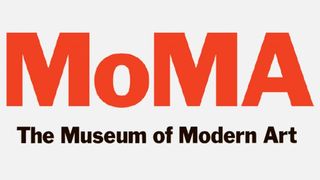
It was also the year of a landmark design for the institution: the year when MOMA in all-caps switched to MoMA with a lower case ‘o’: an innovation introduced by one of the employees, Stephen F. Eskilson.
This wasn’t just a visual redesign, but also a sonic one. It heralded an era in which people would pronounce the name as ‘moh-ma’, which made this cultural institution feel much friendlier and more personal.

“The rebranding of the Museum of Modern Art in New York (MoMA) is, to me, an example of the making of an iconic brand,” says Cecilia Serafini, design director at Mother Design. “The logotype wasn’t the only element of the rebrand, but it was, and is, undoubtedly the most distinctive.
“It was originally set in Franklin Gothic, a quintessentially North American display typeface designed over a 100 years ago that still feels contemporary, and beautiful, today,” she explains. “Then in the 1980s the lower case ‘o’ was introduced, creating the version of the logo we all know today. The ‘o’ appears as solid as the other characters, standing its ground and giving the overall acronym a sense of dimension and a playful rhythm.
“It also encourages us to see it as a word instead of an acronym, making it feel more approachable which, for an art institution, is no small feat. The logotype was adjusted in 2004, and a Moma Gothic has been created, but the forms remain similar to the original.”
02. IBM (1981)
By 1981, in a tech world dominated by upstarts like Microsoft, IBM was looking increasingly out of touch. And so this advertising poster overseen by modernist master Paul Rand, couldn’t have come at a better time.
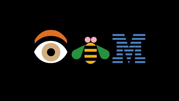
Created in 1981 to promote IMB’s motto, THINK, it featured a type of world puzzle known as a rebus that uses pictures to represent words. At the bottom left is an eye to represent perception, insight and vision; a bee for industriousness, dedication and perseverance; and an ‘M’ for motivation, merit and moral strength.
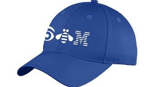
As well as advertising, the rebus was used in special applications, such as merchandise, badges and events. However, it never took the place of IBM’s classic 8-bar logo as an official brand communications sign-off.
“Departing from its traditional image, this rebrand showcased a contemporary and adaptable identity, symbolising diversity and flexibility in the rapidly changing tech sector,” says Karim Salama, director at e-innovate. “This transformation positioned IBM as both a progressive and innovative brand.
“It gave the company the key status as a major player in the industry, and was evidence of how the company was evolving with the times while upholding its well-known brand.”
03. British Airways (1982)
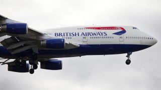
British Airways today is known as a premium, luxury airline, but it wasn’t always this way. A nationalised corporation cobbled together by the government in the 1970s, following with dissolving of BOAC and BEA, it only really started to present itself as a high-end operation after a transformative rebrand in 1982 by Landor Associates.
“The new branding introduced a sleek, modern typography and a refreshed colour palette, symbolising speed and elegance,” explains creative entrepreneur Jessica Crane. “It propelled British Airways into a modern era of air travel, setting a benchmark for luxury and innovation in the industry; something that still stands today.”
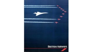
Part of that was about a redesign of the logo, refining its predecessor, which had cast ‘British’ in title case, and ‘airways’ in lower case. “However, this rebrand is significant not just for the visual changes, but for the transformation in the airline’s entire customer experience,” adds Jessica. “The simple yet effective design embodied the sophistication and prestige associated with air travel.”
04. Nintendo (1982)
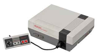
Talking about Nintendo rebranding in 1982 might sound strange. After all, their first video console for Westerners was the first time many of us ever heard of the company. So it might be a surprise to learn that the Japanese company was originally founded in 1889, as a handmade manufacturer of playing cards.
In 1953, Nintendo became the first company in Japan to produce playing cards from plastic. Then in the 1970s, it moved into analogue arcade games such as Laser Clay Shooting System, and later video-based arcade games, beginning with EVR Race in 1975.
The modern Nintendo visual identity, however, can reasonably said to date back to 1982, with the launch of the Nintendo Entertainment System. As Paloma Castiñiera, senior strategy director at Saffron Brand Consultants explains: “What we see today is based on the evolution carried out in the 1980s: a modernised brand that maintains a proud connection with its origins, and is anchored in storytelling to connect deeply and emotionally with users.
“With the launch of the Nintendo Entertainment System,” she continues, “the brand put innovation and entertainment front and centre, providing a memorable experience for all types of gamers.”
And that’s no accident. Nintendo is a brand that triggers memories,” she explains. “Memories of fantasy worlds, fun and excitement. Memories that make its combination of red and white, its rounded shapes, and its very simple wordmark tremendously recognisable to people all over the world.”
05. IKEA (1983)

Sometimes the best rebrands aren’t anything new or inventive, but the simple decision to revert to a previous design. Matt Hauke, senior designer at Design by Structure, offers an example from 1983, from the Scandinavian furniture company IKEA.
“Believe it or not IKEA, which goes back to 1943, once used red as its main brand colour,” he begins. “Their founder, Ingvar Kamprad, liked it because it represents low price: think sales stickers.”
However, in the 60s, IKEA made a strategic move to a logo inspired by the Swedish flag. “This is the colour palette we all know today, which helps convey its mission to bring some Scandinavian chic into your home, at low prices,” says Matt. “So, it’s baffling that for a brief period between 1981 and 1983 IKEA reverted to the red logo.
“This didn’t alter the identity much as their brand was, and remains, more product focused and relied on imagery. But it’s a notable change on the catalogue nonetheless.” Just two years later, though, Ikea quickly reversed the decision. Matt describes this as: “One of the closest calls in terms of undoing a lot of brand equity, and a great decision.”
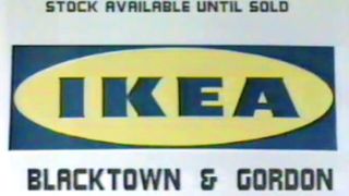
Reneé Virgo, creative director at Boxer Brand Design, agrees. “The brand went through a slew of different fonts and shapes as it defined its vision,” he notes. “But in the ’80s it landed firmly in the globally memorable oval-framed-by-rectangle format in Swedish blue and yellow colourway.
“As with all of the top brands, IKEA’s brand feels timeless, is marked its core tenets – including simplicity, playfulness, modernity, and versatility – and can be recognised even sans wordmark.”
06. Apple (1984)
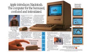
It’s difficult to imagine in a world dominated by the iPhone, but back in the early ’80s it was highly questionable whether Apple, then solely a producer of desktop computers, would survive at all. That’s why the launch of the Apple Macintosh in 1984 was so pivotal.
Prior to the Macintosh, personal computers relied on text-based interfaces that required users to type in commands. The Mac introduced a user-friendly graphic interface with windows, icons, and a mouse – elements that are now ubiquitous today – making computers more accessible to everyday people.
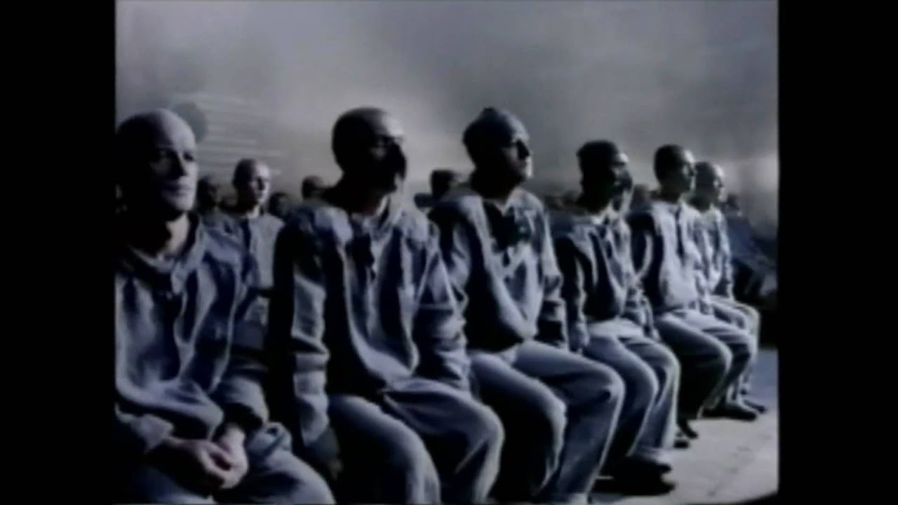
To most non-techies, though, computers were still things that required an advanced scientific mindset to use. “The rebrand of Apple by Regis McKenna was crucial in upturning this paradigm,” says Karim. “This makeover projected a sophisticated and pioneering image. Central to this effort was the now iconic 1984 commercial, depicted a break from conformity, becoming a standout feature of Apple’s campaign.” (We’d have to agree, hence it’s on our list of the best adverts of all time.)
“Overall,” adds Karim, “this rebrand signified a shift towards consumer-oriented technology, forming a lasting brand sentiment that continues to influence the industry 40 years on.”
07. Coca-Cola (1985)

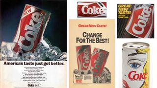
One of the most substantial rebrands of the 1980s was Coca-Cola’s relaunch of Coke in 1985 with the debut of New Coke. This was the company’s dramatic response to Pepsi gaining market share, due to the success of its ‘Pepsi Challenge’ campaign.
The short version is that New Coke wasn’t a commercial success. It was renamed Coke II in 1990, and discontinued in July 2002. But Adam Levine, an advertising expert and performance coach at InnerXLab, reckons it’s work that’s still worth celebrating in retrospect.
“Despite the contentious nature of this rebrand, it marked a crucial turning point in Coca-Cola’s story,” he explains. “The focus was not merely on the product itself, but on the emotional bond consumers had with the brand. The rebrand highlighted the significance of honouring a brand’s heritage while also adjusting to evolving consumer preferences.
“Whilst this was a daring step, it displayed the influence of consumer input and the need for brands to adapt to the times while staying genuine to their core identity.”
08. Walt Disney (1986)
By 1986, Walt Disney Productions had extended its operations far beyond making movies, and so a rebrand seemed like a non-brainer. “Consider the revenue mix they reported that year: theme parks and resorts (70%), filmed entertainment (24%) and consumer products (6%),” points out Kevin Susman, founder and strategy chief at Danton Drake.
Consequently, in that year Walt Disney Productions rebranded itself as The Walt Disney Company. “The genius is in the name they chose,” says Kevin. “For example, Walt Disney Parks & Entertainment might have seemed a more obvious choice for where the company was then. But then that company wouldn’t have made sense earning billions in revenue from sports, to pick just one of the segments where Disney has expanded since.”
And that is why The Walt Disney Company was such a bold and significant choice. “Walt’s name was, and is, synonymous with both entertainment and theme parks,” says Kevin. “What was needed was a name that could transmit the values and promises that Walt represented, across any segment where the company saw opportunity.”
09. Pepsi (1987)
Coke may have lost a battle in the ‘Cola Wars’ when it withdrew New Coke, but it still remained the world’s top selling soft drink, and Pepsi couldn’t let their guard down for a second. Hence in 1987 it enlisted Landor Associates to update its look, aiming for a more contemporary and futuristic appearance. They also doubled-down on their relationship with Michael Jackson, then the biggest pop star in the world, to boost the brand’s credentials as a cool, youthful brand.
“The redesign involved changing the typeface to a sleeker, more modern font, which reflected the brand’s forward-thinking and innovative spirit,” explains Jessica. “This update was part of Pepsi’s strategy to appeal to a younger, trend-conscious audience and to differentiate itself from competitors. The rebranding was successful, reinforcing Pepsi’s identity as a dynamic and progressive company.”
Mike Goldsworthy, creative lead at ilk Agency, is also a fan. “The revamped Pepsi brand is a winner for me,” he enthuses. “It took the existing equity and heritage of the brand and tightened it all up to create a slick execution that is true to itself, and truly celebrates what makes Pepsi, Pepsi.
“The retro brand doesn’t look out of place in a modern environment, despite the brand’s forays into distasteful iterations in the ’90s and ’00s,” he adds. “It has been given a new lease of life within a new brandsphere, which is a heavily inspired iteration of the vintage identity today.”
09. Nike (1988)
When we think of rebrands, we often think of changes to the logo, colours or the introduction of new products. But sometimes the most powerful update to a brand can be something as seemingly small as a new slogan.
An example comes from Nike’s introduction in 1998 of ‘Just Do It’; a phrase that really brought the brand to life and has become more of a philosophy than just a simple tagline. Somewhat paradoxically, the founder of Wieden+Kennedy, Dan Wieden, credits its inspiration to death row inmate Gary Gilmore’s last words: “Let’s do it.”
“Nike was previously just one of many sports brands,” argues Zofia Mackiewicz, creative director at UNIT. “But it reached iconic status in the late 1980s with a slogan that expresses incredible energy and authentic power in three simple words.
“Nike’s Swoosh logo had been in play since 1971,” she adds. “But it was the introduction of this phrase as a core part of their branding in 1988 that shifted Nike’s focus from product-centric to creating an emotional connection with their audience, ultimately securing their longevity as a brand.”
11. British Rail Intercity (1988)
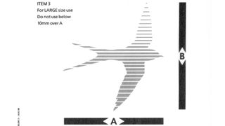
For those too young to remember, or not based in the UK, British Rail was the publicly owned railway operator that was founded in 1948 then privatised over the years 1994-7. Many people now fondly look back on the period of national ownership, but during my childhood in the 1970s and 1980s, I remember people being far less fond of it.
The butt of every comedian’s jokes, British Rail was popularly associated with stale sandwiches, crumbling infrastructure and overall poor service. In fact, things had objectively improved , starting with the introduction of high-speed intercity trains in the 1970s. But popular opinion tends to lag behind the facts, and so the corporation launched a big promotional campaign in 1988 that aimed to reset the balance.
This was based on new branding guidelines developed by Newell and Sorrell Design Limited, which merged with Interbrand in 1997.
The ads certainly made an impact. “I remember British Rail’s change in advertising approach for Intercity to this day,” says Kiri Craig, managing director at onebite. “The combination of single colour videos in tones of sepia, blue and orange coupled with a swing jazz soundtrack was designed to evoke feelings of relaxation and peacefulness.
“The use of different forms of animation alongside some visual choices, like the rabbi playing chess, were all attempts to stand out from the noise of other campaigns that jostled for attention.”
In short, as a piece of branding it was a masterpiece. Whether the actual service could live up to its promises, however, was another story.
“Even I, young as I was at the tail end of the 1980s, could see that there was some disconnect between the picture painted of kick-off shoes and chilled out passengers, and the reality of train travel which was as stressful, cramped and crowded as it is today,” says Kiri.
“In terms of aesthetic and memorability, this campaign by Saatchi and Saatchi won with me,” she concludes. “But whether it convinced people at the time as a rebrand, is less clear to me. The brand still had a lot further to go in reality.”
For more in this series, see our best rebrands of the ’90s, 2000s rebrands, 2010 rebrands and all the best identities of the 2020s (so far).
