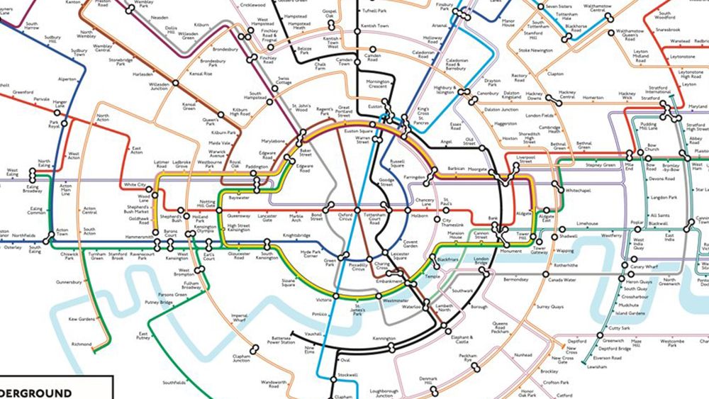
The London Tube map is so iconic we included it in our pick of the best map designs. But is it the right shape? One cartographer thinks it isn’t, and he might have a point. Max Roberts’ circular Tube map already went viral once several years ago, and a new improved version is now repeating that success.
The circular underground map rearranges the Tube lines with their traditional colours to form spokes emanating from the centre. The result is a design that’s less cluttered, making it easier to read. It’s also more geographically accurate that the current official Tube map, which is built on Harry Beck’s design from 1933. And no that optical illusion formed by the circle line isn’t intentional.
After eleven years, it’s time to update my London Underground concentric-circles-and-spokes map. Completely redrawn from centre to edges, it’s so much better than before, and more geographically accurate than the official map. pic.twitter.com/WMd8fkdphYAugust 6, 2024
Roberts wasn’t the first person to make a circular Tube map. He was inspired by Jonny Fisher to create his original design in 2013. More recently Transport for London itself put up several circular maps at specific stations on the Circle Line as part of a campaign by Samsung to promote the Circle to Search with Google feature on the Samsung Galaxy S24.
One of Samsung’s circular Circle Line maps (Image credit: Samsung)
That campaign inspired Roberts to go back to his 2013 design, updating it and correcting some mistakes using the now defunct Intaglio for Mac “kept alive on my snow-leopard Mac”. He says the fact that the Circle Line forms the shape of the Tube logo wasn’t an intentional gimmick. It was the natural way to depict it since the line doesn’t form a true circle. The design might seem like a drastic change, but then many considered Harry Beck’s Tube map to be too revolutionary back in the 1930s.