Last week, London Museum (formerly Museum of London) unveiled a new logo to accompany its new name. And it certainly made a splash (or is that splat?), with the glitter pooing clay pigeon by Uncommon Creative Studio marking a radical departure from typically stuffy museum branding. But as every graphic designer learns at some point in their career, you can’t please everyone.
Various news outlets are reporting that locals are ‘divided’ over the design, with plenty of voices of dissent online. One particularly rattled Telegraph writer even declares, “this wretched fowl turns the city, and the museum itself, into a joke.” (Probably not one of the best logos of all time for him, then.)
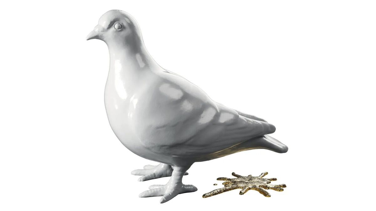
(Image credit: London Museum)
“The pigeon itself is cast from London clay, while its splat is rendered in glitter,” London Museum announced last week. “And the combination is designed to make people think differently about London. “The pigeon and splat speak to a historic place full of dualities, a place where the grit and the glitter have existed side by side for millennia. We share our city with others, including millions of animals. Pigeons are all over London and so are we.”
But in the days since the reveal, X users have declared the logo a “waste of time”, while museums Substacker Maxwell Blowfield describes (as spotted by Time Out) how “no one ever thinks, feels or speaks about pigeons. They’re one of the least unique things about London.”
A pigeon shitting. 2000 years of history in the world’s greatest city and the best they could come up with is a pigeon shitting.I am so sick of this deliberate,incessant debasing of our culture. https://t.co/aKu1pig4btJuly 29, 2024
Of course, bold new logos often attract negative attention before settling into ubiquity (remember the backlash to the new Airbnb logo in 2014? That one’s still around), but I’m a little disappointed to see vitriol aimed at such a fun design. I’m a fan of the logo – with a sense of heritage (and stakeholders) to appeal to, Museum branding isn’t always famous for its personality, but this somehow manages to combine pop art fun with a sense of history and place.
Do Londoners really want to go back to these corporate blobs? (Image credit: London Museum)
I can’t help but suspect that the designers faced somewhat of a Catch-22 from the start with this one. Go for the same old clean and minimal branding that so many institution are leaning towards right now, and it would either be ignored or accused of being dull or unoriginal. Go for bold and fun, and people will say they should have gone for boring. I, for one, am glad Uncommon chose the latter path.
Thankfully, not everyone is hating it online. “I absolutely love the new pigeon branding… clever, witty, memorable and completely nails the subject matter. If you don’t like it, never speak to me again,” one X user comments. Time will tell whether the pooping pigeon will start landing better with the public in general over time, but hey, at least the toilet-themed imagery is deliberate here, unlike with 2021’s unfortunate Calendly logo.