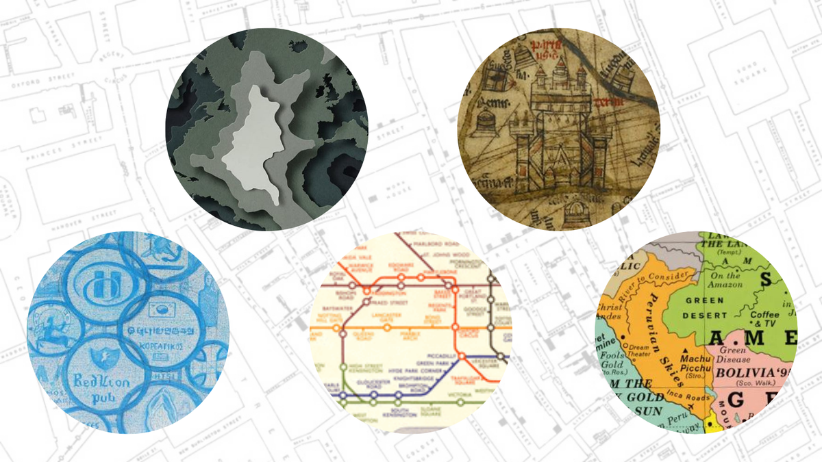
Maps can help us navigate, explore communities and make sense of the world, but that doesn’t mean they have to be boring – in fact, the best map design can be worthy of a gallery wall or a coffee table book, up there with the best design books.
We rely on mapping all the time, whether on our phones (there was a map pinning function on Vodafone’s Glastonbury app for 2024), as a souvenir, or a trusty Ordnance Survey layout for a hike. For hundreds of years, map design has been not just a useful skill, but a creative art. So we’ve put together this list of the coolest maps around, complete with commentary from experts in the field.
01. Hereford Mappa Mundi, by Richard of Haldingham or Lafford, c.1300
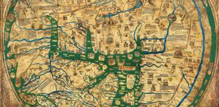
While there are thankfully quite a few historic world maps still knocking around today, the Mappa Mundi kept in Hereford Cathedral is our top pick because it’s full of intricate details, large-scale (5ft 2 inches by 4ft 4 inches), and very well-preserved. It was made by a Lincolnshire man, Richard of Haldingham or Lafford, in about 1300.
The Mappa was incredible for its time (and we still love medieval iconography today), but it wasn’t used for navigation; it showed God’s view over the Christian world, with 500 drawings, including Adam and Eve in the Garden of Eden, and over 400 towns or cities.
Jennifer Dumbelton, Cathedral Librarian, explains why the Hereford Mappa Mundi is so popular: “It’s the largest whole medieval map, made from just one calfskin, and very physically imposing. The pigments were incredibly bright at the time.
“On the map, there are places and people from all over the world (though no Americas or Australia, as they wouldn’t have been known to the mapmaker), and fabulous creatures like mandrakes, unicorns and a Blemmyes. The Mappa captures people’s imagination – they tell us about art inspired by it.”
If you’re inspired by the Mappa Mundi, check out our guide to map illustration.
02. Cholera map, by Dr John Snow, 1854
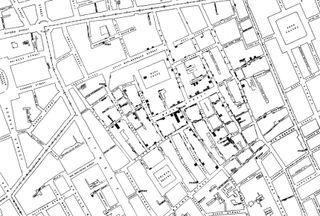
Surely the best map design for a scientific breakthrough, this identified how cholera was spreading in and around Broad Street, London. Dr John Snow showed that affected households (marked in black) drew their water from the same pump, suggesting that was the source of the epidemic, rather than airborne disease.
The cholera map may not have the aesthetic appeal of our other choices in this list, but it was a life-changing piece of work that helped public health. National Geographic recommends using Snow’s map to teach science, health and geography students. Since Snow’s time, science communicators and geographers have used mapping to help monitor other disease outbreaks.
03. London Tube map, by Harry Beck, 1931-present
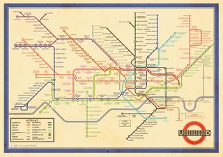
When it comes to public transport, the London Tube map has to have the best design. The user-friendly layout, made by Harry Beck in 1931, doesn’t show the exact geography of London Underground routes, which are often long and sprawling.
Instead, it gives a diagram alternative using horizontal and vertical lines or 45° angles, with clear colour-coding and a minimalist feel – no wonder it was considered ‘too radical’ by London Underground at first. However, the public loved it, and Beck continued to update it until the 1950s.
Themed adaptations the map have become increasingly common in the last few decades, like the Black History Tube Map designed by TfL with Black Cultural Archives, or Luke Carvill’s simplified London Underground map. (If you’re into TFL design, see our pick of the best London Underground posters.)
04. Silk escape maps, by Christopher Clayton Hutton, WWII
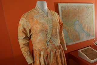
Escape and evasion maps were an essential part of kit for British aircrew, commandos and secret agents in World War Two. MI9 officer and inventor Christopher Clayton Hutton realised they could be made from fabrics like silk and rayon, instead of paper – more durable and silently unfolded. In ration-stricken post-war Britain, silk was valuable to civilians and turned into clothing, which explains why you’ll find a silk map dress on display at the National War Museum, Edinburgh, as part of the exhibition Maps: Memories from the Second World War, until January 2026. Dr Rebecca Higgit, Principal Curator of Science at National Museums Scotland, explains the hype:
“These maps could be folded into small spaces or stitched into the lining of clothing; they were carried easily behind enemy lines or hidden in objects sent to POWs, such as games or sewing kits. If they got wet, they wouldn’t disintegrate, tear or become unreadable.”
Fabric maps continued to be used in the Cold War, too. In a 21st century twist, designer Christopher Raeburn used surplus RAF silk maps from the 40s and 50s in his Raemade fashion collection.
05. AuthaGraph mapping projection, by Hajime Narukawa, 1999-2009
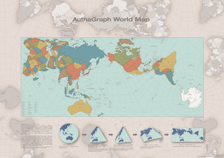
“Japan is at the centre in our world map; on the left, Russia, and on the right, America. Use the same layout and the coastline shouldn’t be interrupted.”
This map better represents the ratio and relative size of oceans and continents, including Antarctica, and avoids overlapping or visible seams by using tetrahedrons. The AuthaGraph was praised by staff in art and science museums, adopted as a mapping tool by the Japanese National Museum of Emerging Science and Innovation in 2011, and the winner of Japan’s prestigious Good Design Award in 2016.
Hajime Narukawa, an architect, artist and Associate Professor at Keio University in Japan who runs his own design laboratory, developed the folded map concept using real-life inspiration from packaging:
“I ate candy wrapped in paper shaped like Tetrapak (milk cartons),” he says. “When unwrapped, it was a rectangle. I found if I project a globe on the Tetrapak and unfold it, I can make a rectangular-shaped map.”
Narukawa’s wife advised on the layout, telling him:
“Japan is at the centre in our world map; on the left, Russia, and on the right, America. Use the same layout and the coastline shouldn’t be interrupted.”
06. Public Places Where We’ve Cried, by Sonia Weiser, 2014-present
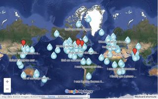
What began as a simple personal project on Google Maps for writer Sonia Weiser turned into a crowd-sourced internet treasure trove mapping vulnerability, viewed 65,000 times. People can anonymously pinpoint places they’ve cried in public, from art galleries to parks, arenas and random street corners.
“I was crying all the time – I didn’t have a job, kept getting rejected. I was lonely, single and floundering. I turned it into a bit of a joke: originally just a map of places I cried, then I expanded it,” says Weiser. “Where I live in New York, seeing someone cry in public is pretty common; I figured other places would be no different.”
For those of us not in New York, this map breaks the stigma of public crying and shows you really are never alone in your feelings; locations I’ve spotted include Buenos Aires Subway Line D, and a shrine to a saint in Multan, Pakistan. Some locations have little anecdotes, others just a pin on the map.
Weiser found “initially there was a huge response and a lot of people added stories.” A decade later, you can still add your weepy locations here. Weiser feels “the novelty of vulnerable content has worn off because people divulge on social media,” but with the reduced relevance of social channels like X (formerly known as Twitter), perhaps we’re due a crying map revival.
07. World song map, by Dorothy, 2017
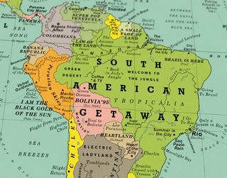
Liverpool-based design studio Dorothy has a themed Street Maps collection covering great songs, films and book locations, with each taking 8-12 months to create. The song maps are our favourites because you can’t help singing along to some of the locations as you browse them (perhaps why there’s an accompanying Spotify playlist).
We’ve gone for a world map with over 1,000 songs, but there are also UK and Ireland or US-only versions, plus an original song map with fictional locations. Jim Quail, who designed most of the Street Maps range, describes the creative process:
“Working on these maps has given us renewed appreciation for the patience of cartographers. The World Song Map has continents, countries, cities, oceans, seas and rivers made up entirely from song titles like Born in the USA, Back in the USSR, London Calling, and No Sleep Till Brooklyn. We’ve just launched the third edition, as we try to keep the Street Maps updated. People don’t get bored of looking at them; even after owning one for years, they still find new content.”
08. ‘The Planet Can’t Stand This Presidency’ illustration by Eiko Ojala, 2017
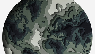
Estonian illustrator Eiko Ojala has a distinctive style, using intricate layers of paper cuttings to create depth with scissor-sharp precision. Maps and globes are some of his recurring motifs, appearing in editorial illustrations for the likes of Computer Arts, report covers for McKinsey, and brand materials for big names like Nokia. This illustration was the New York Times Sunday Review cover in April 2017, showing the environmental impact of the Trump presidency at the time.
“I spent a lot of energy refining the details so people would notice real continents, but also kept an abstract feeling with layers,” he says. You might think of topography maps, rising ocean levels, or rock strata.
Ojala makes big concepts easy to understand through paper art, but his map-inspired work is also covetable in its own right – it would make an impact on a gallery wall. Unsurprisingly, “clients have asked me to make a similar illustration quite a few times.”
9. First Nations of Australia map, by Wildwood Maps, 2022
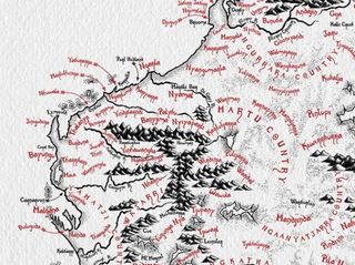
Alex Broers, of Wildwood Maps, shows his year-long research into Aboriginal and Torres Strait Islander communities, which have more than 350 languages and dialects. This is also a gorgeous piece of hand-drawn art in itself.
First Nations communities have faced discrimination and displacement in Australia over the centuries; in contrast, the map celebrates millennia of history and culture from the traditional owners of the land, instead of the colonisers. Wildwood Maps has donated 20% of proceeds from the map to Aboriginal and Torres Strait Islander charities and non-profits.
10. Mapping Symbols, Athens, by Toby Melville-Brown, 2024
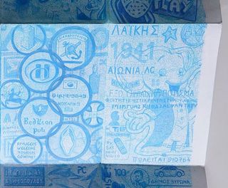
This intriguing Athens map, available as a limited-edition print, sees illustrator Toby Melville-Brown document some of the hundreds of symbols he spotted in different districts. Using watercolour pencils and oil pastels in a phthalo blue shade, he showed each neighbourhood’s distinct logos, murals, graffiti and characteristics.
“My territory needed to include a spectrum of neighbourhoods, but be small enough to navigate on foot. The area is about 10km, from South West to North East,” he says.
“I was curious to see what it would look like if signs, graffiti and motifs were grouped by area and re-drawn on a single sheet. Could we tell the story of a city through its cultural mark-making?”
His influences included the Athenian shop/walking tour/magazine hybrid Desired Landscapes. Next up, he’ll map Liverpool.
Whether you’re captivated by the Mappa Mundi or tempted by maps of songs and street signs, we hope this has inspired you to lose yourself (pardon the pun) in the best map design and maybe even use maps in your work.
