The best poster designs can be a fantastic source of creative inspiration. Despite the shift to digital formats, the poster remains a powerful medium through which designers can communicate and provoke. And when they hit the right mark, they’re a joy to look at.
Posters as a means of communication really took off through advertising and promotional posters way back in the 1870s. Initially, poster designs were black and white and largely text-based, but the introduction of Jules Cheret’s three-stone lithographic printing process in around 1880 allowed artists to start developing striking, colourful designs.
On this page, we’ve gathered a selection of our favourite poster designs, including both commercial projects and indie posters, from classics that still inspire today to more modern designs and including some of the best film posters. For more stunning advertisements, see our roundup of the best billboard advertising, and to upgrade your own design setup, see our pick of the best graphic design software.
Modern poster designs
We’ll start with some inspiring contemporary poster designs. If you’re more interested in classics, skip to the best classic poster designs.
01. Your Name film poster
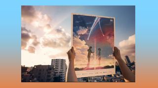
Many fil posters are printed on both sides with a mirrored image to prevent them from looking washed out on lightboxes. This clever poster design for the Japanese anime film Your Name makes a twist on that idea, with different designs printed on each side. When it’s held up to the light, the two designs merge to create a full picture. But it’s more than just a trick for cleverness’s sake; the design perfectly communicates the theme of the film, in which a teenage girl and boy start to swap bodies.
02. Cosmo
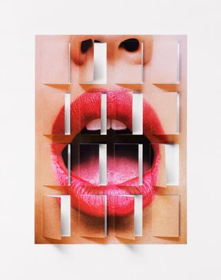
Posters don’t always need to be flat. Matt Chase makes clever use of opening advent calendar-like doors on his cosmo poster to comment on “Secrets and the delicate art of selective disclosure.” The Washington DC-based graphic designer has several playful poster designs.
03. Back to the Future
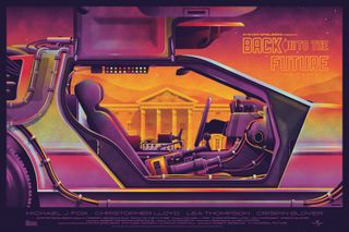
It can be hard to find new angles for something that’s already been the subject of tons of posters, but DKNG found one with their Back to the Future poster for Mondo. The poster focuses on the DeLorean time machine like many that came before it, but it zooms in closer on the detail through the gull-wing doors and throws in a few easter eggs. The neon 80’s colour palette sets the perfect mood.
04. Go Vote
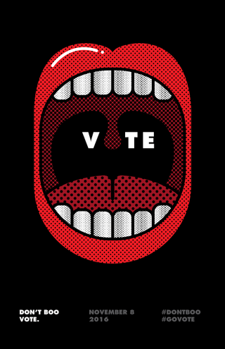
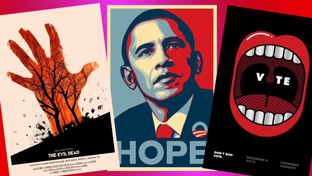
Posters usually aim to get attention, and this poster certainly achieves that. Based on Barack Obama’s phrase “Don’t boo, vote”, it promoted voting in the 2016 US elections with a simple minimalist concept that the eye can’t ignore. The poster was designed by San Francisco-based graphic designer and illustrator Viet Huynh
05. Coffee Facts
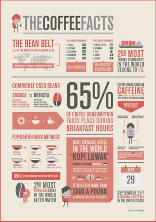
Infographics have become hugely popular for use in media in order to present a ton of data in a visually appealing, easily digestible way, but they’ve also become popular for posters, as demonstrated in this presentation of coffee facts by ONO Creates, a must for any caffeine-addict.
06. Lost & Found by Alva Skog
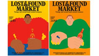
Swedish illustrator Alva Skog created this vibrant poster for a commission by Lost & Found market – a big vintage market in Barcelona. Skog was asked to create images of a man and a woman drinking Estrella beer and wearing something they had bought at the market. Her response was to draw the characters so you can’t tell which is the man and which is the woman.
The bright block colours are deliberately chosen because Skog feels that colours can feel gendered. “I try to find a balance between the pinks, blues and greens in my work,” she told Computer Arts.
The message lies in the detail, says Skog. “The addition of painted nails and a ring on one character, as well as earrings and what could be interpreted as a more feminine-looking top on the other, make it difficult to distinguish whether either whether either is male or female.”
07. Fatih Hardal
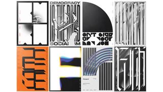
Fatih Hardal is a graphic and type designer who is inspired by Swiss designers and designs from the past. This selection of posters includes work created for the Typografische Monatsblätter (a journal that celebrates Swiss typography), plus typographic experiments printed on transparent paper using silkscreen.
08. Alisa Bay by Purple Creative

This eye-catching poster was created for Alisa Bay, an unconventional distillery operated by chemists. The company uses technology to assess the chemical properties of the whisky and then machinery generates data related to the process. Purple Creative used this data to create generative art for the visual identity.
“We loved the idea that distillery data could be reinterpreted as generative art and was able to capture the essence and personality of Ailsa Bay, which is scientific, technical but also creative,” said Gary Westlake, founding partner and creative director at Purple Creative.
“It’s been an exciting creative challenge for us. We’ve had to learn a lot about algorithms and responsive code, but hopefully the imagery and dynamic applications have been worth all the hard work!”
09. Stamma
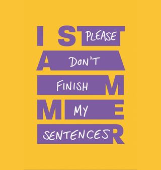
Zag created a striking campaign for the British Stammering Association that seeks to improve public understanding and perception of the condition. The organisation itself has also been renamed Stamma in a bid to reach people who stammer earlier in their lives.
The poster design is centred on the written phrase ‘I stammer’, which is stretched in places to represent the pauses that occur across various designs, including posters. The spaces are filled with the thoughts and frustrations that often go through the mind of someone who stammers during these moments. The aim is to correct common misconceptions, such as the idea that people stammer because they’re nervous.
10. Rock the Farm
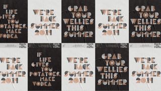
This poster design is included for its innovative approach to typeface and branding. Created by Shoptalk for Chase Distillery, which produces gin and vodka created from produce grown on its Herefordshire farm, the campaign focuses on the potato. In fact, the custom typography was made using potato prints.
“At Chase Distillery, everything starts with the humble spud, so we felt it was important that the new brand and identity did too,” says James Wood, Shoptalk’s co-founder and creative director. “We took inspiration from the stencilled potato crates, jute sacks and enamelled signs that can be found on Chase Farm, and devised a unique typeface using potato carving.”
The potato prints were refined digitally to create the spud sans typeface for use on posters, lanyards, digital platforms, promotional material and wayfaring signage. We’re also fans of the collage-effect imagery and use of white space.
11. Sometimes Always
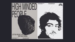
Sometimes Always, a graphic design studio based between São Paulo and Berlin, recently unveiled a striking series of posters for São Paulo fashion boutique Cotton Project’s AW 2019 collection, named Contra. Studio founder Gabriel Finotti says the collection “explores the counterculture spirit behind the rise of surfing and rock climbing” – sports that he states have “questioned a conservative and consumerist society” through participating in more “libertarian and hedonistic lifestyle” pursuits since the 1950s. The images use only black and white, with a typographic focus alongside imagery shot by Brazilian photographer and director Hick Duarte.
Gabriel adds that the aesthetic draws on a “magical moment” in the history of the sports: “a golden age” defined by neither money nor social status but “driven by a group of young people living on the edge of society, questioning morals and venturing into the unknown.”
12. Mother Design for AIGA
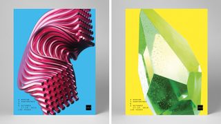
Creative agency Mother Design was challenged with creating the visual materials for the annual gathering of America’s leading design association, AIGA, at a point in time when the organisation has undertaken a new vision to become a hub for broader creative constituencies. A vibrant poster series was a particular highlight.
“Our design solution became a metaphor for the organisation and annual conference itself: evolving over time and embracing the beautiful, messy and sometimes unexpected ways that people and ideas come together in one place,” explains creative director Jason Miller.
“Conceptually, the AIGA ‘cube’ represented a magnetic centre of gravity, drawing design disciplines together,” Miller continues, “while dimensionalising and fostering all kinds of inspiring interactions and collisions along the way.”
13. This is Pacifica for Surf City Festival
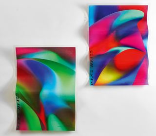
Make Waves is a series of three-dimensional posters on silk paper with fibreglass coating (shown close up in the article’s hero image), created by communication agency This is Pacifica for the international Surf City Festival held in Barcelona.
The process of creating the posters was similar to that of building a surfboard. “To shape the posters, a professional surfboard shaper was invited to create a series of structured casts that allowed him to shape each poster with different waveforms and volumes, transforming a graphic piece that is usually flat into a poster with three-dimensional waves,” explains This is Pacifica creative director Pedro Serrão.
Overall, he describes the collection as “a formal piece of design and the spirit of surf together in a singular and human representation of the sea.”
14. Annik Troxler for Jazz Festival Willisau
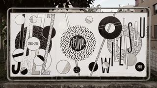
Swiss designer Annik Troxler created the visual identity for the 2018 Jazz Festival Willisau, and her poster designs combine playfulness with a strict coherence and attention to functionality.
In developing her design vocabulary for this project, Troxler referred to the systems of rhythms and forms in music, creating shapes and typographic elements. Troxler’s intention was to make movement ‘visible’ by using a simple device: circle elements rotating with and against each other on different layers of the surface.
The design identity began with an accident. “As I zoomed in on an area a ‘pixel pattern’ appeared. I immediately knew that I wanted to make something out of it using varying densities, brightnesses and typography,“ explains Troxler.
Annik Troxler’s works are usually vibrant and colourful, but for this identity, she chose black and white with silver accents. “I think the shapes and patterns have more impact in black and white – but when I added silver to the silkscreen, it gave the image the elegance of reflective light.”
15. Superunion for Shakespeare’s Globe
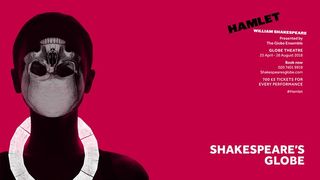
The 2018 radical rebrand of Shakespeare’s Globe resulted in some bold poster design. The entire poster series is deceptively complex in its striking simplicity. The 20 sided symbol, used on each of the posters in a different way, represents the shape of the Globe itself, and was physically made from a rubbing of the original wood.
There are reasons for the choice of colour scheme and typeface too. To find out more about the inspiration for the brand strategy see our piece on How Superunion modernised Shakespeare’s Globe. This Hamlet poster is our favourite because of how it brings the classic symbol of the skull bang up to date, using the Globe’s new logo to create a tribal theme that reflects the diversity of the director’s interpretation.
16. Pronomade(s)
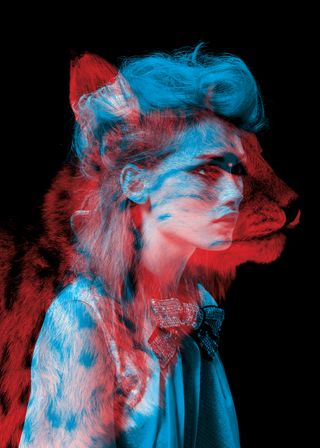
The design team Helmo – Thomas Couderc and Clément Vauchez – created this dramatic series of posters for a fashion event at the Galeries Lafayette in Paris. The concept is centred on the idea of animal instinct versus fashion instinct. The posters were displayed on a huge scale, over the windows and dome of the store.
17. Knochenbox gig poster
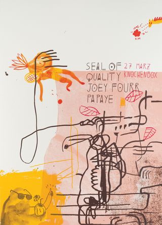
Music venues don’t get much more indie or experimental than Knochenbox in Berlin – it occupies a crypt under a chapel. It’s fitting, then, that this gig poster also steps away from the norm. The limited-edition screenprint poster is the work of Palefroi, Berlin-based French design duo Damien Tran and Marion Jdanoff.
“Palefroi produced a screenprint with the meandering line, splotchy composition and eccentric digressions of an art print,” commented acclaimed design writer Rick Poynor, in an article for Computer Arts magazine. “This is a playfully indirect communication from the subcultural fringes for musicians who command a small but intensely loyal following.”
19. Noise x GIF Fest identity
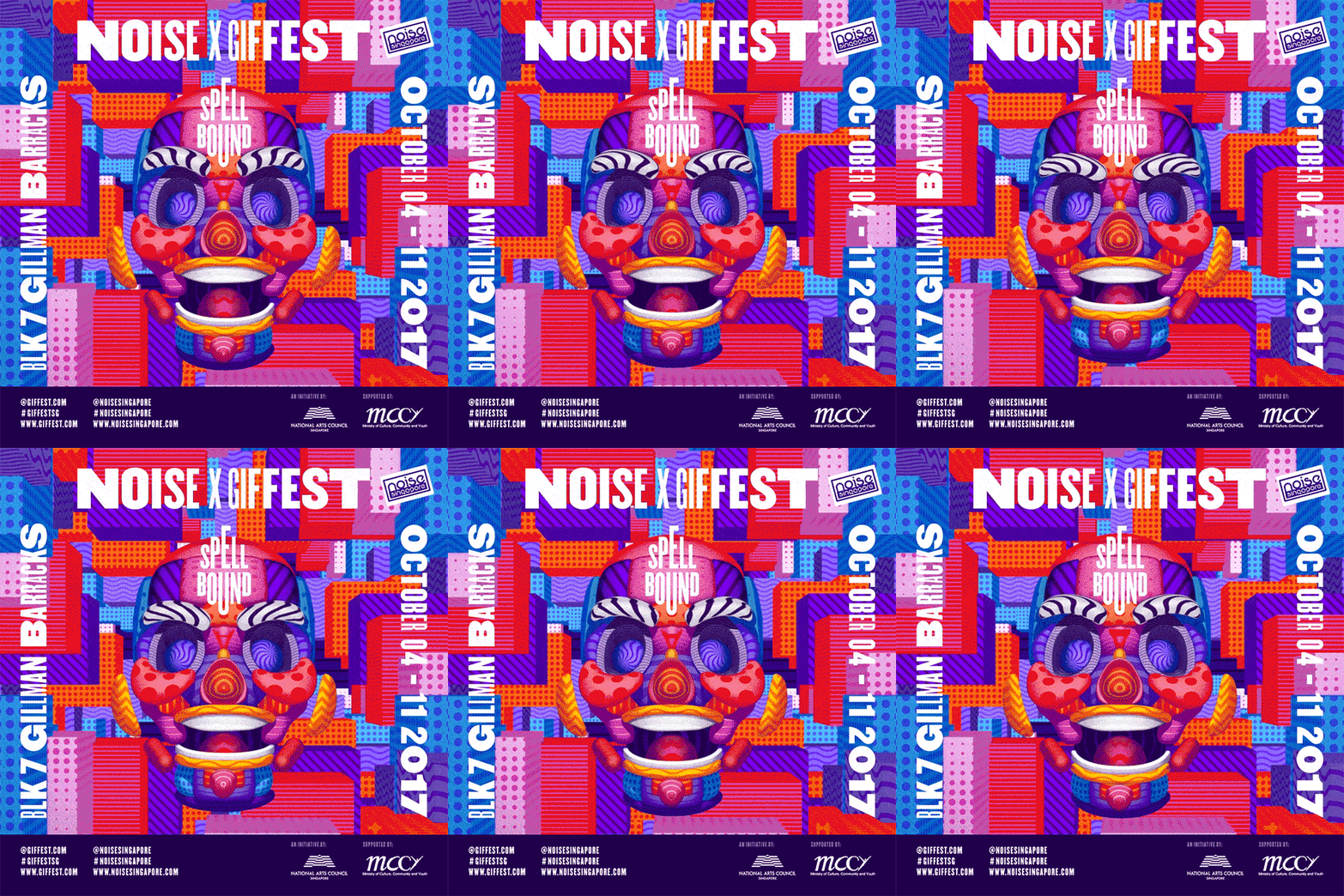
Noise x GIF Fest is Singapore’s biggest GIF festival. When it came to crafting the event’s loud identity, local studio BÜRO UFHO realised the design would need to work as both a static piece of print as well as an animation. “It was pretty much set from the start that the poster would have to be an animated GIF,” laughs BÜRO UFHO creative director Jun T.
The team created 13 different logo variations, which, when played as a sequence, create an illusion of movement. Meanwhile, textures move across the event’s poster to produce a sense of depth and animation. “We also constructed the face in 3D,” adds Jun T, “resulting in a looping GIF poster that’s in line with the theme and concept.”
19. Solo: A Star Wars Story
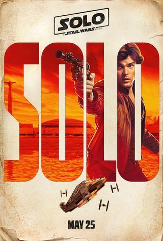
This teaser poster was one in a series of four designed to tantalise fans looking forward to the upcoming Star Wars movie all about Hans Solo. Masking visuals inside the typographic titles is an effective treatment, with each poster showing a different character. However, like much to do with the production of this film, the teaser poster release didn’t run smoothly. It wasn’t long before someone spotted an uncanny resemblance to a range of Sony Music France album covers released in 2015, and a plagiarism scandal swiftly followed.
20. Ready Player One
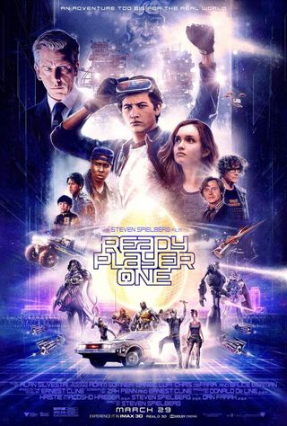
Steven Spielberg’s Ready Player One was a retro sci-fi extravaganza, and we’re including this design as an example of the floating heads genre done well. The movie poster mirrors the film’s aesthetic, with a vintage style that draws on the works of legendary poster illustrator Drew Struzan – of Indiana Jones, Back to the Future and Star Wars fame.
19. Thor: Ragnarok
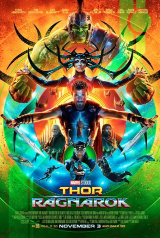
The official Thor: Ragnarok poster design was warmly received by designers and fans alike, thanks to its refreshing and sophisticated visuals, and some cool typography that harks back to 1980s gaming (for more on this, take a look at our article on typographic trends in Marvel logos). A psychedelic masterpiece, the poster harmoniously positions key characters to build a sense of excitement around the film. This poster design is a masterclass in how to use the Photoshopped approach without descending into messy chaos.
22. The Evil Dead
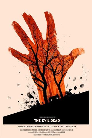
Illustrator Olly Moss is well known for his clever, minimalistic poster designs. As well as this officially licensed screenprinted poster for a 2010 screening of The Evil Dead, he’s also created posters for the Harry Potter posters, The Jungle Book, Star Wars Trilogy and more.
23. Stranger Things
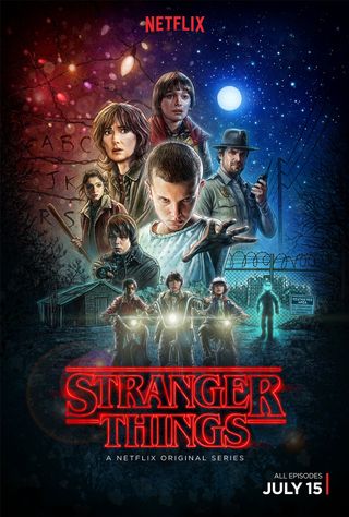
One of 2016’s biggest TV events, Stranger Things came out of nowhere and grabbed everyone’s attention thanks to its gripping supernatural story and pitch-perfect retro stylings, and Kyle Lambert‘s stunning poster was a vital part of the whole package. Briefed to create a 1980s-style poster reminiscent of classic, hand-painted movie artwork, he created this using an iPad Pro and Procreate. You can read about his process here.
24. Ford adaptive poster
Created by Ogilvy & Mather Istanbul (now Ogilvy), Ford’s clever ‘adaptive poster’ was used to promote the company’s new adaptive lighting technology. Using an optical illusion, the poster was designed to allow people to experience its Adaptive Front Lighting System that reacts to steering input when going round corners.
As the viewer moves around the multi-layered poster, the perspective shifts and allows the viewer to ‘see’ round the corner. It was launched in authorised Ford dealers and certain locations around Europe – and you can see how it was done in the video above.
25. Iris
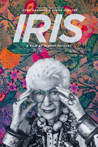
Released in 2015, Iris is a documentary film celebrating the life of fashion icon Iris Apfel, and this poster by Gravillis Inc is one of the best we’ve seen. Iris herself appears in black and white, while a vibrant patterned background showcases her love of fashion. A clever and original concept that doesn’t disappoint in the style stakes.
26. Maze Runner: Scorch Trials
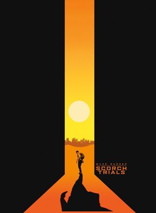
Another film that didn’t set the movie world alight was 2015’s sci-fi offering Maze Runner: Scorch Trials. While the creators did release some more typical poster designs, the public was also treated to this more left-field design, which makes clever use of negative space. The lab flask shape is a nod to the movie’s plot, while the bold use of red in the central strip intensifies the feeling of heat in the scene.
27. Green Man
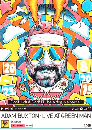
Gig posters are an arena in which graphic designers can really indulge their passion for both art and music. So, it’s always a delight to see music festivals and designers coming together to produce something incredibly special; that’s exactly what Green Man festival and the UK Poster Association have done here.
“The festival asked us to create a series of limited edition prints for some of the acts playing at the festival,” explains designer Luke Drozd. “Eight acts were chosen in total, and they show the diversity of acts that are playing the festival as well as the diversity of talent exhibiting at the UKPA stall. Each poster was created as a limited edition A2 screen print.”
28. It Follows
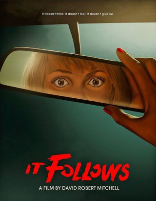
Everyone knows that making a character stare directly out of a movie poster is a sure-fire way to grab the attention of passers-by. Brilliantly illustrated by Akiko Stehrenberger, this poster for 2014 horror hit It Follows ramps up the intensity by framing the figure’s eyes in the reflection of a car windscreen mirror. Stehrenberger has crafted posters for a huge range of indie and commercial releases, and it’s easy to see why he’s in such demand.
29. The Lobster
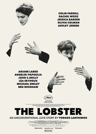
Who couldn’t stop and stare at this one? An unconventional poster design for an unconventional film, artist Vasilis Marmatakis has captured the characters embracing empty silhouettes of each other. Marmatakis has also crafted the titles for Dogtooth as well as working on a range of other movie posters.
30. 1,462 Days of Trump
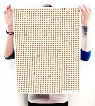
Donald Trump is president of the USA. When Trump was elected, Kurt McGhee calculated that a four-year term is 1,462 days, and he created this poster to ram that fact home and to give you some minimal therapy as you cross off every day that passes. “It may not seem that long until you see that amount of time in days,” he says. “No matter who it is, a lot can go wrong in 1,462 days.”
31. Vintage Heroes
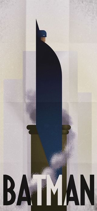
Comic book lover and avid gamer Grégoire Guillemin often creates superhero inspired designs and these minimalist vintage posters have hit the right spot when it comes to inspirational graphic design.
The likes of Batman, the Green Hornet and the Silver Surfer are all included in the retro re-imaginings. The gorgeous typography teamed with the brilliantly sketched superhero illustrations have had us falling head over heels for the series.
32. Call Me Lucky
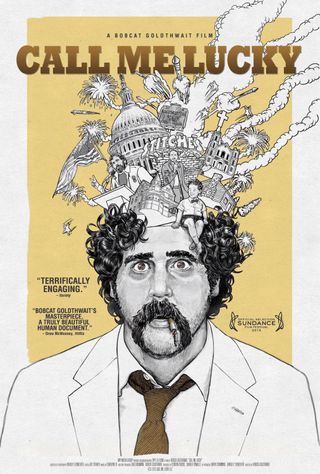
We love it when illustration is given centre stage with movie posters and this one for ‘Call Me Lucky’ is an absolute delight to look at. Contrasting a minimal colour palette with an intricate execution, the design was conjured up by Vodka Creative, with Jesse Vital taking care of the artwork itself.
33. Barack Obama ‘Hope’ poster
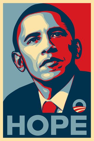
With his roots in the skateboarding scene, South Carolina-born graphic designer and illustrator Shepard Fairey built a name for himself with his ‘Andre the Giant’ guerrilla sticker campaigns – but it was his involvement in the 2008 US Presidential election that really catapulted him towards global recognition.
Fairey’s now-iconic Barack Obama ‘Hope’ poster, featuring a four-colour portrait of the then-Senator in red, beige, light and dark blue, also came in ‘Change’ and ‘Progress’ versions, and was created in a day. Having started life as a screen-printed poster (which sold out almost immediately), the design spread virally across the United States and the rest of the world as a symbol of what American politics could become.
The revelation the following year that Fairey had based the design on a photograph by Associated Press photographer Mannie Garcia without permission – and later admitted to destroying evidence in the ensuing legal battle with AP – led to community service and a hefty fine. Amongst designers, it’s now as much a symbol of copyright infringement as it is a piece of political iconography. But whatever the circumstances of its creation, its influence during the election campaign was enormous.
34. Godzilla X Kong poster designs
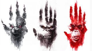
They weren’t the main posters for the film, but we loved these Godzilla x Kong: The New Empire character posters. Part of Legendary’s presence at the CCXP convention in São Paulo, Brazil, there are three in the series: Godzilla, Kong, and Skar King, the villain of the film. The designs show the face of each monster framed within one of its own footprints. Some fans were intrigued by one particular feature in the Godzilla poster, not having noted before that Legendary Godzilla only has 4 fingers (see our piece on the history of Godzilla character design).
Classic poster designs
35. The Lure of the Underground
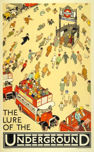
The iconic branding of the London Underground began early in the 20th century when, with dwindling passenger numbers and a shaky public view of the dirty subterranean rail system, Frank Pick saw a need to step up the self-promotion of the tube. Pick totally overhauled the way the Underground marketed itself, even holding public exhibitions of the art produced for Underground advertisement. The result has been that tube posters offer a wonderful reflection of the changing face of graphic design and emerging artistic styles over the last century.
The Lure of the Underground was created by comic strip illustrator Alfred Leete in 1927. We love this example for the individual characters and 1920s styling.
36. 1923 Bauhaus Exhibition in Weimar
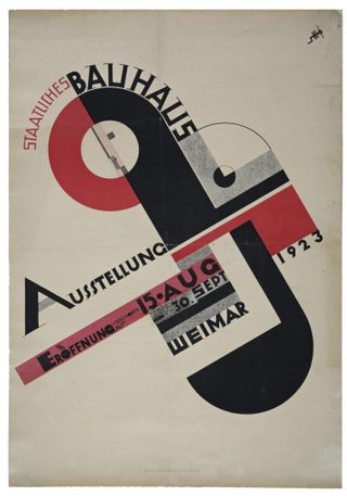
Joost Schmidt’s now iconic poster for the 1923 Bauhaus Exhibition shows a cross comprised of circles and squares, and includes the Bauhaus logo designed by Oskar Schlemmer.
Produced for a competition, the poster had to incorporate the logo, exhibition information, venue details and the date. Schmidt was one of the pioneers of Bauhaus typography, and the original version of this poster was placed in 120 railway stations in Germany.
37. Mass Non-Violent Direct Action
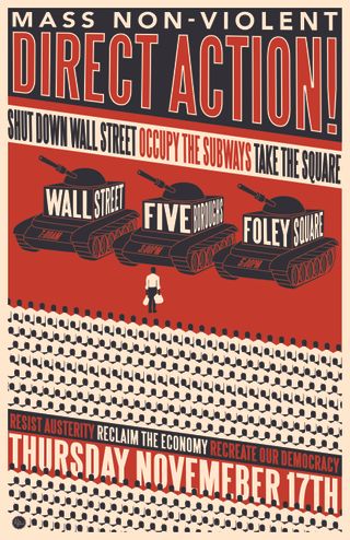
November 17 2011 was an international day of action organised two months after the first Occupy Wall Street demonstration. R. Black’s poster for the event includes a single protester coming forward from the massed ranks – a callback to the Chinese man who blocked the path of a tank in Tiananmen Square in 1989.
“Like many effective protest posters, R. Black’s blocky, constructivist design for Occupy has the stridency and urgency of a brick lobbed through a window,” says Rick Poynor. This memorable poster is all over the internet and, as with many images of this kind, it is far more likely that it was viewed on a laptop or tablet than encountered as a print.”
38. Metropolis
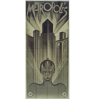
German graphic artist and painter Heinz Schulz-Neudamm designed this art-deco poster for the premiere of Fritz Lang’s groundbreaking 1927 sci-fi film Metropolis. Only four known surviving copies of the poster exist, one of which took the record for being the most expensive ever sold, after reaching a record price of £398,000 in London in 2005.
39. Lord Kitchener Wants You
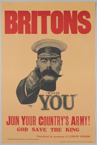
This hugely influential 1914 advertisement by Alfred Leete – often referred to as ‘Britons Wants You’ – became an icon of the enlistment frenzy in Britain during WWI. The poster features Lord Kitchener, the British secretary of state for war, above the words “wants you”, and set the tone for hundreds of copycat posters the world over.
40. Books
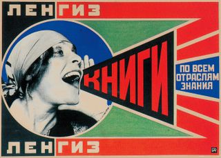
Russian constructivist Alexander Rodchenko experimented with graphic design after retiring from painting. Books combines photography and graphic design, and Rodchenko’s depiction of immediate communication is characteristic of official Soviet art of the period, which sought the best method of conveying the messages of the Communist state to the masses.
41. Le Chat Noir
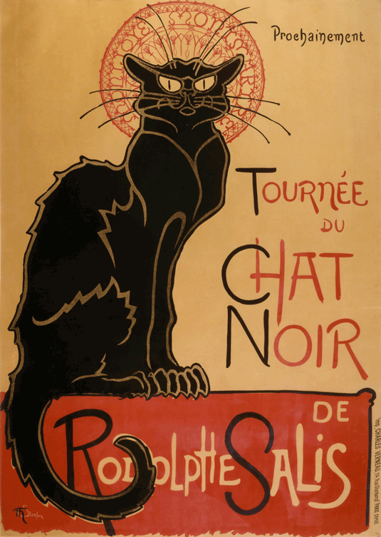
Perhaps one of the most well known posters of all time, this iconic advertisement for the Parisian entertainment establishment, Le Chat Noir, was created by Swiss-born French Art Nouveau painter and printmaker, Théophile Steinlen.
It epitimises the Bohemian, Art Nouveau style and Cabaret culture of late nineteenth century Paris that stemmed from the legendary venue, which, in its heyday, served as an artist salon, music hall and busy nightclub.
42. Dubonnet
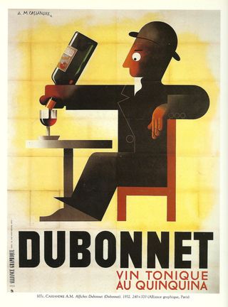
French artist and typographer A.M. Cassandre became famous for his commercial poster designs in the 1920s and 30s. Notably, he was one of the first to create posters designed for those passing by in vehicles. Perhaps his most well-known work was for wine company Dubonnet.
The poster shown here is a particular favourite of Turner Duckworth founder Bruce Duckworth, and the one that began his poster collection when he purchased a super-sized 1952 second edition version in New York in the late 1990s.
“I’d hankered after the poster since I was a student at Kingston Polytechnic,” he says. “You can’t beat the graphic impact of a massive poster! I have breakfast sitting under it every day, and I’ll never tire of it – every element of it is beautifully crafted and fully considered. Of all my possessions, I’d grab this on the way out if my house caught fire.”
43. We Can Do It!
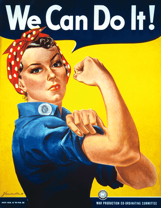
Perhaps one of the most iconic images of the 20th Century, American graphic designer, J. Howard Miller’s beloved Rosie the Riveter was designed to boost morale in during WW2. This poster is still used today and re-modelled on everything from modern feminist texts to tattoos as well as spawning numerous parodies. His bold, modern illustrative style, mirrors the comic books popular at the time and defined an era of advertising.
44. Moulin Rouge
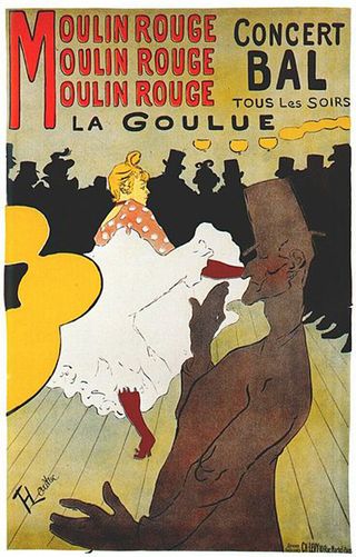
This poster design for the Moulin Rouge is another by French artist Henri Toulouse-Lautrec. When the cabaret opened, Lautrec was commissioned to create a series of posters, with this design being one of his most well known. The piece features images of Moulin Rouge dancer La Goulue and her partner Valentin le Desosse. Lautrec captured La Goulue’s provocative kicks and Valentin’s lanky frame perfectly in this design.
45. TWA
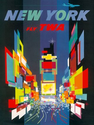
American artist David Klein designed and illustrated dozens of posters for Howard Hughes’ Trans World Airlines (TWA) during the 1950s and 1960s. In 1957, this stunning TWA poster of New York City became part of the permanent collection of the MoMA (Museum of Modern Art) in NYC.
In many of Klein’s designs, he used bright colours and shapes in an abstract style to depict famous landmarks and scenes of cities around the world. Best known for his influential work in the field of travel advertising, Klein’s iconic images are much imitated.
46. Drive
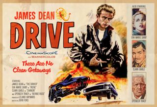
Illustrator and designer Peter Stults published a set of retro poster designs with a twist. His awesome ‘What if’ series explores what if movies we’re all familiar with were made with a different slice of time? Who would be in it and direct it?
Our favourite was this Drive poster, with James Dean as the lead male role. Other designs include alternate posters for Pulp Fiction, Groundhog Day, and 2001: A Space Odyssey.
47. Harper’s
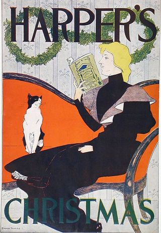
It’s impossible to talk about American poster design without mentioning graphic artist Edward Penfield. Often referred to as a master of graphic design, it was during a school exhibition that Penfield’s work was first noticed by the art editor of Harper’s Magazine, the company that he went go on to create no less than 75 poster designs for.
48. Berlin 1936 Olympic Games
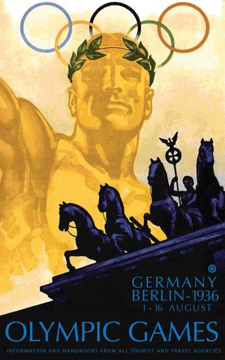
The 1936 Games was dominated by propaganda, as Hitler grasped the opportunity to promote the Nazi line of Aryan racial superiority. Thankfully, the black athlete Jesse Owens won four gold medals and made Hitler look pretty stupid. We can’t deny, however, that the poster designed by Franz Würbel was brilliant, showcasing one of Berlin’s most iconic landmarks. It made the Führer happy it seems, after 44 of Germany’s finest artists had failed.
49. Absinthe Robette
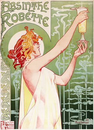
In the late 19th Century, the popularity of Absinthe coincided with the increase of large lithographic advertising posters as a commercial and artistic medium. Some of the greatest artists of that period created posters for the alcoholic beverage, including Belgian posterist Henri Privat-Livemont, who illustrated this iconic Art Nouveau Absinthe Robette image in 1895.
50. Monaco 75
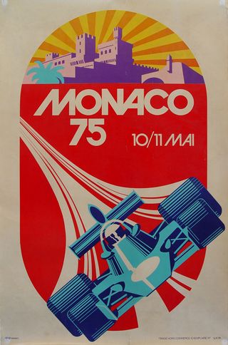
This striking design for the 1975 Monaco Grand Prix was created by talented artist Michael Turner. With minimal type, Turner let his illustration do all the talking, using a vibrant and eye-catching colour palette, the car takes centre stage with the beautiful destination of Monaco in the background.
51. Die Gute Form
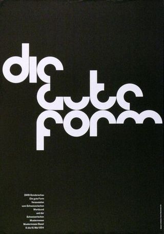
The Swiss graphic designer Armin Hofmann was one of the leading figures in the International Typographic Style, also known as the Swiss style, which emerged as the dominant style in poster design after World War II. The use of bold sans serif typefaces and monochrome in this poster is typical of the movement’s philosophy of creating striking but clear communication in what was becoming a globalised world.
52. The NeverEnding Story
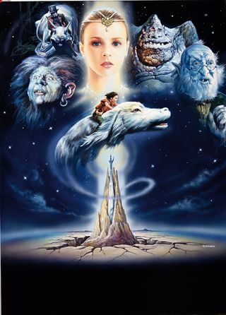
Today, it’s easy to see photos of the characters being montaged together, much like the posters for The Lord of the Rings films. But where would be the fun in that? Renato Casaro, who painted over 1,500 posters during his career, including those for The NeverEnding Story, believes that without the hand of an artist, today’s posters are often devoid of that touch of magic.
53. Peace
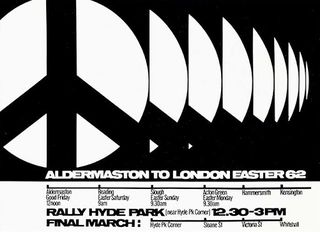
A striking poster even has the power to launch a new symbol into the international vocabulary. Ken Garland’s poster for a march from Trafalgar Square, London, to the Atomic Weapons Research Establishment at Aldermaston took Gerald Holtom’s original design of a symbol for the British nuclear disarmament movement, and made it simpler and bolder, contributing to the expansion of its use internationally. Holtom’s original design took the semaphore shapes for the letters N and D, standing for ‘nuclear disarmament’ (see our article on the unknown stories behind everyday icons).
54. Vertigo
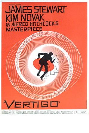
Bass created entire identities for movies, contributing to the whole look and feel of the release by producing a package of materials including title sequences. He produced four posters for Hitchcock’s 1958 classic Vertigo, but this is the one that’s most remembered. The two figures falling into the warped hypotrochoid curves reflects the vertiginous atmosphre of the film.
55. Air New Zealand
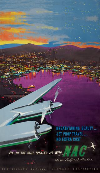
When Air New Zealand celebrated its 75th birthday, the company dug out some of its best poster designs. The posters provide a history of the developments in aviation, as they move from advertising solent flying boats (which flew a maximum of 36 lucky passengers at a time) to modern 737s.
The vibrant Technicolor design provides an interesting contrast with modern advertisement methods – a clear reflection of how things have changed in the last 75 years.
Inspired? See the best prices on Adobe‘s Creative Cloud package if you need to upgrade your software for your own poster designs.
56. The original Star Wars poster
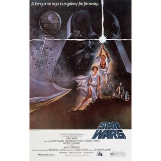
This Tom Jung poster for the original Star Wars film is another classic movie poster. It’s not his best known (see our pick of the best Star Wars posters) but we think it was the most original and evocative design. The asymmetric composition is unsual for a movie poster, arresting our attention, and the illustration encapsulates George Lucas’s intention of combining sci-fi, fantasy and adventure. The beefy Luke Skywalker and Princess Leah look like they’ve walked out of a swords and sorcery flick. Conan the Barbarian anyone?
Some content was originally published in Computer Arts magazine. For more inspiration see our pick of the best print ads. And to hone your skills, see our roundup of Illustrator tutorials.
