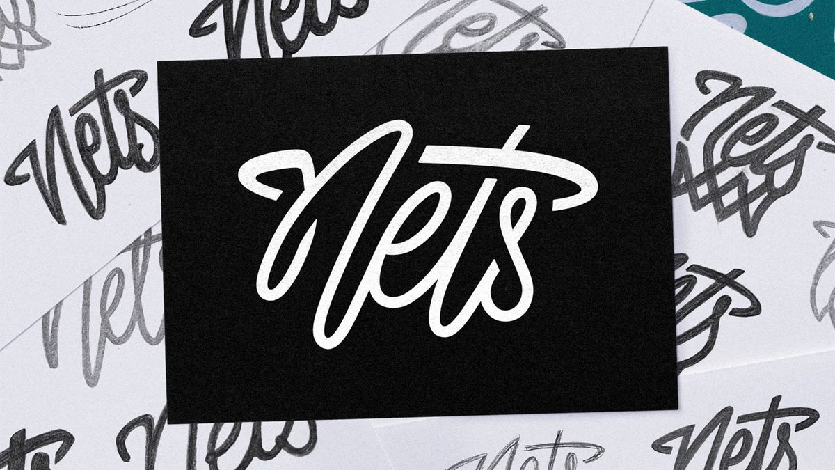
Basketball team the Brooklyn Nets have unveiled a brand new logo, and gauging by fan reactions it’s safe to say it’s a slam dunk. Receiving praise from supporters and design fans alike, the new secondary logo design features “nods to Brooklyn’s unique style” with a stylised cursive wordmark that’s contemporary and clean.
Sports logos are more than just a design – they’re an emblem of a fanbase’s identity – so it’s integral that a new logo wins the hearts of supporters. With its crafty hidden design and stripped-back look, the new Nets logo is a stylish expansion of the team’s already iconic identity.
According to Jessie Kavana, art director for the Brooklyn Nets, the new design was part of a “2+ year long process”. The “Nets Thread” logo acts as a sleek standalone wordmark that’s “stylised for the borough”, embracing the team’s New Jersey roots. The swooshing cursive font gives the design a sense of dynamism, forming a subtle basketball hoop design integrated into the letter “t”.
Design fans on the subreddit r/DesignPorn shared their praise for the hidden design, with one user commenting “It’s just literal enough to kinda imply it is but abstract enough to not make it tacky”. Another called it a “perfect logo”, adding “Simple and straight to the point. Perfect 10”. Similarly high praises were sung on X, where one fan commented “This should be the primary logo,” while another claimed: “This is extremely good. The best wordmark I’ve seen in ages.”
For more sporting design inspiration, check out the brilliantly simple new logo for the National Football Museum. For more branding news, check out basketball star A’ja Wilson’s new Nike logo that divided fans.
