Billboard advertising is some of the best design there is, with larger-than-life design striving to catch the eye of busy consumers out on the street. Their sheer size gives them extra impact, but they need to be clever and not just enormous. We’ve listed our favourite billboard designs, all of which try something new and different to make their mark.
While print ads have the advantage of smaller-scale design, it can be hard for billboard advertising to stand out amongst the surrounding visual noise. Billboard advertising campaigns can shake things up; whether it’s by using different materials, creating designs that interact with the surrounding environment, or just introducing some super-clever copy. Read on for some of our favourite creative billboard advertising campaigns.
Great billboard advertising can make you stop in your tracks, embracing larger-than-life design and clever copy to grab the attention of passers-by. With such a big space to fill, it’s no easy task to make a successful ad that’s scalable and traffic-stopping but these inventive designs are a great example of how diverse the world of billboard advertising can be.
While TV adverts might have the added enhancement of audio, the standalone visual impact of billboard advertising means that they can make a lasting impact through bold imagery alone. Whether they embrace interactive design, immersive imagery or simple stripped-back visuals, the best billboard advertising examples can be a great source of creative inspiration, pushing the limits of static design.
Best billboard advertising
01. Gymshark shoplift campaign
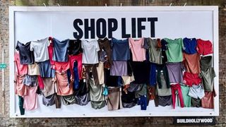
This ingenious billboard from the athletic apparel brand Gymshark is a perfect example of interactive marketing mixed with clever, eye-catching copy. The simple design features exclusive clothing pieces pinned to the billboard. The provocative copy seemingly invites passers-by to pluck items off the board, effectively encouraging consumers to ‘shoplift’ from the billboard.
Once the times were all removed from the billboard a new message was revealed that read: “Shop lift-ing essentials—up to 60% off everything”. While it might seem like a rather dramatic ad for a simple sale promo, the clever stunt got creatives talking, opening up the interactive possibilities of billboard advertising.
02. Surreal cereal
When it comes to marketing the humble cereal box, it can be pretty hard to reinvent the wheel. With this in mind, breakfast brand Surreal created a selection of hilariously bad billboard ads to poke fun at the post-Christmas fitness fad.
With laughably primitive design, basic WordArt and typos galore, the playful brand commits almost every design crime under the sun, but somehow it works. While the billboards might seem traffic-stopping for all the wrong reasons, Surreal’s rebellious campaign proves that breaking the rules can be a clever way to give your brand a boost of refreshing personality.
03. Dracula
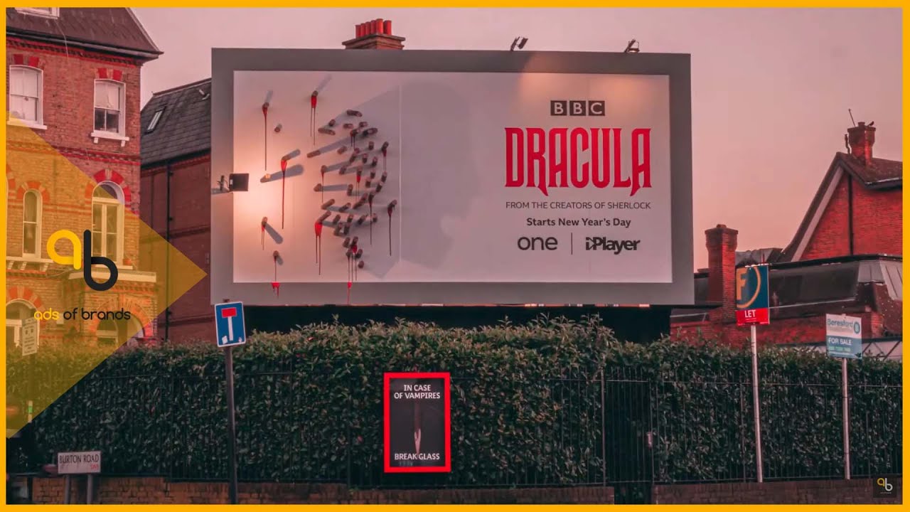
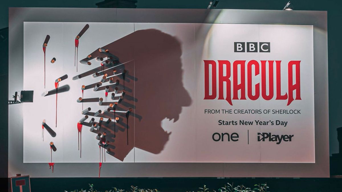
In this advert for the BBC’s adaptation of Dracula, bloody stakes stick out from this billboard during the day. But at night, a light on the side of the billboard means that the stakes form a haunting shadow of Dracula himself. It’s certainly a clever way to get people’s attention.
04. KFC
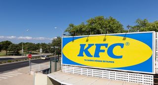
No, this isn’t a billboard for Ikea, we promise. But it is a clever marketing tactic from fast food outlet KFC. The billboard was designed to resemble the furniture giant’s logo as where the restaurant is located is know as “where the Ikea is”, and in a fun interaction on Twitter it seems Ikea were equally as amused with this great billboard advertising as we were.
05. Corona
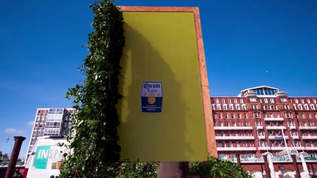
This billboard ad for beer brand Corona makes the most of its surroundings, using nature to do the hard work. Created by ad agency Wieden+Kennedy, the ad celebrates Corona’s 100% natural campaign, using the sunlight to cast a shadow of a beer bottle with the message “made from the natural world”.
It’s a billboard ad that embraces simplicity, with the bright yellow wall and Corona label acting as clear signifiers of the brand’s identity. Coming to life during the evening golden hour, it’s transformed into a strong multidimensional ad that’s innovative and effortlessly stylish.
06. IKEA Steps
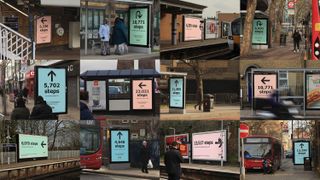
This intriguing approach to billboard advertising was created by Mother. To promote IKEA’s new Greenwich store – the most sustainable IKEA ever – the ad agency devised a campaign aimed at highlighting the store’s eco-friendly credentials. Billboards and posters all over London directed would-be shoppers to the new store, encouraging them to take the most eco-friendly route (on foot, or by public transport).
07. Rust
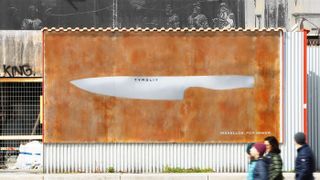
This billboard by Heimat transformed over time to show off Tyrolit’s Iceline knife range’s USP. Initially, passers-by were faced with a mysterious sheet of metal, bearing only the brand’s logo. In a matter of a few weeks, the surface became covered with rust, leaving only the shape of a knife untarnished. The tagline: Flawless. Forever. drove home the message.
08. Wave of Waste
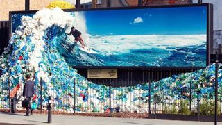
To mark World Oceans day in 2018, Corona worked with Wieden + Kennedy on this sobering billboard advertising campaign. Artist Andy Billett created a 3D ‘wave’ from plastic waste collected in the UK, which combined with an image of Chris Hemsworth surfing to emphasise the volume of plastic ending up in our oceans. The public was encouraged to drop off their own waste at the site. Similar campaigns were run in Melbourne, Lima, Santiago, Bogota and Santo Domingo.
09. Who is America?
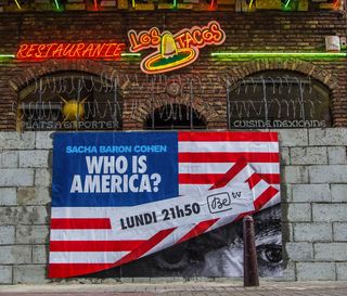
Sacha Baron Cohen’s TV series, Who is America?, was an exercise in getting assorted American politicians to humiliate themselves on camera, with hit-and-miss results. But it’s hard to fault this Belgian campaign to get people viewing on BeTV; Brussels agency Happiness built ugly breeze block walls in front of Mexican restaurants, complete with razor wire, and used them as billboards to advertise the show. Strong stuff.
10. Follow the Arches
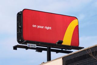
It takes a lot of chutzpah to mess with a logo, but that’s what Toronto agency Cossette, along with Spencer & Jordan, did for this McDonald’s campaign. For the award-winning Follow the Arches campaign, the team deconstructed the iconic golden arches and transformed them into minimal directional billboards to help steer drivers to the nearest branch of McDonald’s.
11. Reebok ZPump 2.0
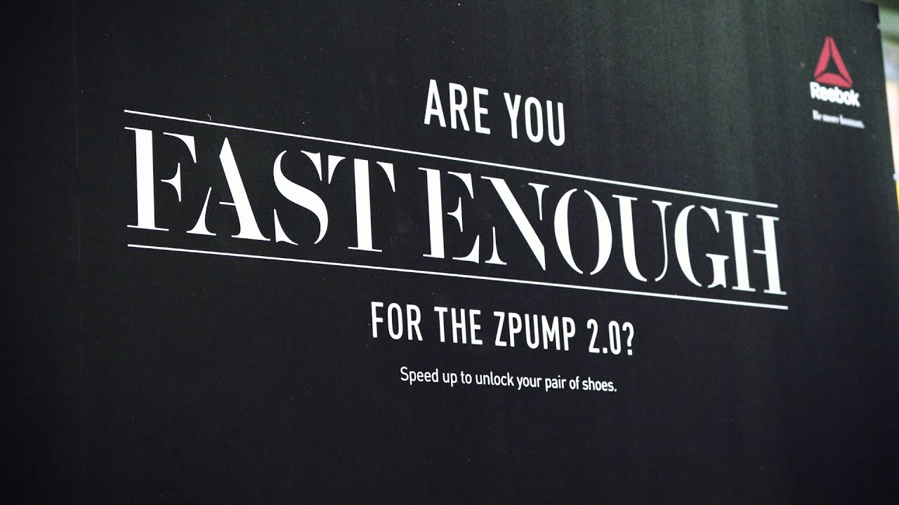
Swedish agency Animal came up with an impressive way of drumming up publicity for Reebok’s new running shoes: it set up an outdoor billboard in central Stockholm, challenging people to a human speed test. Anyone who ran past the billboard faster than 17 km/h unlocked a brand new pair of ZPump 2.0 shoes.
The billboard used a speed camera developed specifically for this campaign, which used realtime object recognition and motion detection to identify runner’s movements and calculate their pace, to great effect.
12. Coca-Cola: The Sign
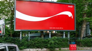
This billboard advertising campaign from Publicis Italia encouraged Coca-Cola drinkers to recycle their empty bottles. The agency cleverly adapted Cola’s iconic ribbon design to literally point passers-by to the nearest recycling bin. There was some controversy surrounding the ads, however, with critics commenting that Coca-Cola was doing too little to offset the massive environmental impact of its products.
13. AIR-INK
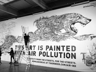
Launched via a successful Kickstarter campaign from Graviky Labs, AIR-INK is an innovative ink made from air pollution. A device captures particles of black soot from car exhaust fumes and chimney smoke, which is then processed and transformed into safe, top-quality ink.
To promote the project, the team roped in illustrator Kristopher Ho to paint a huge billboard for London’s Shaftesbury Avenue, effectively ‘recycling’ the pollution into artwork. To make the scale of the undertaking clear, and intrigue passers-by, the billboard has a simple slogan: ‘This art is painted with air pollution’.
14. McDrive
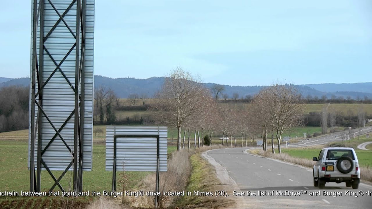
Taking advantage of the fact that in its client, McDonald’s, operates a lot more drive-through restaurants in France (known as McDrives over there, because France) than its main competitor, Burger King, TBWAParis set up this cheeky pair of billboards near Brioude in the Haute-Loire. The ludicrously tall one gives directions to the nearest Burger King drive-through, 258km away, while the little one points drivers to a much, much closer McDrive. Formidable!
15. The Human Billboard
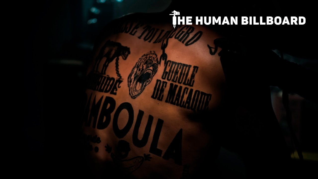
When extreme right-wing party Le Front National won the first round of the 2017 French presidential election, the country saw a rise in racist rhetoric. Leo Burnett France and Le CRAN (Le Conseil Representatif des Associations Noires) used a different type of billboard to remind the French people the lasting damage racist language can have.
Racist insults were collected via social media, and tattooed onto the body of a man to turn him into a ‘human billboard’. The man then walked around Paris distributing leaflets explaining the campaign and encouraging people to join the conversation.
16. Unitech
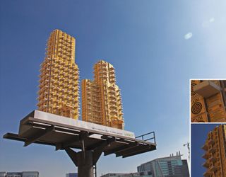
Developed by the team at advertising agency JWT, New Delhi, this Unitech billboard takes advertising to new heights. Here, hundreds of dummy matchboxes were produced and and stuck together in these Lego-like high-rise structures promoting new villas gated community at Karma Lakelands in India.
17. IBM
As part of IBM’s Smarter Cities initiative, ad agency Ogilvy & Mather Group
(now Ogilvy) designed “ads with a purpose”, adding a curve to the billboard to create a rain shelter, bench and even a convenient ramp while promoting the technology brand – because “if cities were smarter, life in cities would be better”.
The billboards seamlessly blend modern design with functionality to help people while they remind them who is behind the act of generosity – it’s a clever way to sell.
18. Lego
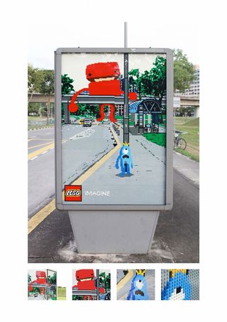
Lego has a consistently brilliant, creative and fun approach to its ad campaigns, but one that particularly sticks out is Oglivy Malaysia’s bus stop billboards, featuring unique lego art that blends into its surroundings.
Certified Lego artist Nicholas ‘Blackbulb’ Foo worked with Ogilvy’s creative team to design three separate bus stop signs: Whale, Monster and Caterpillar. From the front the murals blend into the background, with lego characters parading the streets as if the board is a portal to another dimension that’s entirely made of lego.
Also read: How Lego reinvented itself as a super-brand
19. Leica
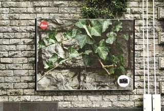
A picture speaks 1,000 words, or in this case 12x optical zoom. These billboards designed by the team at Advico Young & Rubicam in Switzerland display exactly how simplicity can often be the most creative and impactful form of design. Each billboard is a zoomed in image (presumably 12X and taken by a Leica V-Lux 1 camera) of the object behind it, displaying the camera’s superior zoom quality that doesn’t miss a detail.
20. OBI
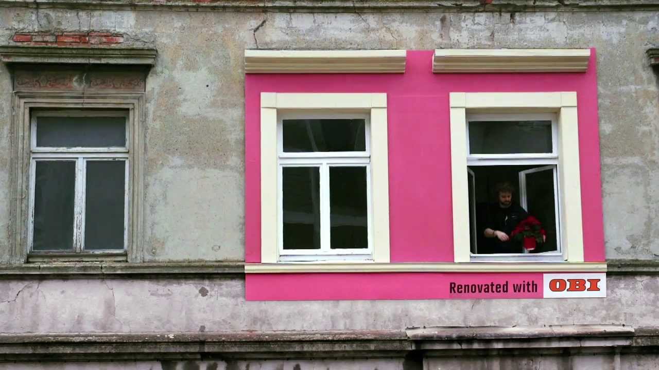
DIY chain store OBI decided to do something different by placing its billboards not in the usual places but on people’s homes themselves. Its thinking was based on the question: Why promote things that make our homes more beautiful, with advertising that makes everything look uglier?
Instead, with the help of advertising agency Jung Von Matt/Elbe, it came up with something much more imaginative and attention-grabbing. “The big challenge was the search for appropriate run-down houses,” Jung Von Matt/Elbe’s Max Pilwat explains.
21. McDonald’s
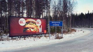
Love it or hate it, McDonald’s has always managed to produce inventive advertisements, which is why it’s made it into this list once again. Created by advertising agency DDB Stockholm, this billboard takes an innovative approach to ‘slashing prices’ on the border of Norway and Sweden. Highlighting the price differences on the cusp of each country, the advert showcases how much cheaper the Big Mac is in Sweden.
22. British Airways
This design from British Airways certainly got our attention. Designed by the Ogilvy, the company uses surveillance technology to track flights – allowing a child to point to the overhead flights in real time. BA head of marketing Abigail Comber explains, “This is a first, not just for British Airways but for UK advertising.”
Channelling that childlike excitement of seeing your first ever aeroplane, the billboard is a marvellous example of interactive design. The billboards were showcased in London’s Piccadilly Circus and Chiswick.
23. OREO
One of America’s favourite cookies, Oreo celebrated its 100th birthday with the ‘Wonder-filled’ campaign, and The Martin Agency was tasked with creating a series of inspiring animations. It then teamed up with Brand New School to take over the largest advertising space in the United States – Times Square.
“It’s an amazing venue that allows the work shine in a dynamic space that naturally fills people with wonder,” creative director of Magnus Hierta enthuses. “This piece also takes advantage of the Times Square space by creating a visual tapestry of sharing that spreads across the screens and leaps from building to building.”
24. Formula Toothcare
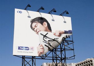
This utterly creative billboard design for Formula Toothcare takes its tag line ‘builds strong teeth’ to extremes. The ‘broken’ metal frame makes the billboard design look all the more realistic and eye-catching – ensuring a strong execution in delivery. This would certainly catch our eye if we were walking past.
25. BMW
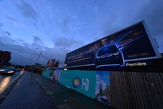
Out-of-home communications agency Posterscope developed an illuminating outdoor advertising campaign to promote the BMW i3, which is claimed to be the world’s first premium fully electric car.
Posterscope’s Hyperspace division worked closely with BMW’s creative agency, WCRS, on the attention-grabbing campaign which incorporates ‘Halo’ lighting into customised billboard special builds to create an after-dark glow effect around 2D cut-outs of the i3.
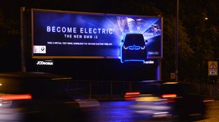
Key parts of the car are separately illuminated to highlight the models hi-tech eco-friendly features and electric inner workings, while a cutting-edge printing technique accentuates the contrast with the backlit skin.
Part of a larger £1m campaign running on across roadside, rail and underground sites in the UK, the advertising also encourages consumers to download a companion mobile app from the App Store, enabling them to take a virtual test drive in the BMW i3.
26. Orphea
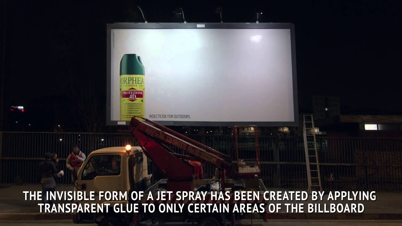
Orphea4D Protection is a powerful insecticide spray for exteriors. This brilliant campaign promotes the brand by transforming a normal billboard into a huge insect trap. Transparent glue was applied on a portion of the billboard in a recognisable shape and when flies and mosquitoes got trapped there, they made the shape visible.
27. C.A.L.M.
Street art can be a great way present a powerful message. To raise awareness of the charity C.A.L.M. graffiti artists Soulful Creative created these brilliant billboards. The posters aimed to highlight the statistic that three men under the age of 35 take their own lives every single day in the UK. The lighting is also a very nice touch – ensuring that passers-by will almost certainly take notice of the billboards.
28. Nike: Knitting
To promote its latest Free Flyknit sneakers, Nike got together with advertising giants Wieden + Kennedy Shanghai to knit a humongous shoe onto a billboard. With the help of three workers, strips of neon green were threaded together to create the shoe on top of a bare foot. The live knitting sessions took place on Nanjing East Road, one of the most heavily trafficked streets in Shanghai, and raised more than a few eyebrows…
29. iPod and iTunes
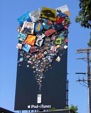
Apple made sure there’d be no chance of missing this advertising campaign for its iTunes store and iPod. Towering several feet in the air, the attention-grabbing design features a fountain of products that can be purchased and enjoyed on the popular portable media player. Apple’s message is simple: combine an iPod with iTunes and you have an endless source of entertainment at your fingertips.
30. Black Tower Home Security
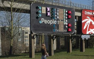
In a campaign for Black Tower security, advertising agency TBWA/Vancouver demonstrated that some people will take whatever they can get their hands on.
The agency lined a 10x20ft billboard with sought-after household items like framed paintings, rugs, pillows, and cookware on a Friday afternoon. By the end of the weekend, the board was bare, revealing the campaign’s simple anti-theft message: ‘People Steal. Black Tower Home Security’.
31. Sky Discovery Channel
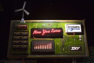
This eye-catching billboard design for the Discovery Channel was developed by advertising agency DDB New Zealand. A working model, the design replicated a circuit board demonstrating how various different elements work – the wind turbine powering the batteries, which stored power until the display read ‘full’, activating the neon lights and finally the light box revealing the Discovery logo.
32. BBC World
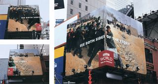
When BBC World became available in the US, BBDO New York chose amazing photography and clever billboard placement to tell the country the international news channel had arrived. The imagery, taken from events around the world, is enough to grab your attention alone. But the BBDO team cleverly used corner billboards to show different takes on the same situation. It’s simple but very effective.
33. Kill Bill
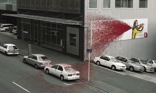
Advertising agency Saatchi & Saatchi New Zealand went all out a few years back when promoting Quentin Tarantino’s Kill Bill, Vol 1. The cool billboard design features Uma Thurman, her priceless Hatorri Hanzo and an impressive wall spatter of blood.
The installation was erected at a busy Auckland intersection to promote a local channel’s screening of the movie. If anyone was in doubt as to what the film entailed, Saatchi & Saatchi made it crystal clear with this design.
34. Miele vacuum cleaner
In order to promote the power of the Miele S8 monster suction vacuum cleaner, Bratislava-based adverting agency Mayer McCann Erickson placed this brilliant billboard design over a well-known tunnel. The agency then filmed traffic over a period of time, resulting in this video that gives the impression of various vehicles being sucked into the vacuum hose.
35. The Economist
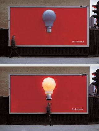
This simple yet ingenious design comes from UK-based creative advertising and brand management agency Abbott Mead Vickers BBDO. The ‘less is more’ idea features a giant lightbulb popping out of the centre of a red background, the only words reading ‘The Economist’.
Using electronic motion sensors, the bulb lit up every time someone walked underneath it, which is a brilliant, effective way to get the message across.
36. Koleston Naturals: Change
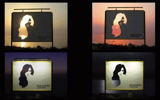
Advertising agency Leo Burnett like incorporating the sun into their awesome designs, including this one for hair colourant Koleston Naturals. The innovative design features a woman’s hair die-cut in the billboard to capture the variations of Koleston Naturals’ colours through the different phases of the day and night. The effect the sun has on this design is just brilliant, with the model’s hair colour changing from blonde to black in just a few hours.
37. Bleeding billboard
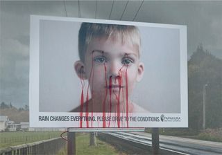
The concept for this powerful billboard design came from New Zealand-based creative agency Colenso BBDO. The team was approached by South Auckland local government bodies with a brief to create a design that would lower the number of fatal accidents on the road.
Noticing that accidents had increased during a particularly wet Easter, the road safety team put up this billboard that ‘bleeds’ when it rains. The message? ‘Rain changes everything. Drive to the conditions.’ If that harrowing image doesn’t make people slow down, we don’t know what will.
38. Panasonic nose hair trimmer
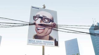
We love this comedic design by Saatchi & Saatchi Indonesia for Panasonic’s nose hair trimmer. The billboards were built around wires and poles to amusingly advertise the need for the device and showcase its safety cutting system. It’s a fun and innovative idea.
39. Colorado State Patrol
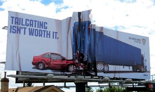
‘Tailgating isn’t worth it. Give Trucks room. It’s the law.’ That’s the message that features on this brilliantly designed billboard by French-American advertising agency Amélie Company for the Colorado State Patrol. It’s simple, keep your distance or end up looking like the billboard. This is one design that will certainly grab the attention of drivers. Although let’s hope the campaign doesn’t keep their eyes off the road for too long…
40. Science World
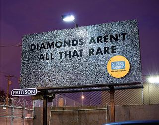
Advertising agency Rethink, Canada teamed up with the Science World Museum to create a series of brilliant billboards dedicated to promoting science in Vancouver. The Rethink team glued 9,000 glass diamonds to a billboard to promote Science World’s Treasure exhibit, and to demonstrate that, compared to many other gems, diamonds aren’t all that rare.
Other brilliant designs include a board covered in pure gold and a stick man made from 9,000 pencils.
41. The Day After Tomorrow
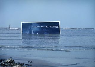
In order to promote Roland Emmerich’s 2004 global-warming disaster movie The Day After Tomorrow to Indian audiences, ad agency Contract submerged a billboard in the sea not far from Mumbai. The idea was to mimic the idea of Manhattan being overwhelmed by water, so the team also placed a replica of the Empire State building further out to sea.
Leaving just the details of the film’s release and venue, the marketing campaign attracted the attention of many a passer-by.
42. Smart: Little billboard
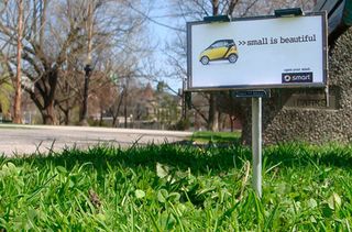
This pocket-sized design proves that when you have a good idea, size really doesn’t matter. In keeping with Smart car’s low impact on the environment, instead of using big billboards that pollute the environment, advertising agency BBDO, Toronto created a series of scaled down versions.
The miniature street advertising boards were placed in various locations around Toronto, all of them celebrating the beauty of being small.
43. Levi’s
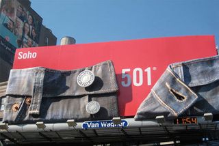
Founded back in the mid 1800s, Levi Strauss and Co has since become known worldwide for its Levi brand of denim jeans. With such a recongiseable brand and product, a simple but clever design was all that was needed for this billboard.
Here, Levi’s lets its jeans do the talking, featuring a section of a giant pair of 501s, unbuttoned to reveal not only the the infamous numbers, but realistic detailing in the denim, stitching, buttons and rivets.
44. Heineken
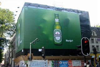
This billboard for Heineken is a perfect example of how a small and simple idea that’s perfectly executed can have a big impact. The three dimensional concept features a hand seemingly coming out of the background about to grab the bottle of beer.
The concept for the billboard, which graced the city of Amsterdam, was developed by the team at advertising agency TBWA.
45. Absolut Vodka
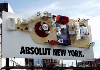
Absolut Vodka’s long-running advertising campaign is one of the most successful consumer products campaigns in the history of advertising. Known for it creative design, the company outdid itself back in 2000 when it created this eye-catching billboard.
After teaming up with fellow Swedish global brand IKEA, the company transformed a billboard in Manhattan into a stylish, but cramped, New York City apartment turned on its side – and shaped like an Absolut bottle. Genius.
For more advertising inspiration, check out the ingenious optical illusion billboard that takes the terror out of the prostate check. If you’re after more clever marketing, check out Oslo’s sarcastic tourism ad that breaks every rule in the book (and somehow it still works).
