Graphic designer David Airey has become something of a go-to expert in the world of branding and design. He has worked with a broad range of clients on all aspects of brand identity, and has launched two design-themed websites – Logo Design Love, and Identity Designed – both of which resulted in publishing deals for books that have gone on to be released worldwide.
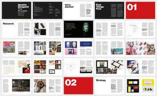
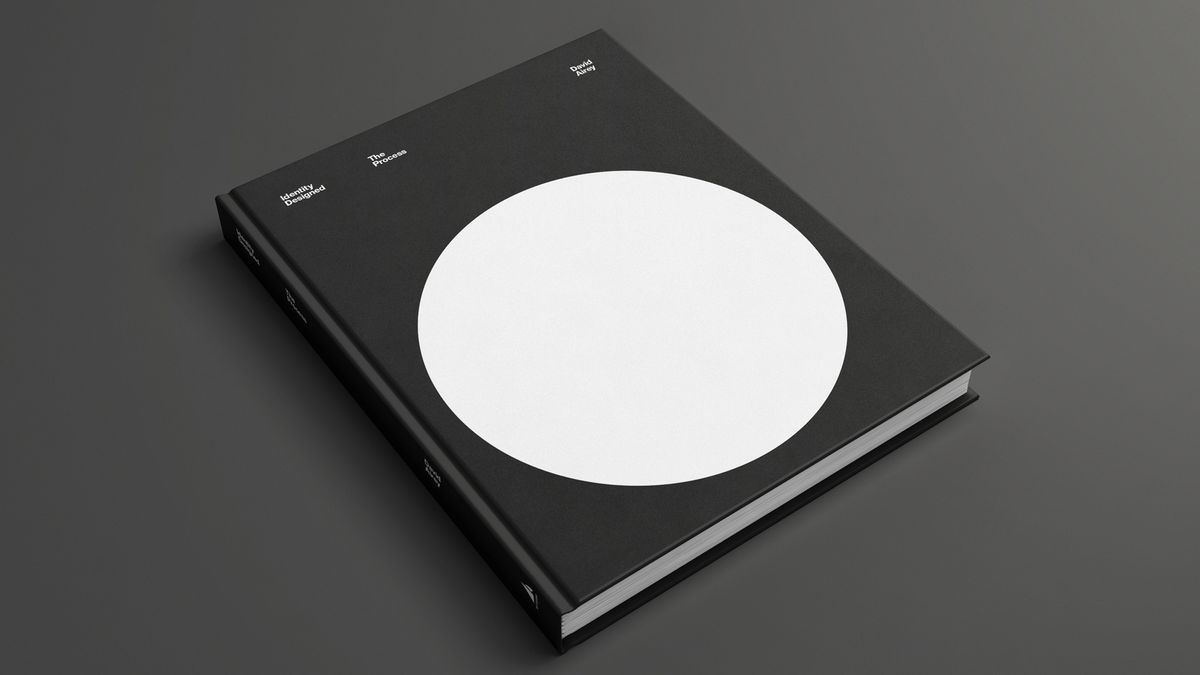
We’ve availed ourselves of David’s wealth of knowledge before too – he was one of the experts we polled for our rundown of the best simple logos. As such, we were excited to learn more about his upcoming book, Identity Designed: The Process, a holistic examination of the entire journey of design, which David separates into four key stages: research, strategy, design and implementation. The book includes insights into David’s own career, as well as illustrative case studies from top design studios. He agreed to share with us a few of the lessons learned along the way…

Your previous book looked behind the scenes at design studios; this one is more a “how to” for designers. What inspired this approach?
That’s right — my last book was a series of interviews with sixteen excellent studios from around the world. It was published back in 2019, and as we’re all continually learning, it seemed like a good time to cover more of my own experiences in the profession.
This new book still includes other designers and studios who kindly shared beautiful case studies and valuable project advice, but it felt right to talk about my own take on things, too. It’s a little similar to my first book, Logo Design Love, except with more focus on creating the broader identity.
How have you integrated lessons and insights from your own design career?
For almost 20 years now I’ve been hired to design logos and visual identities. There’s flexibility in how I do that, but more often than not I work through the four stages of research, strategy, design, and implementation, so that’s exactly how the book’s structured — four sections that give a “start to finish” insight into the designer/client relationship.

The book features case studies from top design studios. Can you share a sneak peek at one of these?
One of the first design-related websites I paid attention to was Noisy Decent Graphics, the online journal of designer Ben Terrett. He shared some stellar advice many moons ago, as relevant today as it was back then, so it’s included in the book with a relevant sample project or two.
“As a designer, if you’re asked to put some handwriting in a brochure document, do it for real. Do not use a handwriting font. (How can you have a handwriting font, anyway?) Write the text out, and scan it in.
“If you need some distressed type, then print the type out, screw it up, photocopy it, re-screw it up, re-photocopy it, and so on, and so on. Distress it for real. Do not use a distressed font.
“If the client asks for a brochure in the style of a scrapbook, then make a scrapbook and scan it in. Page by page. Do not use Photoshop layers.
“If the job needs some chalk-writing on a blackboard, then do it for real.
“Sure, all this takes a lot more time (and therefore costs more money), but it will look a million times better. It will make you think about the thing you are designing, and good people will be able to tell you’ve done it for real. And they will appreciate that.
“It’s not just designers — ad agencies need to do it, too. Actually, the good ad agencies are very good at it. For example, if you need to chuck some coloured balls down a hill, then chuck some coloured balls down a hill. Don’t just CGI it. If you need to make a six-foot pencil, then make a six-foot pencil. Don’t just enlarge it in the editing suite.
“And if you’re not convinced, then take a look around. There are millions of examples of handwriting fonts, photoshopped 3D text, and models comped onto dodgy backgrounds. Don’t do it. Always do it for real.”
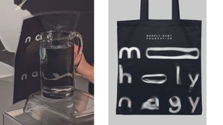
I love that advice. An appropriate case study in the book is Pentagram’s work for the Moholy-Nagy Foundation. Born in Hungary, Laszlo Moholy-Nagy was a renaissance man — a skilled artist, photographer, filmmaker, and writer. He was also a professor at the Bauhaus School in Weimar, and after the Second World War he was invited to move to Chicago to establish the Chicago School of Design, a radical design school that was known as the “New Bauhaus.”
Moholy-Nagy’s legacy of design led his daughter Hattula Moholy-Nagy to establish the foundation in 2003. The aim is to foster the artist’s legacy by conducting research on his life and work and by developing new programs, affiliations, and partnerships.
Pentagram followed the mindset and methods the artist used in his portfolio. Moholy-Nagy was known for his experimental photographs with light, referred to as photograms, and these directly informed the design team’s craft-based approach. A set of typographic forms were created by hand in the studio using a series of projections made with light and water. These intriguing letterforms are the basis of the fluid identity.

Tell us about the process of creating design books – does the idea come first, or take shape in development?
My two publishers kindly approached me before any book plans were in place. After the approach I’d come up with a few book ideas, each including a title, sub-title, list of contents, competitor books, and some words on how I’d promote the work. There’d be a bit of back and forth on what seemed like the best fit before a decision was made and contracts were drafted. This put a framework in place before any writing or page layout happened, and although publishers often handle book designing in-house I enjoyed doing that myself.
Titles and chapter headings might’ve changed as the work progressed, so there was flexibility, but the page count was fixed from the outset. That page limitation meant I had to make a few apologies along the way — I’d asked a lot of designers I respect if I could share their work in the books, and I had many amazing contributions, but when a book was nearing completion I’d sometimes have to go back to a number of contributors and say, “Actually, sorry, I’ve run out of room!” The designers were gracious and understanding, but thinking about it makes me grimace.
Something you mention when describing the book is the “the symbiotic relationship between creativity and strategic thinking”. What does this mean in the context of design?
Creativity can be spontaneous. Think of the flow of an artist as an abstract painting appears on canvas. Design is obviously creative, too, but it needs to fulfil a brief, so there’s strategy involved.
Strategy is essentially about having a plan, so before you throw paint at a canvas, you first need to ask whether that’s the right approach. Will it result in something beneficial for the client?
Basically, this symbiosis refers to how creativity in a design project needs to be planned if the process is to run as smoothly as it should.
