Believe it or not, great branding is about more than just a logo. Ask the experts and they’ll tell you that it’s a combination of things. “We respond to experiences,” says Ben Marshall, creative director at Landor Associates, “stories we can pass on, and frankly, some things that are simply unusual or inspired.”
We asked several experts to pick 20 brands that they feel qualify as iconic. Here’s what they came up with. And if it’s logos you’re after, take a look at our guide to the best logos of all time.
01. Apple
It would have been inconceivable not to include Cupertino’s finest on any top brands list. “It’s a truly great brand because it’s become synonymous with innovation and outstanding design,” says Form’s Benson. “Its brand values permeate through absolutely everything, from usability to design to language to packaging to retail stores.”
“Apple has large revenues but only a very small number of products,” Benson adds. “The real hallmark is care.”
02. The Red Cross
Top brands can be universal in what they represent; the Red Cross logo is so ingrained into our collective consciousness that we automatically associate it with medical assistance. “Some of us have never interacted with the Red Cross, yet we perfectly know what it stands for and how it changes people’s lives across the world,” says Andra Oprisan, strategist at Saffron Consultants. “We are able to recognise its logo anywhere.”
03. Bass
The Bass logo is by far the most venerable of this collection; the Bass brewery was founded in 1777, and its red triangle logo is notable for being the first trademark registered in the UK, on 1 January 1876.
For Kieren Thorpe, creative director at BrandOpus Australia, Bass’s bold use of a very simple primary shape and colour has helped it towards top brand status. “It’s since been redesigned with a bigger icon and a smaller word mark, giving it a much clearer standout,” he believes.
“We recognise colour and shape before the written word,” explains Thorpe – and Bass goes for the jugular on both.
04. Uniqlo

Founded in Japan as the ‘Unique Clothing Warehouse’, this basics-clothing line became Uniqlo, or yoo-nee-koo-roh in Japanese. “What sounds very Japanese actually derives from English,” explains Johnson. “They’d already developed a world-class product and environment – the bilingual logo was the masterstroke that pushed them into being iconic.”
05. Subway
Logo Design Love’s David Airey believes all of the top brands offer the ‘go to’ product or service within its market. “If you want a quick sandwich made with care, you think of Subway,” he observes. “Some people might consider them great simply because of the product or service that backs up the brand: ultimately, that’s what it’s all about.”
06. Ralph Lauren
Although its logotype may be relatively uninspiring in and of itself, Ralph Lauren is unquestionably iconic and one of the top brands in the world. “It has successfully connected the Ralph Lauren mythology with the American collective psyche and the American dream. Together, they form the brand,” suggests Geoff Phillips, design director at MetaDesign. “That goes much deeper than any logo itself could achieve.”
07. Veuve Clicquot
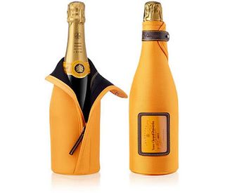
This champagne brand, according to Thorpe, has used colour to great effect to stand out from its competitors. “As a distinctly yellow brand in a world of category conventional colours such as black, gold and cream, the scope to create instant recognition across a multitude of touch points is clear,” he points out. The identity carries across its advertising, with the signature becoming the flourish of an artist’s brush.
08. Zippo
For Landor Associates’ Marshall, Zippo is a prime example of a brand that easily transcends its logo, which he dubs almost irrelevant. “It’s a great innovation – windproof – and has great integrity in its history, having switched from commercial to military-only supply in the war,” he says. “Its form, interaction and even sound are all unique.”
“I love the smell of a Zippo,” says Marshall. “Face it, even people who don’t smoke want a Zippo.”
09. Adidas
Two distinctive graphic devices lie at the core of the Adidas brand: the trefoil of Originals, and the three stripes of the Sports division. “It also received the most positive uptake of any brand involved with the Olympics, which helped it secure its iconic status,” says Benson.
10. Google

Google is another must-include on this list – although its logo alone is hardly a work of art. “Consider the bigger picture,” advises Oprisan. “Google’s brand lives in its products; its culture (those famous job interviews); its environment (its enviable creative offices); its advertising; and also its visual identity.”
11. Paul Smith
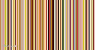
The Paul Smith signature wordmark is beautifully crafted in itself, but for Thorpe it’s the continuity of the pinstripe livery that brings the brand iconic status: “It represents the ‘classic with a modern twist’ ethos.” Johnson concurs, having nominated the same brand: “This recognisable ‘graphic wallpaper’ makes everything from carrier bags to scarves instantly recognisable.”
12. IKEA
Airey believes that modern customers are looking for a complete experience, and highlights the free coffee that IKEA gives family-card holders as part of the global home furnishing giant’s wider brand experience: “If you want to kit out a new home without spending a fortune, you think of IKEA,” he adds.
13. Charity Water
Compared to most non-profits, argues Phillips, Charity Water has particularly high design acumen. “The founder said that charities’ poverty mentality reflects in their brands: he wanted a more aspirational approach,” he says.
“The jerrycan logo is an iconic symbol of water accessibility. It has some notoriety, but it’s not in the top brands yet – although it deserves to be.”
14. Toms
Like Charity Water, Toms is another brand tipped for iconic status in the future: “It doesn’t necessarily have a great logo,” admits Thorpe: “A modern-looking san serif font, in the context of an Argentinian flag – the place where inspiration struck. But it’s a cause-related brand dedicated to making things better, or in the words of the founder: ‘Making things that matter.'”
15. Dyson

Marshall advocates a simple mantra: “to be iconic, be the first, best or only.” In the modern marketplace, this often means truly innovative products cut through the competition. “When I was a kid, a vacuum cleaner was a Hoover; it was the byword,” he recalls. “By using new, radical (and importantly, better) technology, Dyson eclipsed all others in people’s minds.”
16. The Rolling Stones
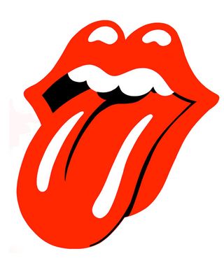
Designed by John Pasche in 1970 and first used on the Sticky Fingers album cover, the illustrated lips and tongue became an iconic emblem for the Rolling Stones. “It sums up the band brilliantly, and is one of the world’s most instantly recognisable symbols of rock and roll,” argues Benson.
17. Coca-Cola

If any of the top brands have nailed global ubiquity, it’s Coke. “It’s a shining example of continual evolution, as relevant and desirable today as it was over a century ago,” believes Thorpe. And the highly distinctive script logotype has remained a constant throughout its lifetime – compare that to bitter rival Pepsi’s multiple radical rebrands.
18. The V&A
Alan Fletcher’s V&A logo has been a classic since the late-’80s, but Johnson recalls a time when it was better loved than the museum: “It was dusty, labyrinthine – the kind of place a design student loved to get lost in, but confounded the everyday visitor,” he says. “It’s since elevated itself into one of the world’s greats.”
19. Pixar
“The animated intro of the bouncing lamp isn’t grandiose, like most production company intros,” Phillips observes. “It’s witty, simple, down-to-earth and intimate. Pixar’s brand is rooted in original stories, rather than sampling traditional children’s literature, sugar coating it and watering it down. They’ve proven that audiences don’t always want what they’ve already seen and heard.”
20. Irn-Bru
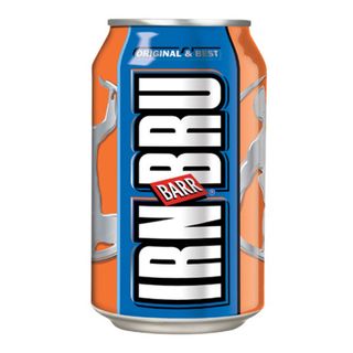
Perhaps a slightly unconventional choice from Marshall: Scotland’s finest, Irn-Bru. “Looking beyond its distinctive neon-ginger aesthetic and brilliant straplines, why is it one of the few markets that outsells Coca-Cola?” he poses. “Because it’s part of the Scots’ outlook. The challenger. It will always be this.”
