Colour grading is a central part of content creation. For example, changing levels or curves in Photoshop, taking a photograph in black and white, adjusting a person’s face colour in After Effects – this is all colour grading.
In this article, we look at why we need colour grading, and how colour grading can have an intentionally dramatic effect in film and photography. Finally, we will look at some of the best software tools to help with colour grading for video and photography, of which some of the best are free. And if you’re looking for more creative tools, take a look at our guide to the best video editing software.
Is colour grading necessary?

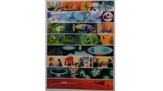
Colour grading can be used denote mood, character and time. Considering a colour look for a creative project before production is an essential part of any process. Pixar, one of the masters of storytelling, creates a range of colour scripts before production commence, which indicate the colour palette that will be used for each scene. This ensures that the colour is helping to tell the story rather than fight against it.
What’s the difference between colour correction and colour grading?

Even though the tools and software are the same, the difference between colour correction and colour grading is the mental approach taken by the creative team. Colour correction includes tasks like removing spots and dust from an image, removal of skins marks and cropping and composition of the picture.
Colour correction is also applicable to making footage from different cameras ‘match’ so that when the colour grader is applied, a consistent look can be achieved throughout a scene.
Colour grading is adjusting the image in specific ways to create a stylistic effect. For example ‘crushing’ the blacks of an image to make it feel contemporary, or taking the matched shots from a camera and tracking and lightening main characters face so that they stand out.
The one essential thing is making sure that any colour choice, whether for colour correction or grading, is made using non-destructive methods. If a camera has a neutral colour or flat profile, or a log profile use that. Render CG using a file type that can support as high a bit depth as the equipment can handle. This will ensure the maximum amount of flexibility in both colour processes.
What is cinematic colour grading?
In cinema, colour grading is a creative choice taken by a creative individual or team on how best to represent the story being told by the use of colour. Naturally, colour grading is heavily influenced by decisions made on set by the director of photography (DOP) and the director. If the production pipeline has ensured that they have been shooting in the most flexible way possible (for example RAW recording or shooting in LOG format), this means that decisions can be made regarding colour grading all the way through to the final edit.
CG artists are acutely aware of the need to accommodate colour grading workflows, so use file formats such as EXRs, which store a wide range of colour data.
Workflows are being developed like the ACES (Academy Color Encoding System) to ensure colour accuracy across as many different input formats as possible, which will hopefully make colour work less about correction and more about colour grading.
Because colour grading is primarily an emotional polish on a film, many feature films leave the colour grade to the very end of the production process. Colour grading will involve the director sitting in a dark room with the colour grader, this can be a standalone post (or the editor on smaller productions) making changes to affect the mood of the entire film.
Colour grading in cinema (and TV) can be controversial especially as cinemas and TV look to formats such as HDR. An example of where a colour grade was potentially pushed too far was the Game of Thrones episode The Long Night. Here a beautifully graded episode in the colour suite was rendered muddy and blocky by people watching the episode on regular TVs.
What is colour grading in photography?

Photography is another area where colour grading is hugely influential. Adjusting the mood of a food shot to greener hues may make a salad look tastier for an Instagram shot. Adding some blue to the shadows of a photograph will evoke a more urban look.
The use of filters in Instagram and other online social apps is very basic colour grading. As there is a conscious decision being made to adjust the look of the photograph to better represent what the photographer wants. Never be afraid to press the edit button in Instagram and become a power colour grader.
The other big colour grading choice with photography, of course, is whether to shoot in black and white. The choice to use black and white in this age of digital colour is a purely aesthetic one. Therefore it falls under the ‘definition’ of colour grading, as elements like composition and texture become much more important.
Fuji cameras, for example, are popular with their owners not just because of their retro industrial design; but because they offer a range of in-built looks. These looks very closely mimic those of older film stocks and therefore colour grade the inbuilt image accordingly. See our roundup of the best cameras for more on different camera types.
Best tools for colour grading

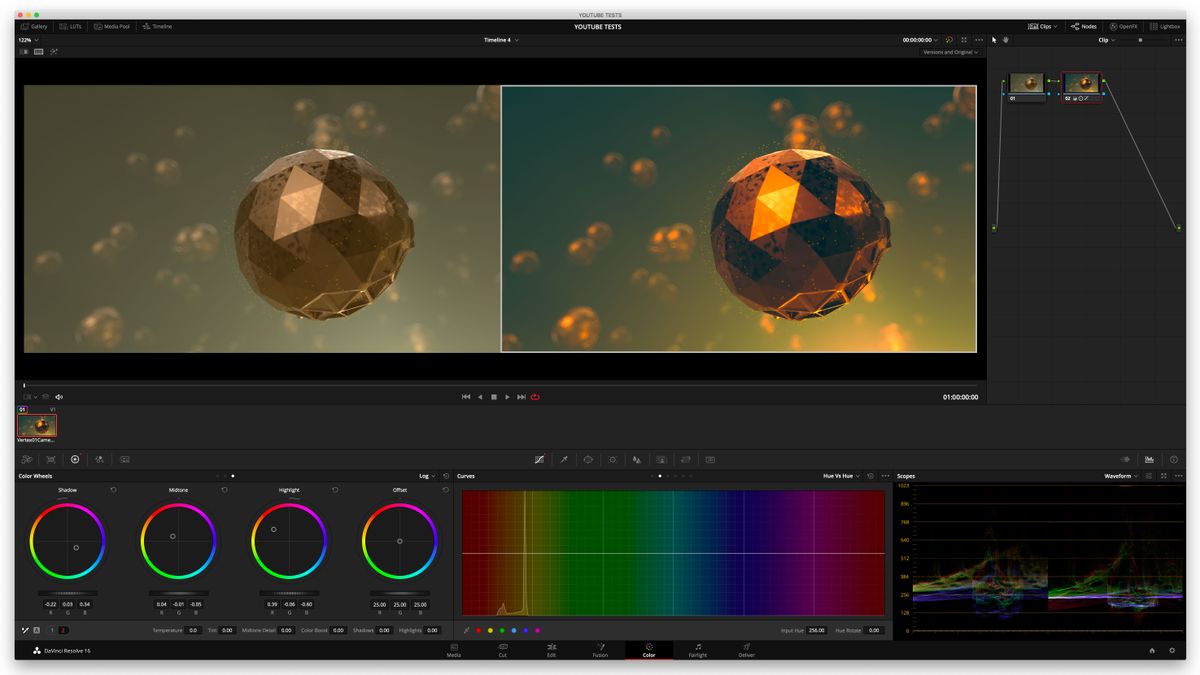
For moving image content creators there is no better piece of software to learn colour grading on than Blackmagic Design’s Davinci Resolve. Davinci Resolve started its life as a colour grading tool, which worked with impressive hardware colour wheel desks. Blackmagic Design has added VFX and editing features to resolve to make it a powerhouse creative tools. The best thing of all is that it is free for any artist on Mac, Windows and Linux.
For photographers, there are a wide range of tools available, as mentioned above, don’t dismiss the edit tools in apps like Instagram. Snapseed from Google is another excellent colour grading tool available for Android and iOS.
On the desktop, Capture One is a fantastic photography editing tool that offers professional-grade toolsets with a similar ‘page’ approach to DaVinci Resolve.
